Arrows
Overview
Need to direct the attention of your viewers to something specific in your chart? Arrows give you the ability to do just that. ZingChart offers a variety of ways to customize your arrows, in terms of both positioning and styling.
Basics
The first step to adding arrows to your chart is to add the "arrows" container. This will allow you to create any number of arrow objects in your chart.
arrows: [ ]
Once you've done this, you can begin to add individual arrow objects. Each of these arrow objects require the "from" and "to" attributes to be set in order for the arrow to appear.
arrows: [{
  from: {},
  to: {}
}]
To add multiple arrows, you can simply add another arrow object within your container.
arrows: [
  {
    from: {},
    to: {}
  },
  {
    from: {},
    to: {}
  }
]
Attributes
From
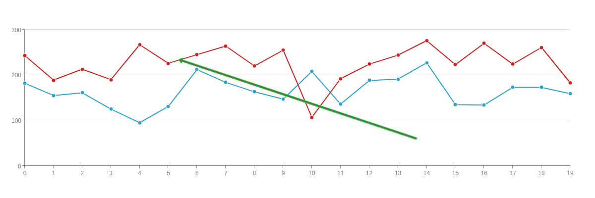
The "from" attribute is used to set the point on the chart at which the arrow begins. This can be set in one of two ways. The first method involves setting specific x and y coordinates that refer to a point on the chart. The second method sets the arrow's beginning point to a data node on your chart.
(X,Y) Coordinates
Setting the (x,y) coordinates for your arrow gives you more control, but may cause you to run into issues if the values used within your chart change or if the size of your chart changes. When using (x,y) coordinates, keep in mind that all coordinates will be relative to the origin, which is located in the top-left corner of the chart.
arrows: [{
  from: {
    x: 400,
    y: 200
  },
  to: {}
}],
Data Nodes
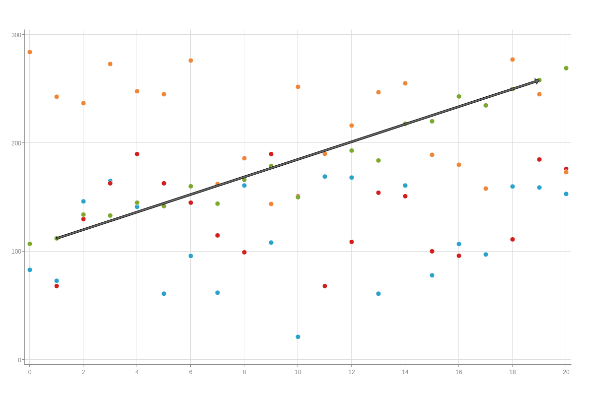
Data nodes are arguably more reliable because they will automatically make the appropriate adjustments to the arrow if the size of your chart were to change. When the size of a chart changes, the (x,y) location of your data may change position, which would potentially require you to adjust the (x,y) position of your arrow. With data nodes, arrows will always point to the same data point, even when your chart changes. To set a data node, use the "hook" attribute in place of the individual x and y coordinates. Plot refers to a set of values, and the index refers to the individual item of data within that set of values. Plots and indices begin at 0, not 1.
arrows: [{
  from: {
    hook: 'node:plot=2,index=1'
  },
  to: {}
}],
To
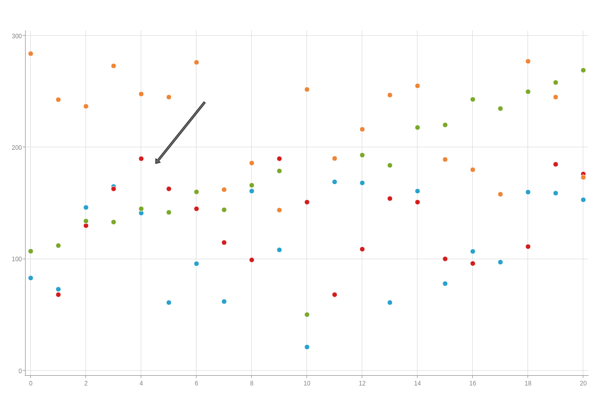
The "to" attribute is used to set the point on the chart at which the arrow ends. The functionality of the "to" attribute is virtually identical to the "from" attribute. As such, arrows can point to either a specific (x,y) coordinate on the chart, or to a data node on your chart.
(X,Y) Coordinates
Setting the (x,y) coordinate for your arrow gives you more granular control over your arrow, but may cause you to run into issues if the values within your chart change or if the size of your chart changes.
arrows: [{
  from: {},
  to: {
    x: 304,
    y: 320
  }
}],
Data Nodes
Data nodes offer more flexibility when it comes to manipulating your chart data or chart size. Just like with the "from" attribute, data nodes are set using the "hook" attribute.
arrows: [{
  from: {},
  to: {
    hook: 'node:plot=2,index=19'
  }
}],

Styling
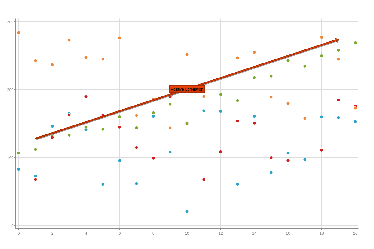
Many of the styling options will produce the best results when you include a text box with your arrow. In our scatter chart, we can see a positive correlation between the red data points. Having already used data nodes to set the placement of the arrow, let's add a text label and some styling options. Setting the "text" attribute will apply a label over the arrow.
arrows: [{
  text: 'Positive Correlation',
  from: {
    hook: 'node:plot=2,index=1'
  },
  to: {
    hook: 'node:plot=2,index=19'
  }
}],
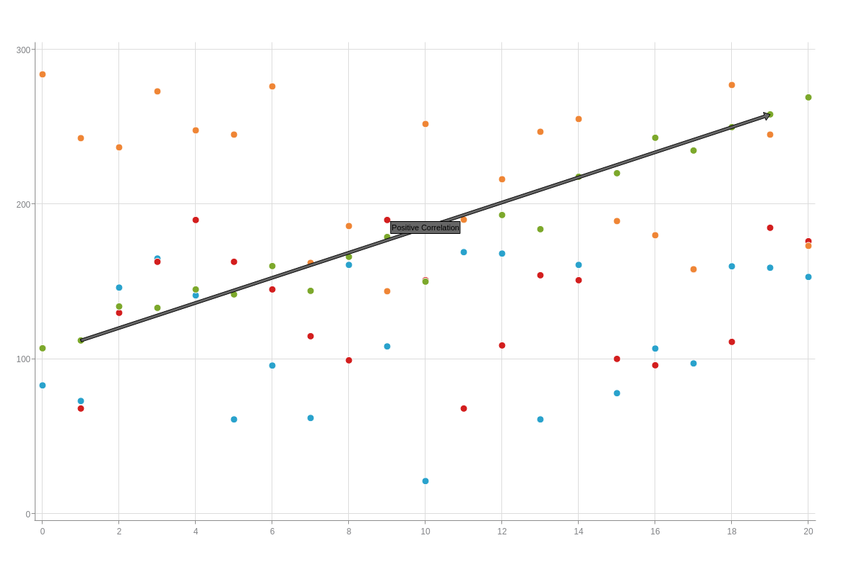
Adding a text label opens up a number of styling options. We can customize the appearance of the text using a number of CSS-like attributes such as "font-family", "font-weight", and "font-size".
arrows: [{
  text: 'Positive Correlation',
  fontFamily: 'Helvetica',
  fontSize: 12,
  from: {
    hook: 'node:plot=2,index=1'
  },
  to: {
    hook: 'node:plot=2,index=19'
  }
}],
Now, let's add some color to our arrow. By setting two background colors, we're creating a gradient that will be used by the text label. We can also modify the border so that it more resembles the data markers.
arrows: [
  {
    text: 'Positive Correlation',
    fontFamily: 'Helvetica',
    fontSize: 12,
    backgroundColor1: '#ef4810',
    backgroundColor2: '#cc3300',
    borderWidth: '2px',
    borderColor: '#a62b02',
    from: {
      hook: 'node:plot=2,index=1'
    },
    to: {
      hook: 'node:plot=2,index=19'
    }
  }
],
Finally, we'll add a slight shadow effect by setting the "shadow" attribute to true, setting a vertical offset so that the arrow does not cover the data points that we're interested in, and adding some padding around the text within the label.
arrows: [{
  text: 'Positive Correlation',
  fontFamily: 'Helvetica',
  fontSize: 12,
  backgroundColor1: '#ef4810',
  backgroundColor2: '#cc3300',
  borderWidth: '2px',
  borderColor: '#a62b02',
  shadow: true,
  shadowBlur: 3,
  offsetY: '-35px',
  padding: '5px',
  from: {
    hook: 'node:plot=2,index=1'
  },
  to: {
    hook: 'node:plot=2,index=19'
  }
}],
For a more full list of available attributes, please visit our JSON Syntax page.
Summary
Arrows are a helpful feature for charts that need a prominent callout, and there are a number of styling options to make them look just the way you want.
Don't forget, a comprehensive list of available attributes and objects can be found on our JSON Syntax page.