Shapes
Overview
ZingChart offers shapes in its charts, a feature that is not commonly found in other charting libraries. At first, the applications for shapes may seem superficial. However, once you think outside of the box (of the chart area), the possibilities to inspire creativity and excitement are endless.
Basics
The first step to using images is to create the shapes container.
shapes: []
At the minimum, you will need to add the shape type attribute.
shapes: [{
  type: 'rect'
}]
However, without adding background color and a size, the shape will not appear.
The size of the shape is determined either with the size attribute, or by setting dimensions with numeric attributes for height and width. The sizing attributes used depends on the type of shape you are adding.
shapes: [{
  type: 'rect',
  'background-color': '#5297b6',
  height:40,
  width:40
}]
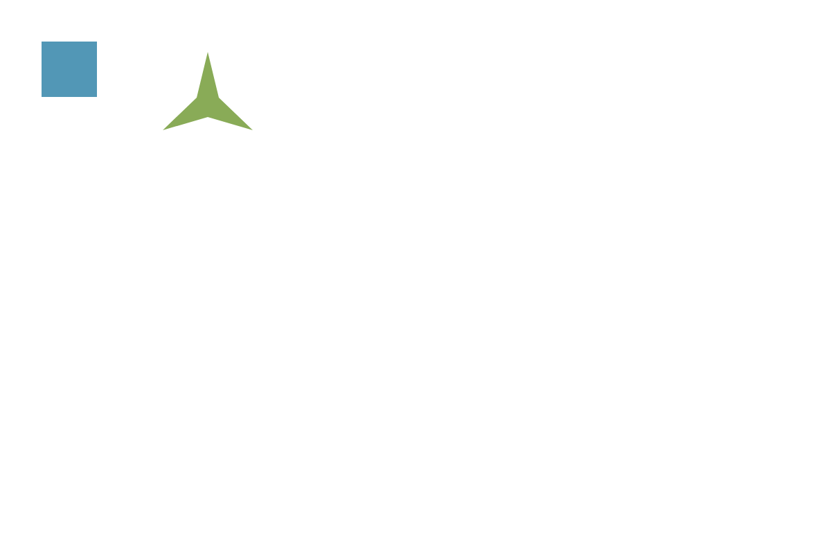
By default, the shape will be positioned at the top left corner of the chart area.
With the exception of lines, positioning a shape relies upon the mixed attributes x and y. These attributes position the center of the shape.
shapes: [
  {
    type: 'rect',
    'background-color': '#5297b6',
    height: 80,
    width: 80,
    x: 100,
    y: 100
  },
  {
    type: 'star3',
    'background-color': '#89ab57',
    size: 50,
    x: 300,
    y: 150
  }
]
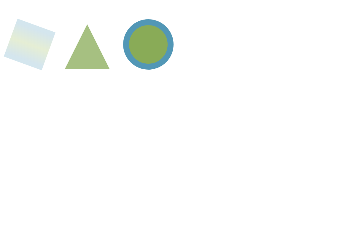
Styling
What good is adding a shape unless it is styled to match your chart or infographic? There are many ways to customize the shapes you use, including:
shapes: [
  {
    type: "square",
    'gradient-colors': "#59b #9b5 #59b",
    'gradient-stops': "0.1 0.5 0.9",
    angle:20,
    size:75,
    x:100,
    y:150,
    alpha:0.5
  },
  {
    type: "triangle",
    size:75,
    'background-image': "https://www.zingchart.com/images/pattern_bling.gif",
    'background-repeat': "repeat",
    x:280,
    y:150,
    shadow: true,
    'shadow-color': "#89ab57",
    'shadow-angle':45,
    'shadow-distance':20
  },
  {
    type: "circle",
    size:75,
    x:500,
    y:150,
    'background-color': "#89ab57",
    'border-width':20,
    'border-color': "#5297b6"
  }
]
Types
Knowing the main considerations for adding and coding a shape, let’s briefly look at some of the unique attributes among the shape collection.
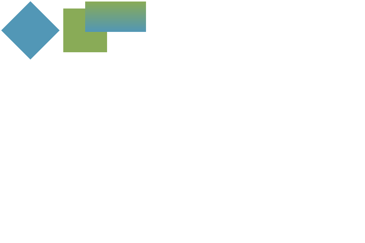
Square/Rectangle/Diamond
These shapes may look very similar, but they are actually added in different ways. Squares and diamonds are added with the size attribute, while rectangles require height and width. If you want to make a diamond with different sized angles, then set the type attribute to poly within a shape object and set the points attribute to create the angles you desire. They can be positioned using x, y, and angle.
shapes: [
    {
        type: "diamond",
        'background-color': "#5297b6",
        size:80,
        x:100,
        y:100
    },
    {
        type: "square",
        'background-color': "#89ab57",
        size:80,
        x:280,
        y:100
    },
    {
        type: "rect",
        'background-color': "#89ab57,#5297b6",
        height:100,
        width:200,
        x:380,
        y:55
    }
]
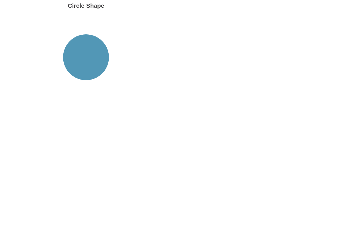
Circle
Like squares and diamonds, circles are added with the size attribute.
shapes: [
    {
        type: "circle",
        'background-color': "#5297b6",
        size:80,
        x:100,
        y:100
    }
]
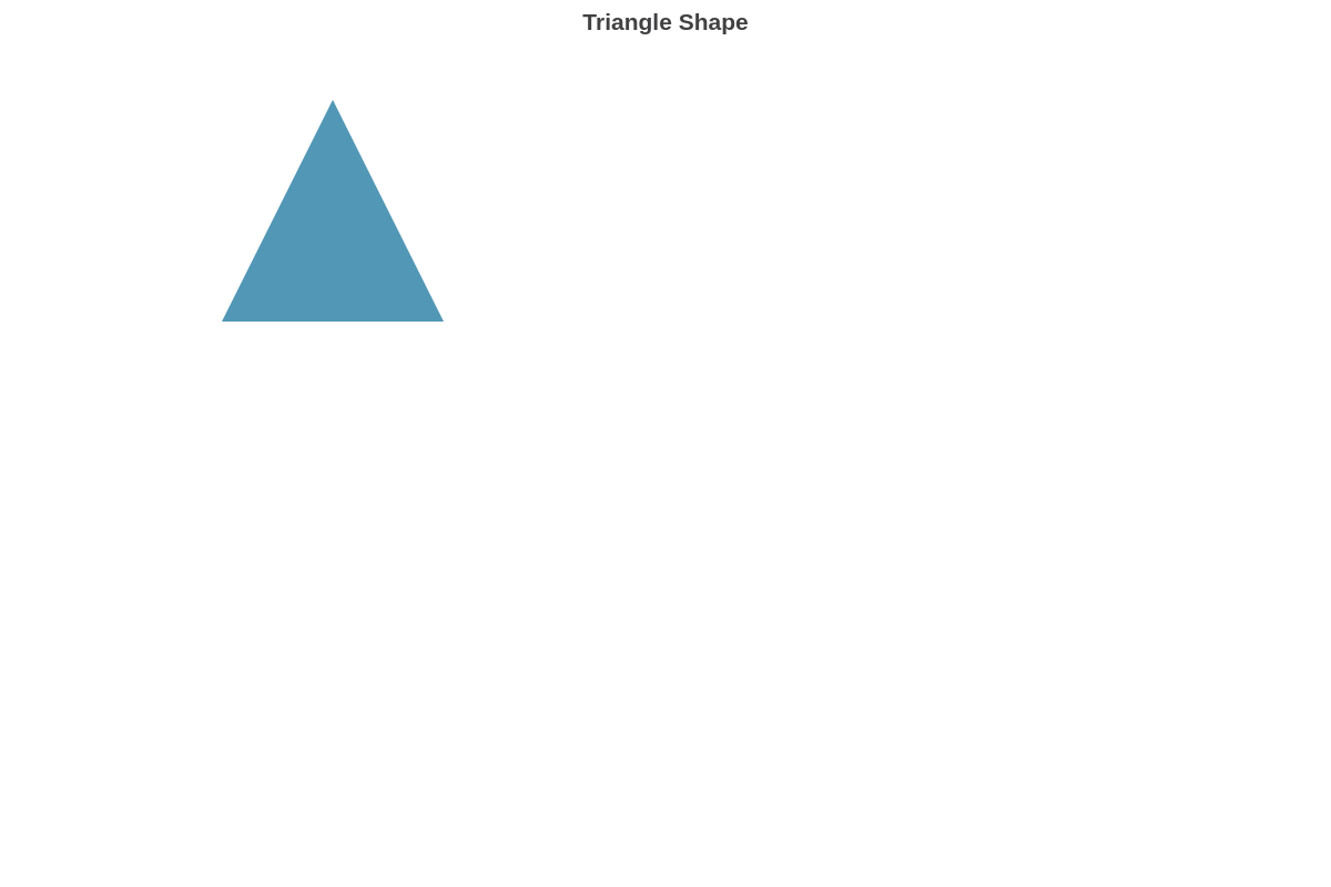
Triangle
Triangles are also added with the size attribute. If you want to make a triangle with different angles, then set the type attribute to poly and set the points attribute to create the angles you desire.
shapes: [
    {
        type: "triangle",
        'background-color': "#5297b6",
        size:100,
        x:200,
        y:200
    }
]
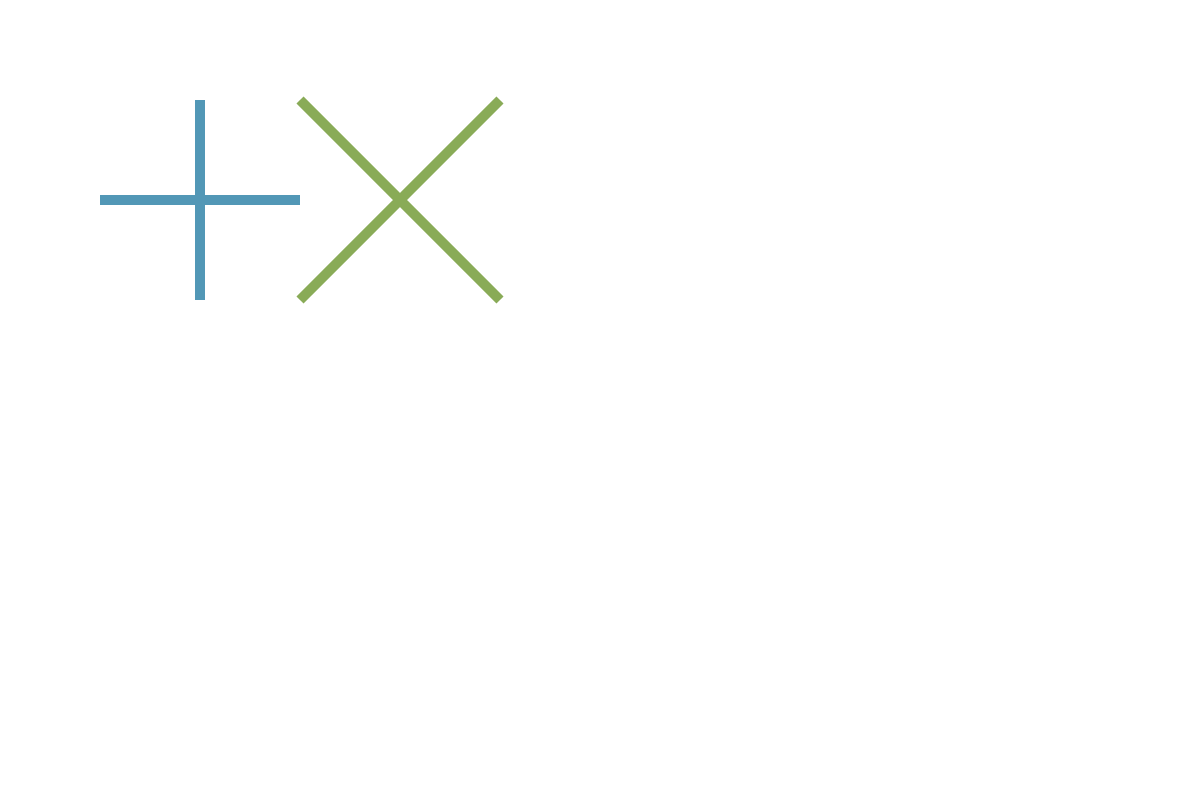
Plus/Cross
Intersected shapes are also added with the size attribute, and instead of specifying background color, they use the line-width and line-color attributes. They are sized with the size attribute and positioned with the x and y attributes.
shapes: [
    {
        type: "plus",
        'line-width':10,
        'line-color': "#5297b6",
        size:100,
        x:200,
        y:200
    },
    {
        type: "cross",
        'line-width':10,
        'line-color': "#89ab57",
        size:100,
        x:400,
        y:200
    }
]
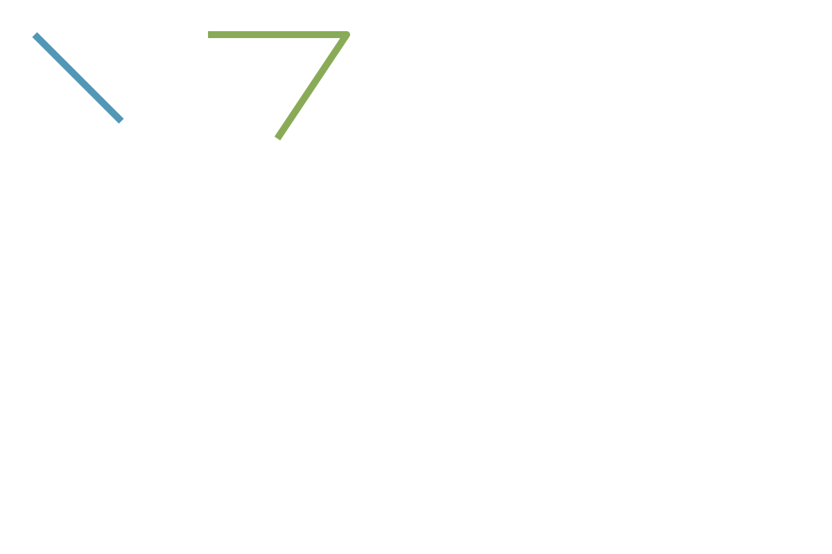
Line
Lines are added, sized, and positioned through the use of the points attribute.
shapes: [
    {
        type: "line",
        'line-width':10,
        'line-color': "#5297b6",
        points: [[50,50],
        [175,175]]
    },
    {
        type: "line",
        'line-width':10,
        'line-color': "#89ab57",
        points: [[300,50],
        [500,50],
        [400,200]]
    }
]
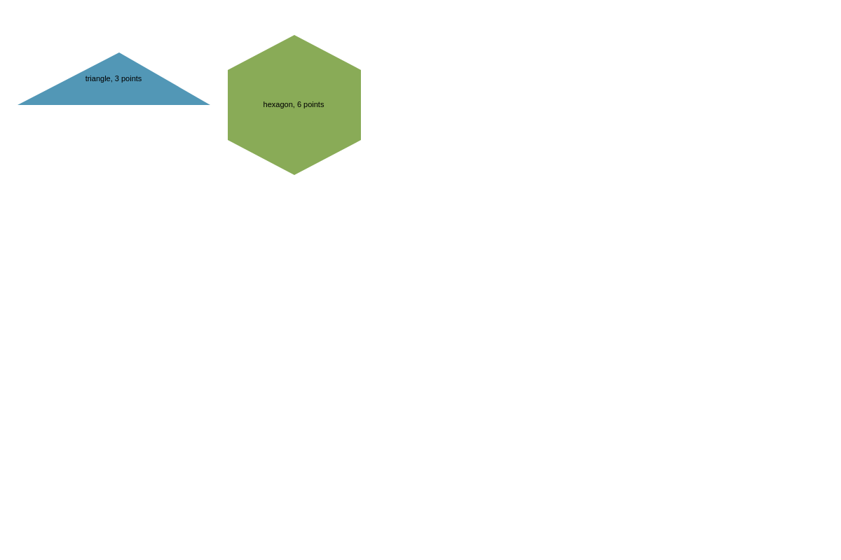
Poly
Poly is your workhorse for shapes with custom angles. The number of sides, as well as the position of the poly are determined by the coordinate sets you add to the points attribute. For example, three points will yield a triangle.
shapes: [
    {
        type: "poly",
        label: {
            text: "triangle, 3 points"
        },
        'background-color': "#5297b6",
        points: [
            [170,75],
            [25,150],
            [300,150]
        ]
    },
    {
        type: "poly",
        label: {
            text: "hexagon, 6 points"
        },
        'background-color': "#89ab57",
        points: [
            [420,50],
            [325,100],
            [325,200],
            [420,250],
            [515,200],
            [515,100]
        ]
    }
]
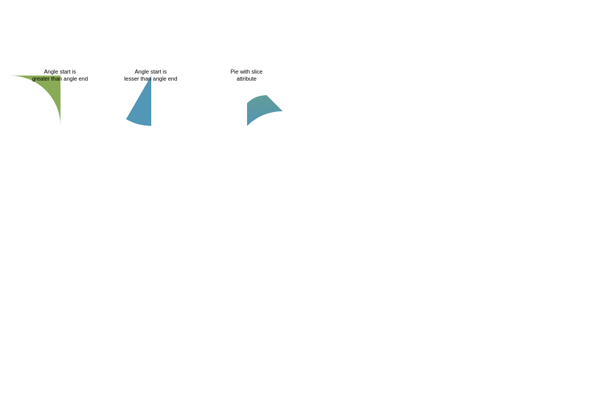
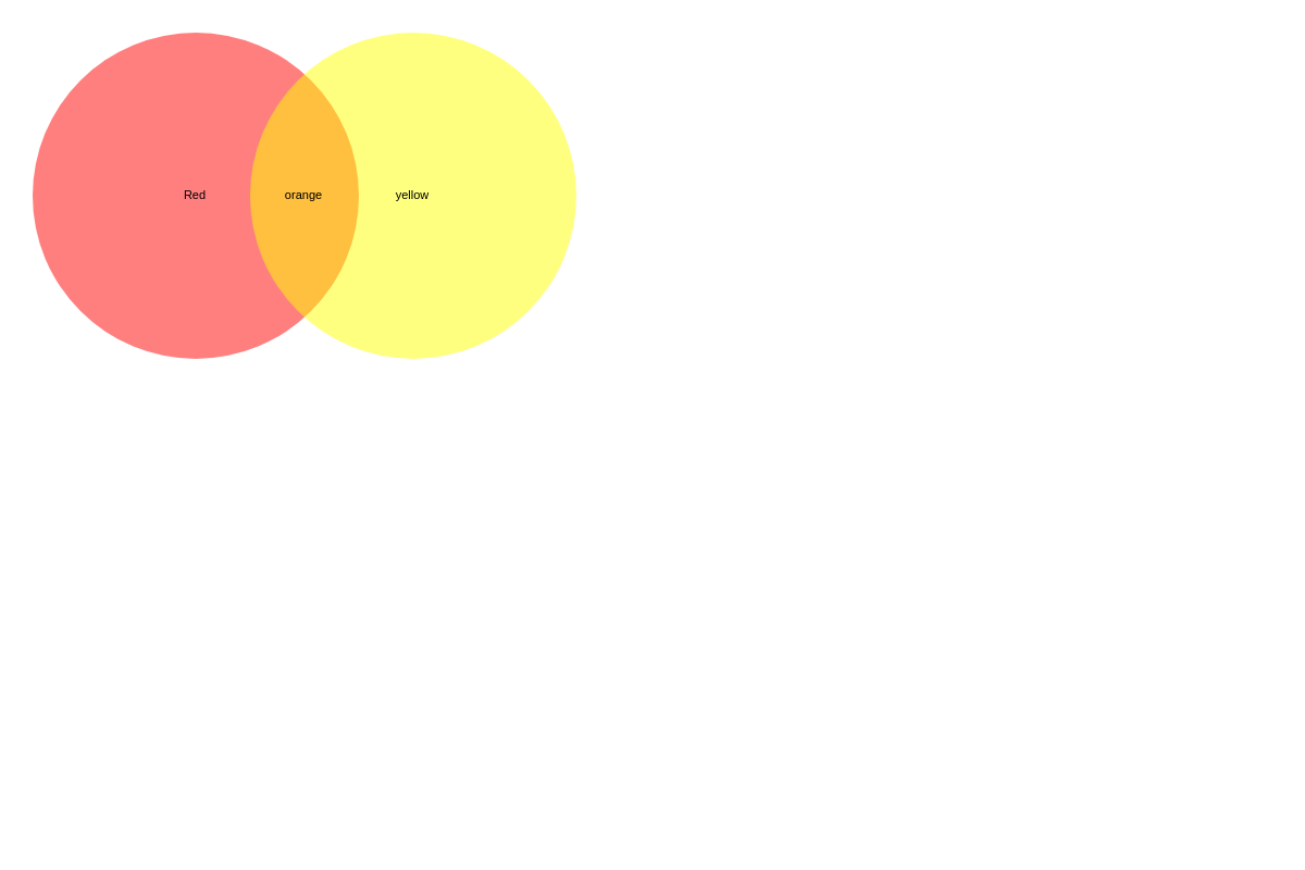
Pie
Pie shapes are sized with the size attribute and the center is positioned using the x and y attributes. The angle-start and angle-end attributes determine the size of the slice, as well as where the slice is located within the pie. The slice attribute can be applied to pie shapes to remove part of the center.
shapes: [
    {
        type: 'pie',
        'background-color': "#89ab57",
        size:100,
        x:120,
        y:150,
        'angle-start':180,
        'angle-end':90,
        label: {
            text: "Angle start is greater than angle end"
        }
    },
    {
        type: 'pie',
        'background-color': "#5297b6",
        size:100,
        x:300,
        y:150,
        'angle-start':90,
        'angle-end':120,
        label: {
            text: "Angle start is lesser than angle end"
        }
    },
    {
        type: 'pie',
        'background-color': "#89ab57,#5297b6",
        size:100,
        x:490,
        y:150,
        'angle-start':90,
        'angle-end':45,
        slice:55,
        label: {
            text: "Pie with slice attribute"
        }
    }
]
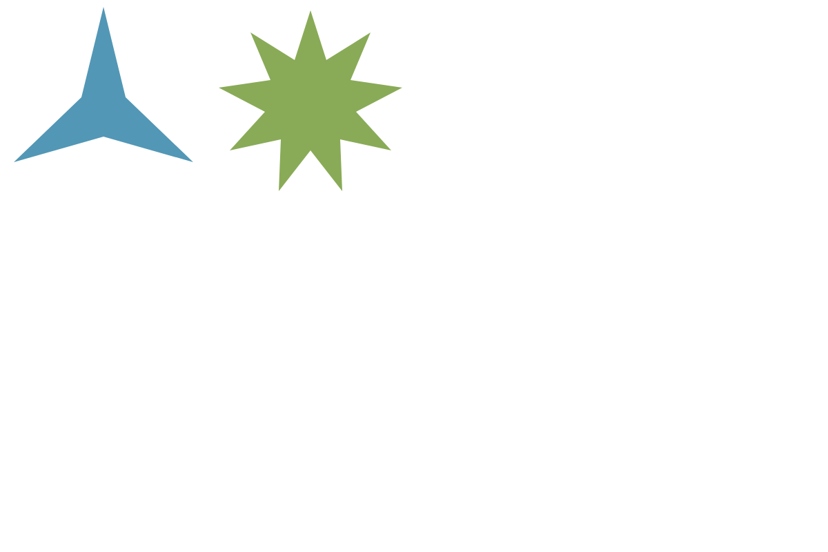
Star
Stars can be customized by specifying the type to star3 or any number up to star9. They are sized with the size attribute and positioned using the x and y attributes.
shapes: [
    {
        type: "star3",
        'background-color': "#5297b6",
        size:100,
        x:150,
        y:160
    },
    {
        type: "star9",
        'background-color': "#89ab57",
        size:90,
        x:450,
        y:150
    }
]
Interactions
Shapes can be even more useful if they have interactive features applied to them.
Hover
Applying a hover state can be useful for highlighting specific shapes. The hover effect can change the attributes of a shape when the mouse hovers over it. Add the hover-state container and then add your desired attributes within the container to add hover effects.
shapes: [
    {
        type: "square",
        'background-color': "#5297b6",
        size:75,
        x:100,
        y:150,
        alpha:0.5,
        'hover-state': {
            alpha:1
        }
    }
]
Tooltips
Tooltips can be used to add text and pointers for specific shapes. They may be applied to shapes to indicate different regions in a chart, or to add more text than is appropriate on a label.
shapes: [
    {
        tooltip: {
            text: "Research.",
            'background-color': "white"
        }
    },
    {
        tooltip: {
            text: "Strategize.",
            'background-color': "white"
        }
    },
    {
        tooltip: {
            text: "Execute.",
            'background-color': "white"
        }
    }
]
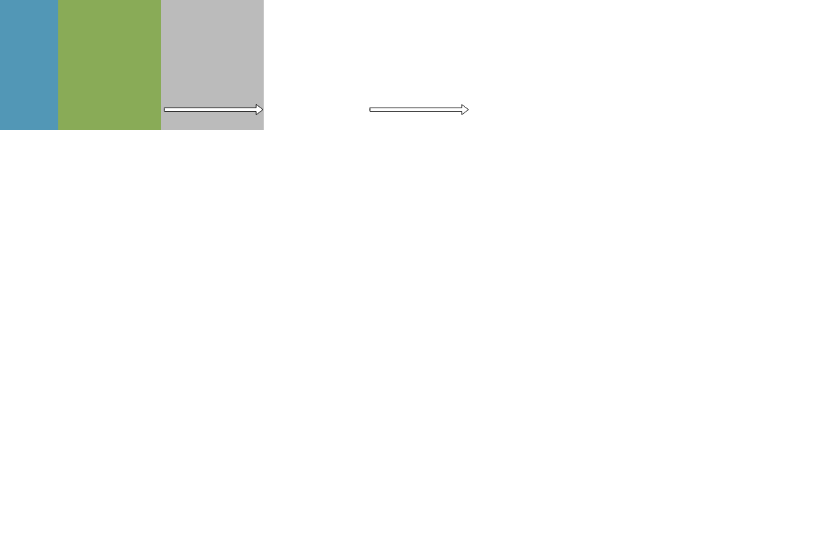
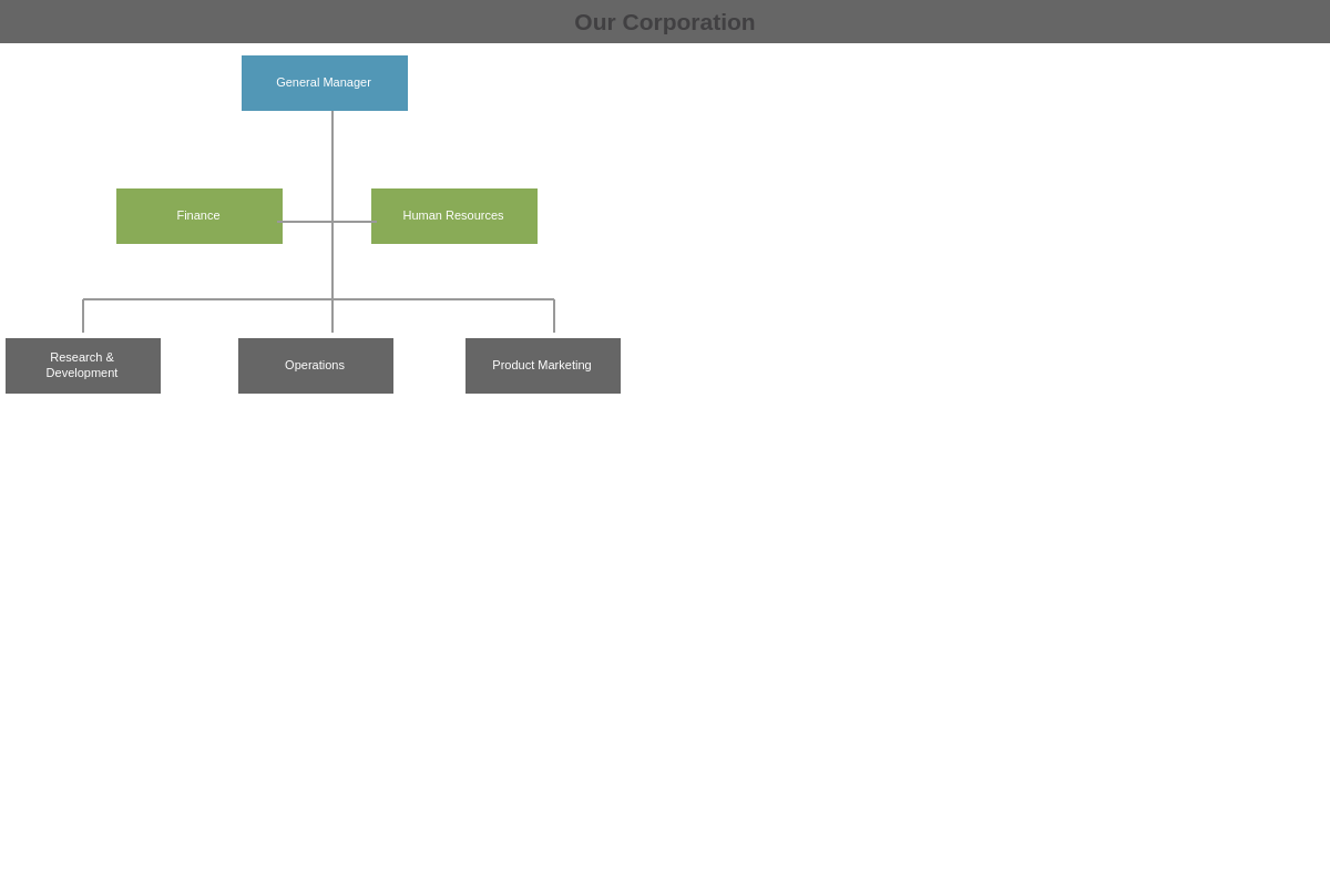
Labels
Labels are especially useful if you want to create an organizational chart or a flow chart. They are added in a similar way to tooltips, and default to the center of the shape to which you are applying them. An easy way to move them in relation to the shape is through the offset-y and offset-x attributes, as padding attributes affect the position based on the origin of the top left corner of the chart.
shapes: [
    {
        label: {
            text: "Phase 1",
            'background-color': "#5297b6",
            color: "white",
            'offset-y': "140px"
        }
    },
    {
        label: {
            text: "Phase 2",
            'background-color': "#89ab57",
            color: "white",
            'offset-y': "140px"
        }
    },
    {
        label: {
            text: "Phase 3",
            'background-color': "#bbbbbb",
            color: "white",
            'offset-y': "140px"
        }
    }
]

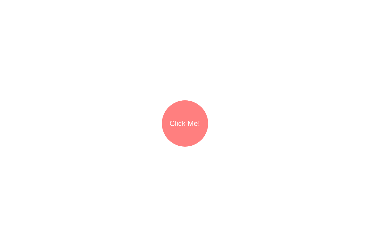
Clickable
Here's a ZingChart Easter egg just for you! You can add the url attribute to your shape to make it a link.
shapes: [
    {
        url: "https://www.zingchart.com/",
        target: "_blank"
    }
]
Applications
Once you know how to add and customize shapes, you are ready to put them into action.
Diagram
Pictogram
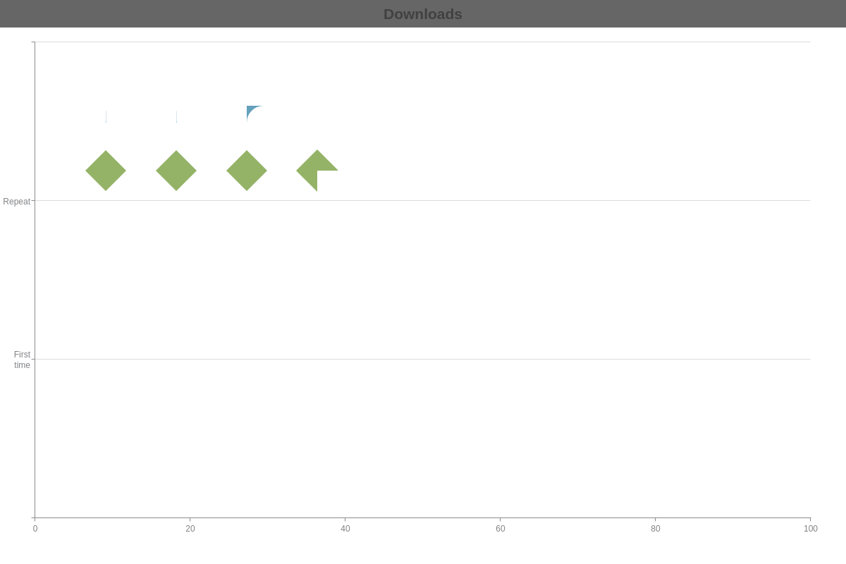
Callout
Flow Chart
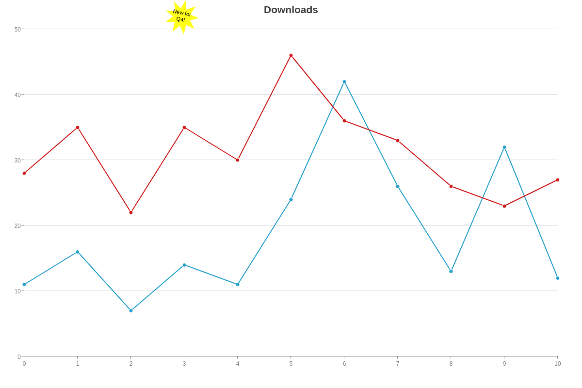
APIs
APIs can help to add interactivity to your charts. The chart below uses the shape_click event to detect shape clicks, and then uses the modify method to change the stacks and the appearance of the shapes to make them appear as buttons.
For more information on API Events and API Methods, check out the following links:
Summary
These are just a few ideas of how to apply shapes in your charts and infographics. Hopefully these examples get your creative juices flowing. If you make something really cool, please let us know so we can take a look!
Don't forget, a comprehensive list of available attributes and objects can be found on our JSON Syntax page.