Nested Pie Charts
Nested Pie Chart Types
You can create a nested pie chart (aka multi-level pie chart), nested donut chart, or nested pie small multiples.
Nested Pie Chart
Specify the chart type by adding a type attribute to the chart object and setting the value to nestedpie. Without further modification, here is how a default nested pie chart appears:
{
  type: 'nestedpie',
}

Nested Donut Chart
You can create a nested donut chart by adding a slice-start attribute to the plot object. Specify your desired ring size as a percentage or pixel value.
{
  type: 'nestedpie',
  plot: {
    sliceStart: '35%'
  },
}

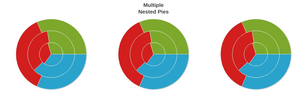
Small Multiples
You can create nested pie small multiples, aka a trellis chart, by using a layout attribute (to organize the columns and rows) and the graphset array (to contain the charts).
Note: Our Adding Additional Charts page explains in greater detail how to create a graphset array, as well as how to insert multiple charts throughout your webpage.
{
  layout: '1x3',
  graphset: [
    {
      type: 'nestedpie',
      series: [
        { values: [59,55,30]},
        { values: [60,50,35]},
        { values: [50,40,30]}
      ]
    },
    {
      type: 'nestedpie',
      title: {
        text: 'Multiple<br>Nested Pies'
      },
      series: [
        { values: [59,55,30]},
        { values: [60,50,35]},
        { values: [50,40,30]}
      ]
    },
    {
      type: 'nestedpie',
      series: [
        { values: [59,55,30]},
        { values: [60,50,35]},
        { values: [50,40,30]}
      ]
    }
  ]
}
Data
Provide your nested pie data in the series array. Each values object corresponds to a slice in the pie. As a nested pie chart, each slice can have two or more layers. Assign your values in the following format:
series: [
  { values: [slice1-layer1, slice1-layer2, ..., slice1-layerN]},
  { values: [slice2-layer1, slice2-layer2, ..., slice2-layerN]},
  { values: [slice3-layer1, slice3-layer2, ..., slice3-layerN]},
  ...,
  { values: [sliceN-layer1, sliceN-layer2, ..., sliceN-layerN]}
]
Note: You can use zero or null values to represent unavailable data. The difference is that zero values appear with tooltips and null values do not.
Chart-Specific Properties
You can create a donut hole (ring) and/or insert bands (separations) into your nested pie chart.
Donut Ring Size
Use the slice-start attribute in the plot object to create a hole or ring in your nested pie chart. Provide a percentage or pixel value.
{
  type: 'nestedpie',
  plot: {
    sliceStart: '65%'
  },
}

Band Space
Use the band-space attribute in the plot object to insert bands (or separations) between your pie layers. Provide a pixel value.
{
  type: 'nestedpie',
  plot: {
    bandSpace: 15
  }
}

Band Widths
Use the band-widths attribute in the plot object to set the bands widths. Provide a pixel value.
{
  type: 'nestedpie',
  plot: {
    bandWidths: [30, 10, 20, 10, 20]
  }
}

Further Customization
Once you have your basic chart, you can customize and style it to fit your data visualization needs.
Plot/Series Styling
You can style the backgrounds and borders on your nested pie chart using the background-color, border-width, border-color, line-style, alpha, and other styling attributes.
Note: For more styling options, refer to the Plot/Series Styling Tutorial. For a full list of attributes, refer to the plot / series JSON Configuration page
{
  type: 'nestedpie',
  plot: {
    alpha:0.8,
    shadow: false,
    borderWidth: '1px',
    borderColor: 'white',
    sliceStart: '30%',
  }
}

Tokens
Tokens (or string interpolation) are highly useful when customizing nested pie tooltips and value boxes. Commonly used nested pie chart tokens include:
| Token | Description |
|---|---|
| %data-_____ | Format for custom tokens. The custom token is defined in the plot or series object as an attribute or array using the "data" prefix(e.g., data-year). It is then recalled in the tooltips or value boxes (e.g., %data-year). |
| %node-percent-value %npv | The percentage value of the pie slice (node) relative to the entire pie (sum of all nodes) |
| %node-value %v | The pie slice (node) value |
| %plot-description | The description of the current plot, pulled from the description attribute in the plot/series object |
| %plot-text %t | The text of the current plot, pulled from the text attribute in the plot/series object |
Note: Learn more about tooltips with our Tooltips Tutorial. For more tooltip styling options, see our Tooltips JSON Attributes/Syntax page.
Tooltips
To enable and style tooltips, add a tooltip object in the plot object. Customize the tooltip's text with a text attribute.
Note: Learn more about tooltips with our Tooltips Tutorial. For more tooltip styling options, see our Tooltips JSON Attributes/Syntax page.
{
  plot: {
    tooltip: {
      text: 'Ages %t: %v',
      fontColor: 'black',
      fontFamily: 'Georgia',
      fontSize: 12,
      backgroundColor: 'white',
      borderWidth: '1px',
      borderColor: 'gray',
      borderRadius: '3px',
      lineStyle: 'dashdot',
      padding: '10%',
      textAlpha: 1,
      alpha: 0.7
    },
    alpha:0.8,
    shadow: false,
    borderWidth: '1px',
    borderColor: 'white',
    sliceStart: '30%',
  }
}

Value Boxes
To enable and style value boxes, add a value-box object in the plot object. Customize the value box's text with a text attribute.
You can also use rules to create conditions when value boxes appear.
Note: Learn more about value boxes with our Value Boxes Tutorial. For a list of available attributes, see our Value Boxes JSON Attributes/Syntax page.
{
  type: 'nestedpie',
  plot: {
    valueBox: {
      text: '%data-year',
      fontColor: 'white',
      fontFamily: 'Georgia',
      fontSize: 12,
      fontWeight: 'normal',
      rules: [
        {
          rule: '%p != 0',
          visible: false
        }
      ]
    }
  }
}

Legend
Include a legend object to enable and style an interactive legend.
Note: Learn more about legends with our Legend Tutorial. See our Legend JSON Attributes/Syntax page for more information on legend styling and customization.
{
  type: 'nestedpie',
  legend: {
    borderWidth: '1px',
    borderColor: 'gray',
    borderRadius: '5px',
    lineStyle: 'dashdot',
    header: {
      text: 'Ages',
      fontFamily: 'Georgia',
      fontSize: 12,
      fontColor: 'purple',
      fontWeight: 'normal'
    }
  }
}

Interactive Charts
You can create interactive nested pie charts by utilizing features such as animation.
Animation
Add the animation object to your plot object to create an animated nested pie chart.
Note: Learn more about adding animation to your chart with our Animation Tutorial.
{
  plot: {
    animation: {
      onLegendToggle: true, //set to true to show animation and false to turn off
      effect: 5,
      method: 1,
      sequence: 1,
      speed: 1
    }
  }
}