Chord Charts and Diagrams
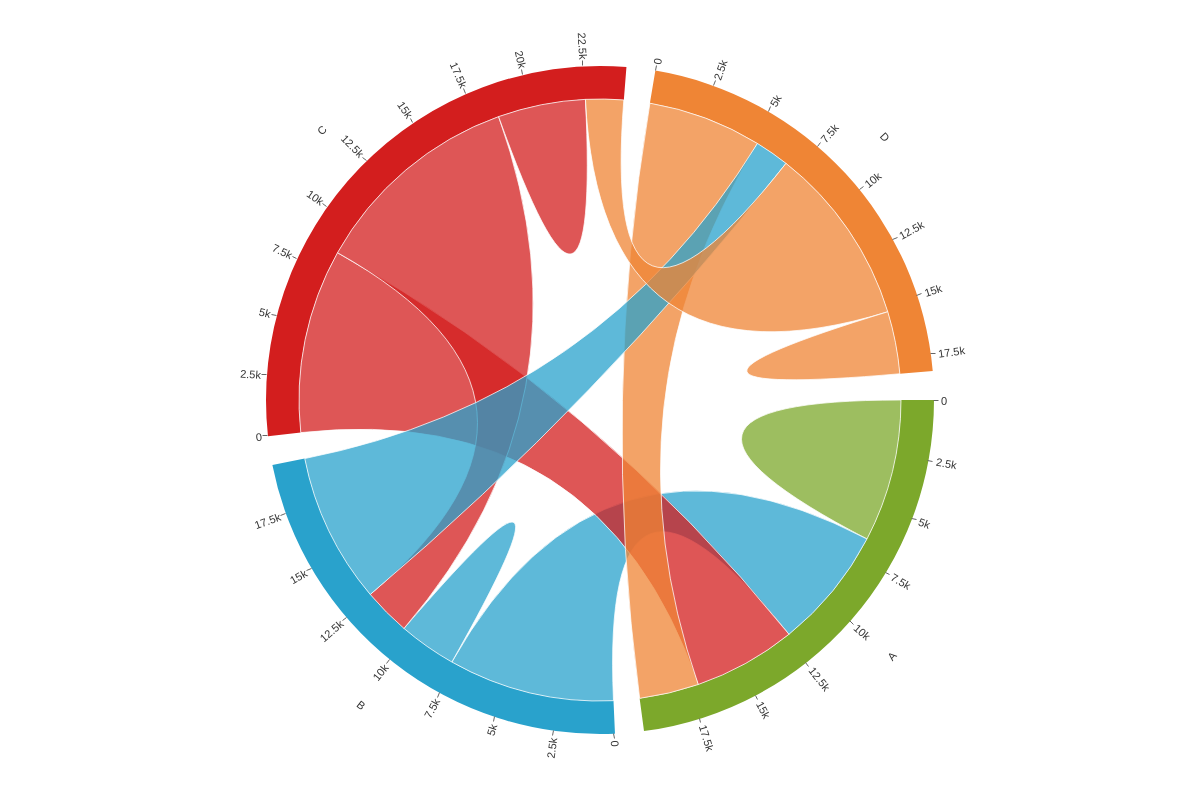
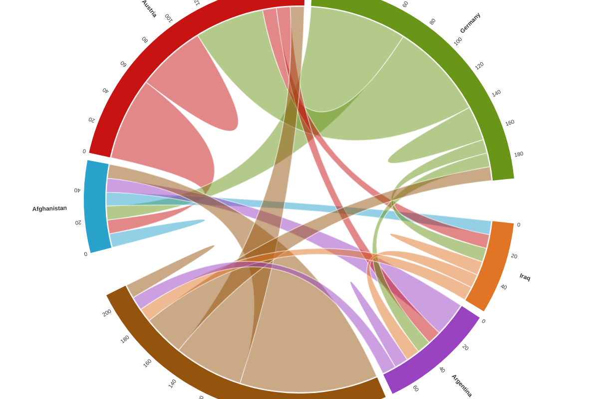
Note: See our Chord Chart Gallery for inspiration on all the different chord chart possibilities.
Chord Chart Type
In your chart object, add a type attribute and set the value to chord.
{
  type: 'chord'
}
Data
Chord charts support data in the form of a series array of objects.
Number Arrays
Create a series array of objects of length N. Within each of those objects, place a values array with a length equal to the number of objects within the series array.
{
  type: 'chord'
  series: [ // Length N array of objects
    {
      values: [val1, val2, ..., valN] // Length N array of numbers
    },
    {
      values: [val1, val2, ..., valN]
    }
      ...,
    {
      values: [val1, val2, ..., valN]
    }
  ]
}
Chord Chart-Specific Properties
Customize how chord segments and bands display via the options object.
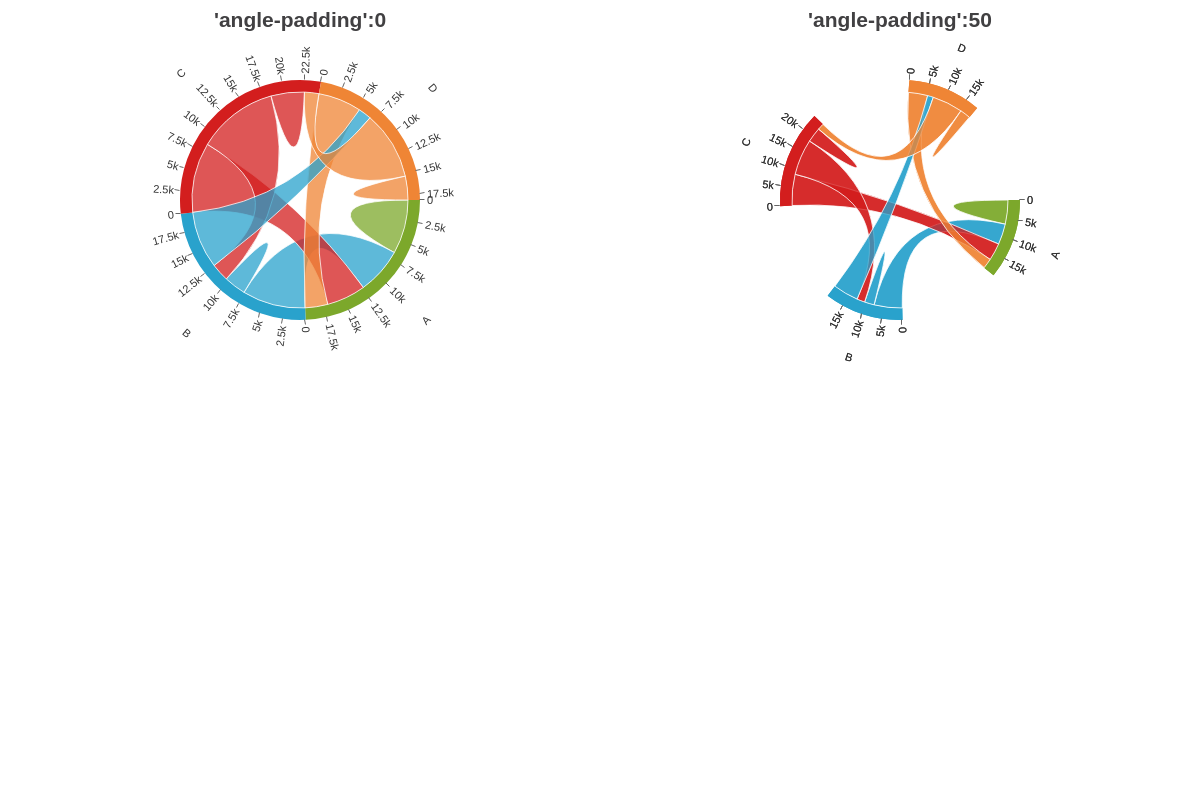
Angle Padding
The anglePadding attribute sets the angle padding between two chord segments.
{
  options: {
    anglePadding: 0
  }
}
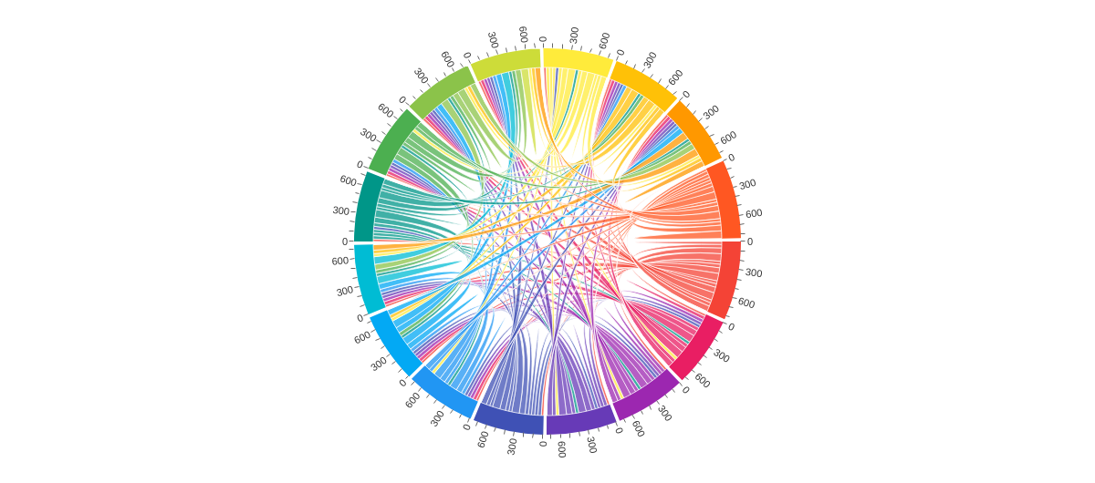
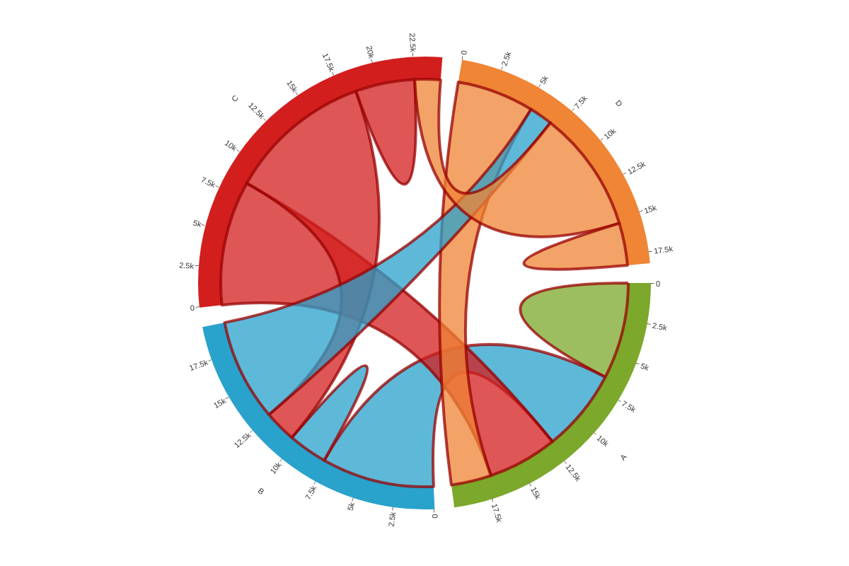
In the chart below, compare 'anglePadding':0 with 'anglePadding':50:
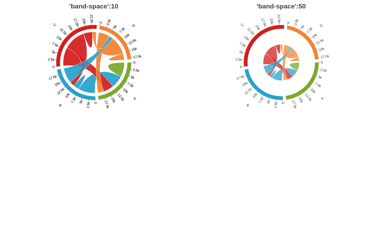
Band Space
The bandSpace attribute sets the space between the band and the chords.
{
  options: {
    bandSpace: 10
  }
}
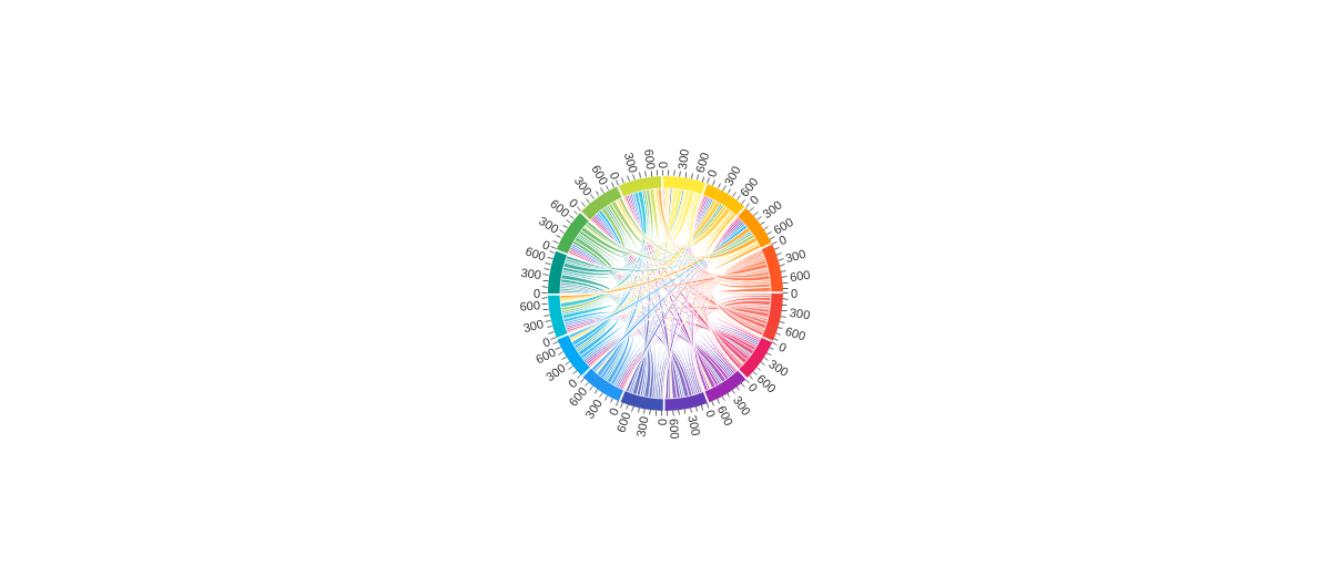
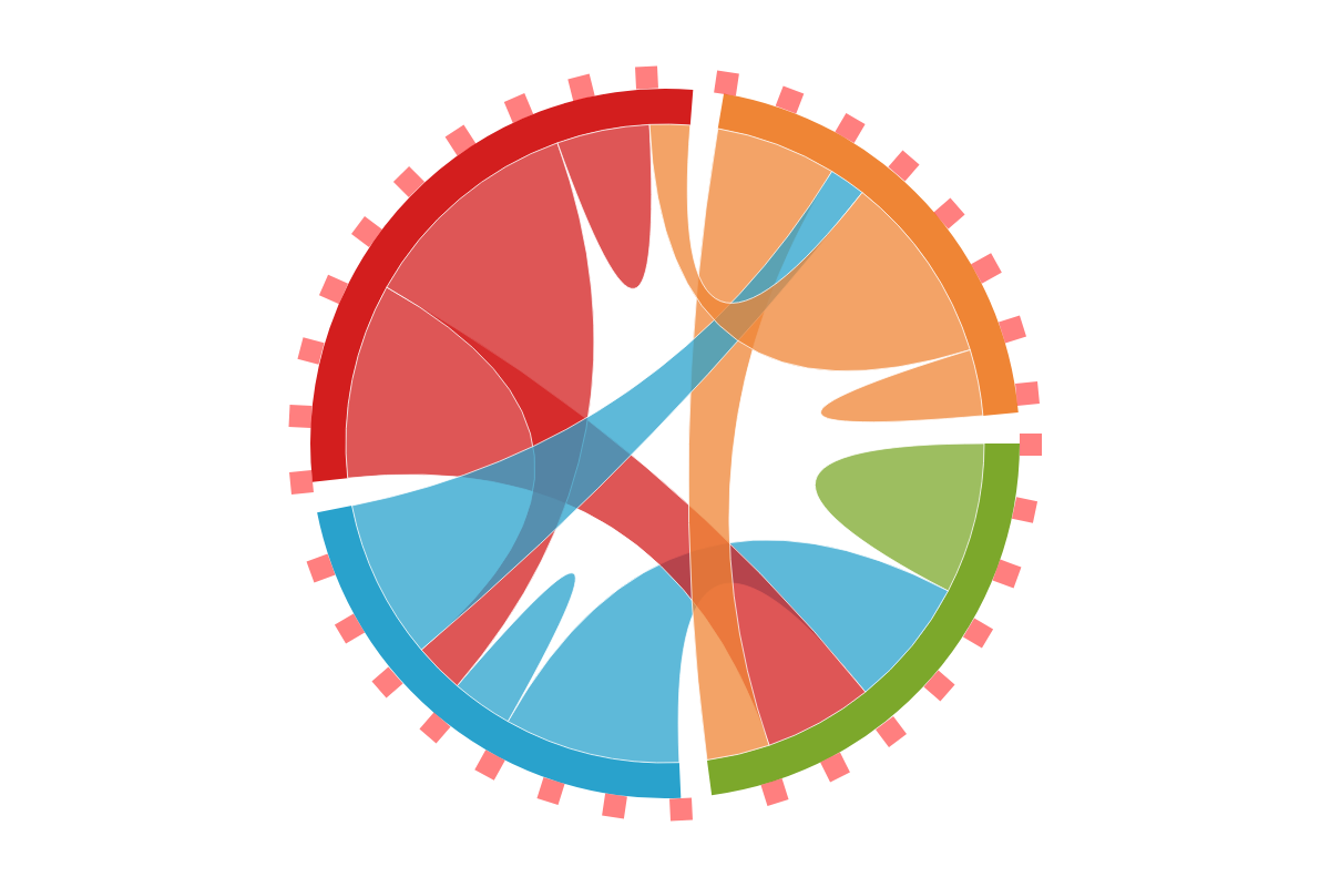
In the chart below, compare 'bandSpace':10 with 'bandSpace':50:
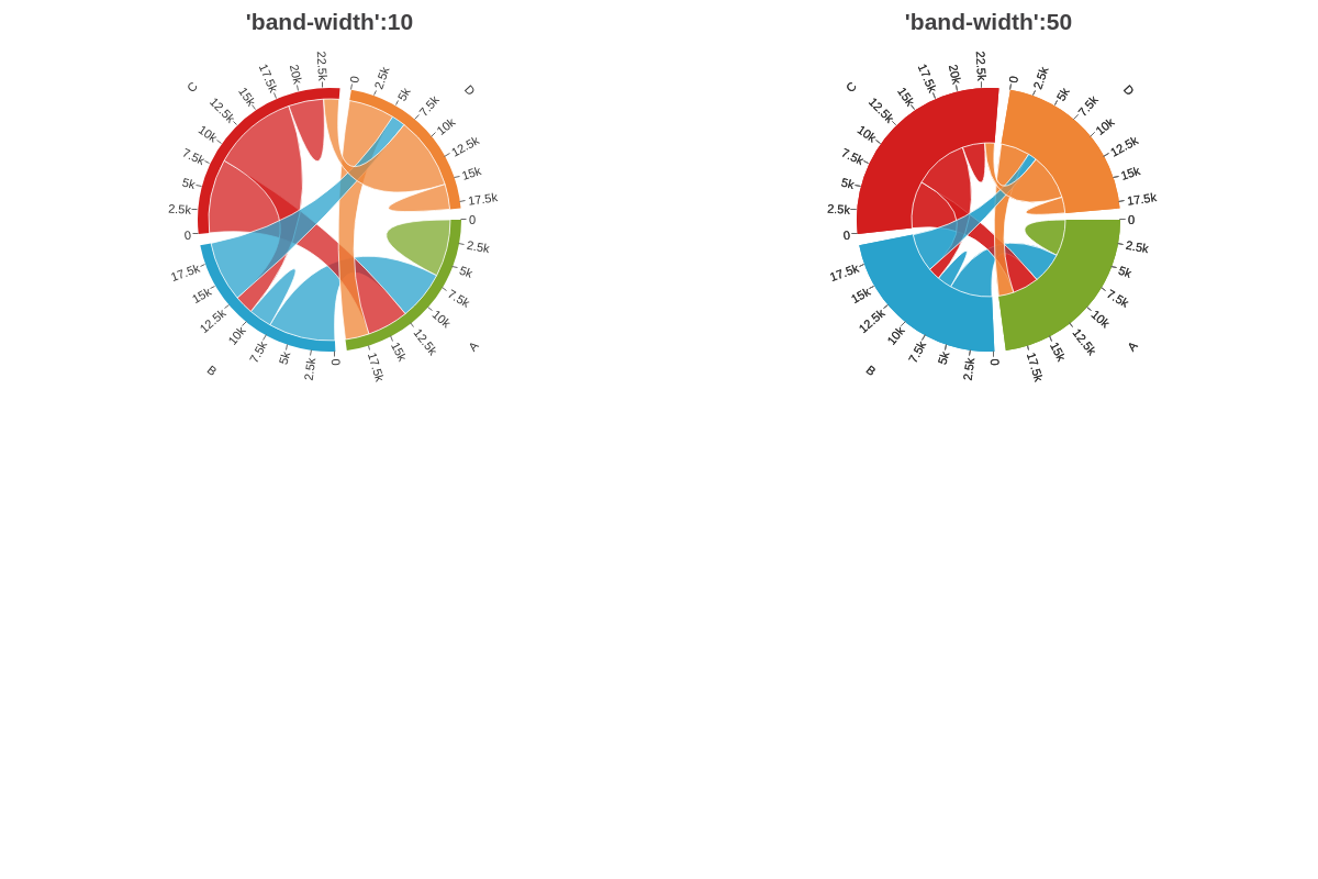
Band Width
The bandWidth attribute sets the width of the band.
{
  options: {
    bandWidth: 10
  }
}
In the chart below, compare 'bandWidth': 10 with 'bandWidth':50:
Flat
The flat attribute sets whether the chord's highlight effect (when hovering over the band) is enabled or not. Setting the flat attribute to true will disable the highlight effect when hovering over the band.
{
  type: 'chord',
  options: {
    flat: true
  }
}

Group Offset
The groupOffset attribute sets an offset of the angle from which the chords are painted.
{
  type: 'chord',
  options: {
    groupOffset: 100
  }
}
Group Padding
The groupPadding attribute sets a radial space between the bands.
{
  type: 'chord',
  options: {
    groupPadding: 110
  }
}

Hover Effect
The hoverEffect attribute specifies which elements to apply the hover effect on.
The following options are:
- 0: no alpha change applied
- 1: alpha change on chord element
- 2: alpha change on both band and chord elements
{
  options: {
    hoverEffect: 2    // default is `1`
  }
}
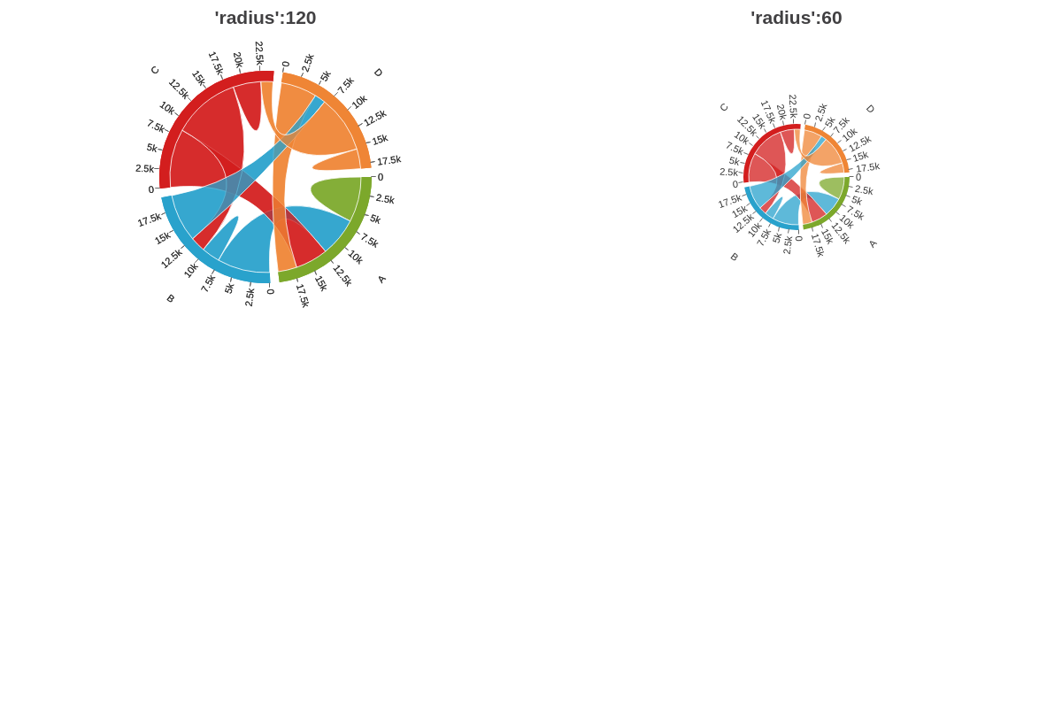
Radius
The radius attribute sets the radius of the chord. The value can be relative to the plotarea size.
{
  options: {
    radius: 60
  }
}
In the chart below, compare radius: 120 with radius: 60:
Size Factor
The sizeFactor attribute sets the size factor to apply to the chart.
{
  options: {
    sizeFactor: 0.5
  }
}
Further Customization
Chord charts also include a number of global stylings that allow you to manipulate the appearance and behaviors of your chord chart. They can be implemented into your chart by placing them within the options object.
Note: For more styling options, browse our JSON Attributes/Syntax page.
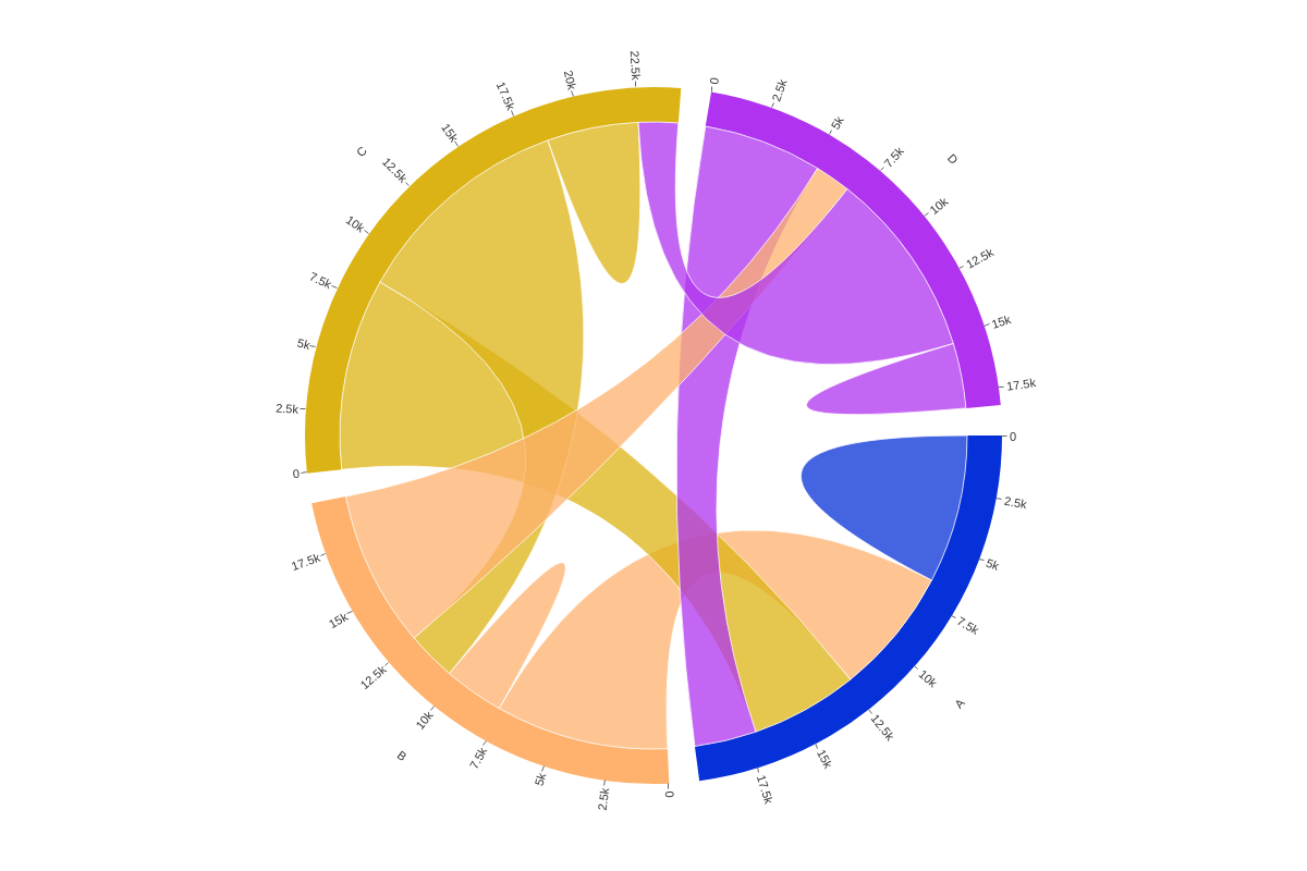
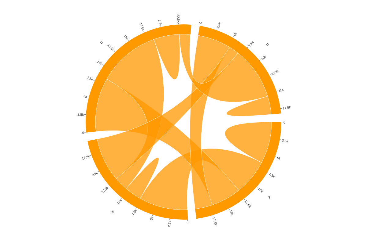
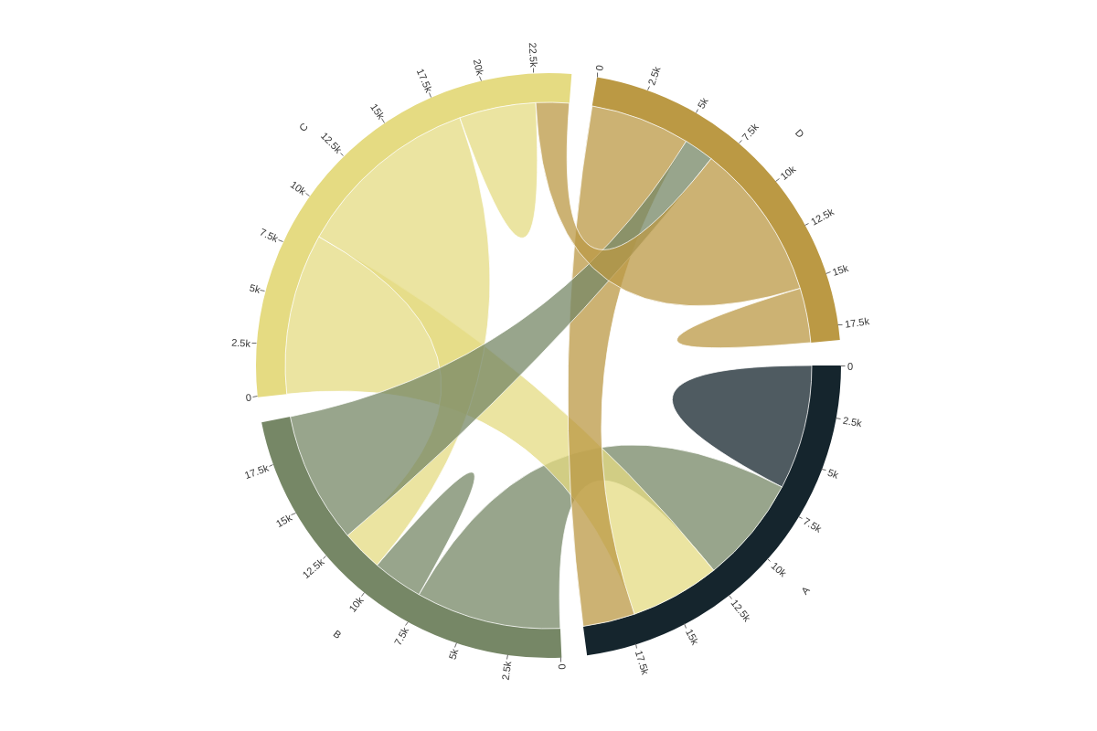
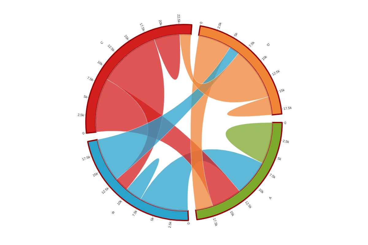
Color Type
The color-type attribute sets the color algorithm used to color the items.
Random
Setting 'colorType': 'random' lets the library choose random colors each time the chart renders.
{
  options: {
    colorType: 'random'
  }
}
Color
The color attribute sets the color of the items when 'colorType': 'color' is set. Provide a color, HEX, or RGB value.
{
  options: {
    colorType: 'color'
    color: '#f90'
  }
}
Palette
The palette attribute defines a custom palette used by the items when 'colorType is set to palette. Provide a string of comma separated color, HEX, or RGB values.
{
  options: {
    colorType: 'palette',
    palette: [ '#15252d', '#768766', '#e5db82', '#bb9944', '#bb6622', '#b1200f', '#342e3a' ]
  }
}
Band
The band attribute defines the global or series styling for the band. To style globally, create a style object and insert your band object.
{
  options: {
    style: {
      band: {
        borderWidth: 4,
        borderColor: '#900'
      }
    }
  }
}
To style by series, create a style object within the series array you want to apply your styling to and insert your band object.
{
  series: [
    {
      values: [6637,5700,4789,2771],
      text: 'A',
      style: {
        band: {
          'border-width':4
        }
      }
    }
  ]
}
Chord
The chord attribute defines the global or series styling for the chords. To style globally, create a style object and insert your chord object.
{
  options: {
    style: {
      chord: {
        borderWidth: 4,
        borderColor: '#900'
      }
    }
  }
}
To style by series, create a style object within the series array you want to apply your styling to and insert your chord object.
{
  series: [
    {
      values: [6637,5700,4789,2771],
      text: 'A',
      style: {
        chord: {
        borderWidth: 4,
        borderColor: '#900'
        }
      }
    }
  ]
}
Label
The label attribute defines the global or series styling for the labels. To style globally, create a style object and insert your label object.
Note: Learn more about labels with our Labels Tutorial and labels JSON Configuration page.
{
  options: {
    style: {
      label: {
        color: '#900'
      }
    }
  }
}

To style by series, create a style object within the series array you want to apply your styling to and insert your label object.
{
  series: [
    {
      values: [6637,5700,4789,2771],
      text: 'A',
      style: {
        label: {
          color: '#090'
        }
      }
    }
  ]
}

Tick
The tick attribute defines the global or series styling for the ticks. To style globally, create a style object and insert your tick object.
Note: Learn more about tick styling options with our tick JSON Configuration page.
{
   options: {
    style: {
      tick: {
        size: 6,
        lineColor: '#900'
      }
    }
  }
}
To style by series, create a style object within the series array you want to apply your styling to and insert your label object.
{
  series: [
    {
      values: [6637,5700,4789,2771],
      text: 'A',
      style: {
        tick: {
          size: 6
        }
      }
    }
  ]
}
Tooltips
The tooltip attribute defines the global or series styling for the tooltips. To enable tooltips, you will need to add a tooltip attribute to the band and chord objects.
To style tooltips globally, create a style object and insert your tooltip object.
Note: Learn more about tooltips with our Tooltips Tutorial and tooltip JSON Configuration page.
{
  options: {
    style: {
      tooltip: {
        borderWidth: 2,
        borderColor: '#900',
        backgroundColor: '#fc0'
      },
      band: {
        tooltip: {
          text: 'Band of item %text'
        }
      },
      chord: {
        tooltip: {
          textChord: 'Chord between %text-source (%value-source) and %text-destination (%value-destination)',
          text: 'Self-chord of item %text with value %value'
        }
      }
    }
  }
}

To style by series, create a style object within the series array you want to apply your styling to and insert your tooltip object.
{
  series: [
    {
      values: [6637,5700,4789,2771],
      text: 'A',
      style: {
        tooltip: {
          backgroundColor: '#090',
          color: '#fff'
        },
        band: {
          tooltip: {
            text: 'Specific text for band of item %text'
          }
        },
        chord: {
          tooltip: {
            textChord: '%text-source/%value-source links to %text-destination/%value-destination',
            text: '%text has value %value'
          }
        }
      }
    }
  ]
}
