Box Plot Charts
Overview
ZingChart supports two box plot (aka box and whisker plot) types:
- Vertical
- Horizontal
Note: See our Box Plot Gallery for inspiration on all the different box plot possibilities.
Box Plot Chart Types
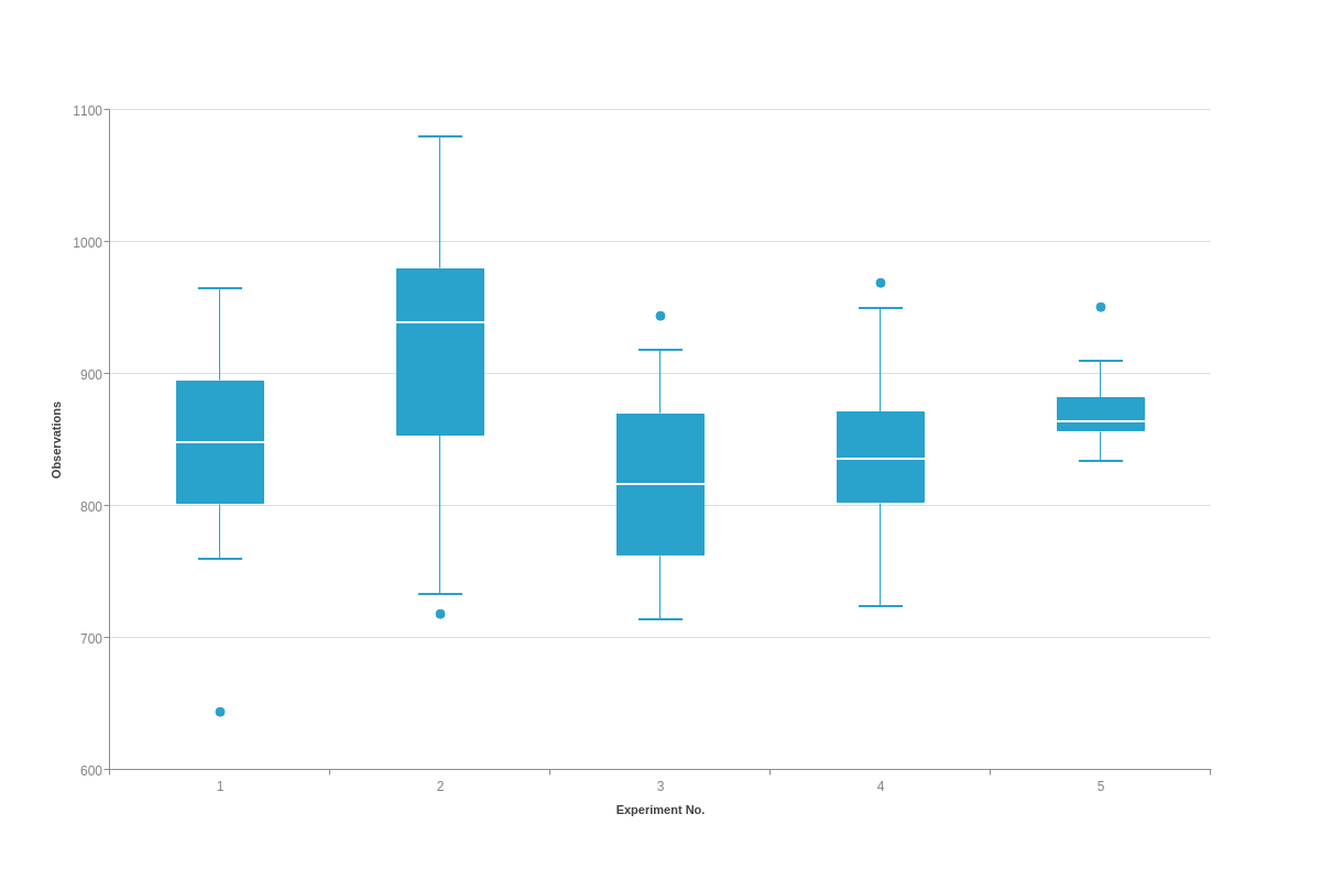
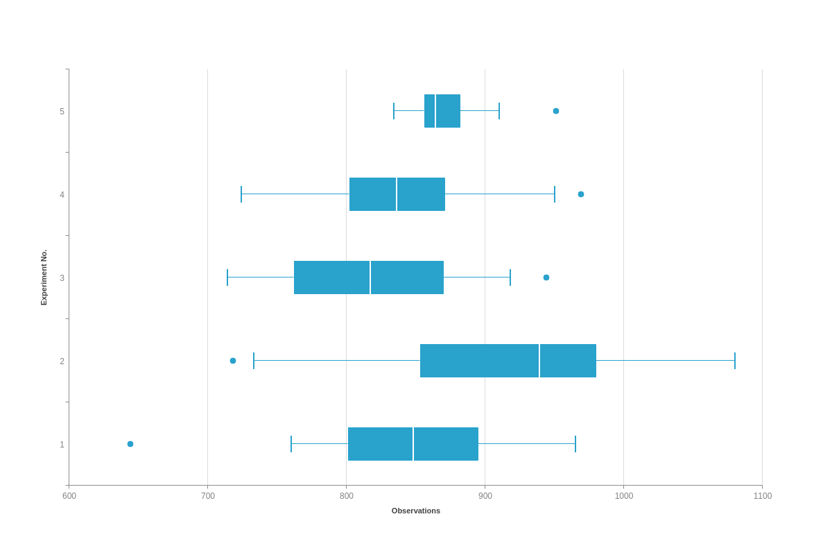
To specify your chart type, use the type attribute. Box plot charts support two type values: boxplot for vertical box plots and hboxplot for horizontal box plots.
Vertical Box Plot
{
    type: 'boxplot',
}
Horizontal Box Plot
{
    type: 'hboxplot',
}
Data
Box plot charts support data in the form of a series array of objects.
Box Plot Values
Create a series object array. The object within should have two additional arrays, a data-box array and a data-outlier array.
The data-box array holds arrays, each of length 5, to indicate the calculated minimum, first quartile, median, third quartile, and maximum values of a dataset.
The data-outlier array also holds arrays, with each having a length 2, to indicate the experiment number and outlier values for an individual outlying point.
{
  type: 'boxplot',
  series: [ // Array of objects
    {
      dataBox : [ // Array of length 5 number arrays
        [ (Min), (Q1), (Median), (Q3), (Max) ]
      ],
      dataOutlier : [ // Array of length 2 number arrays
        [ (Experiment No.), (Outlier Value) ]
      ]
    }
  ]
}
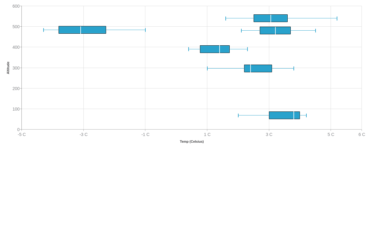
Alternatively, you can pass extended box plot data in [key, min, lowerq, med, upperq, max] format.
{
  type: 'boxplot',
  series: [ // Array of objects
    {
      dataBox:[ // Array of length 6 number arrays
        [69,2,3,3.8,4,4.2],
        [297,1,2.2,2.4,3.1,3.8],
        [391,0.4,0.766666651,1.4,1.73333335,2.3],
        [481,2.1,2.7,3.2,3.7,4.5],
        [484,-4.3,-3.8,-3.1,-2.26666665,-1],
        [540,1.6,2.5,3.05,3.6,5.2]
      ]
    }
  ]
}
Calculating Box Plot Values
Consider the following dataset of 18 values:
let data = [24, 30, 35, 38, 45, 45, 46, 48, 49, 51, 52, 53, 56, 57, 59, 60, 62, 70]
Since there is an even number of values in this dataset, the median is the mean (average) of the two values in the middle.
let mean = (49 + 51) / 2
Mean= 50
If there is an odd number of values, the median is simply the value in the middle of the dataset.
There are a few different methods for calculating Q1 and Q3, but for this example, we will make Q1 be the median value of the first half of the dataset (excluding the median of the entire set). Q3 will be the median value of the second half of the dataset (again excluding the median value of the entire set).
The first half of the dataset, up to the median:
let firstHalf = [24, 30, 35, 38, 45, 45, 46, 48, 49]
Q1 = 45
The second half of the dataset, from the median:
let secondHalf = [51, 52, 53, 56, 57, 59, 60, 62, 70]
Q3 = 57
The Interquartile Range (IQR) is equal to the difference between the upper and lower quartiles, so IQR = Q3 - Q1.
let IQR = 57 - 45
IQR= 12
The lower and upper fences are used to determine which values are considered outliers. The lower and upper fences can be calculated with the following formulas:
- Lower fence = Q1 - 1.5(IQR)
- Upper fence = Q3 + 1.5(IQR)
Now, using our data:
let lowerFence = 45 - 1.5(12)
Lower Fence= 27
let upperFence = 57 + 1.5(12)
Upper Fence= 75
The minimum and maximum values of our dataset will be used to plot the whiskers of our box plot. Since the lower fence was calculated to be 27, we want to find the smallest value in our dataset that is still greater than the lower fence.
Looking at the dataset again:
let data= [24, 30, 35, 38, 45, 45, 46, 48, 49, 51, 52, 53, 56, 57, 59, 60, 62, 70]
We can see that the minimum value greater than 27 is 30, with 24 being an outlier value.
The upper fence was calculated to be 75, so find the maximum value that is not greater than the upper fence. There are no values greater than 75, so 70 is our maximum with no outliers on this end of the spectrum.
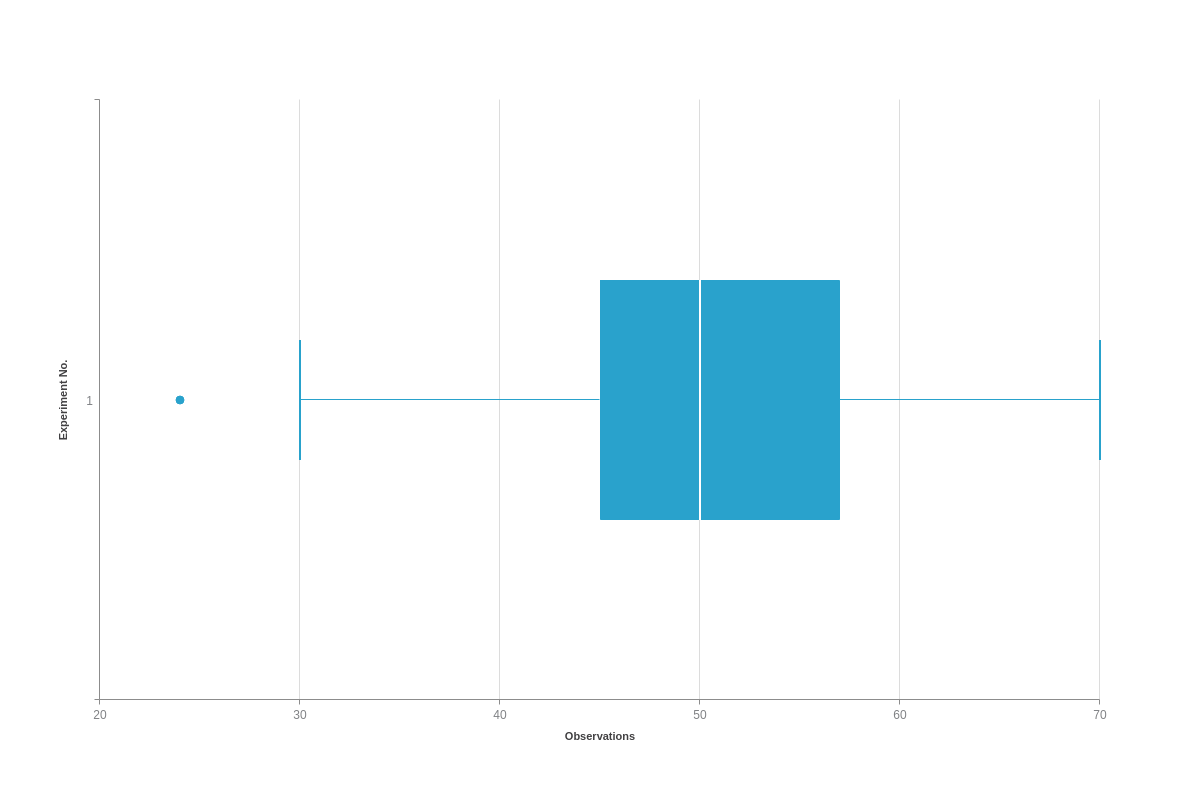
To sum up our findings, this is the collected data that we will use in our box plot:
- Min: 30
- Q1: 45
- Q2 (M): 50
- Q3: 57
- Max: 70
- Outlier(s): 24
We can insert our data from the above example into a series array:
series: [
    {
        dataBox : [ [ 30, 45, 50, 57, 70 ] ],
        dataOutlier : [ [ 1, 24 ] ]
    }
]
Further Customization
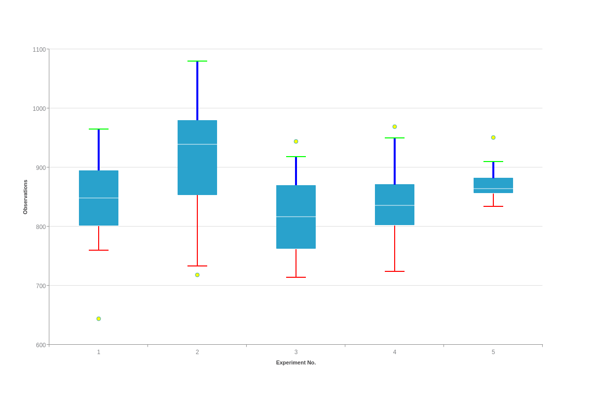
Once you have your basic chart, you can customize and style lines, outliers, and the main box to fit your data visualization needs.
Styling
Styling for box plot charts is done through the options object. The following can be used as an object in the options object to style the individual parts of a box plot:
| Attribute | Type | Values | Details |
|---|---|---|---|
| box | Object | Mixed | Accepts styling attribute to style the box section of the box plot |
| outlier | Object | Mixed | Accepts styling attributes to style the outlier markers |
| line-median-level | Object | Mixed | Accepts styling attributes to style the Q2(M) line object |
| line-min-level | Object | Mixed | Accepts styling attributes to style the line at the minimum value |
| line-min-connector | Object | Mixed | Accepts styling attributes to style the whisker that connects the box plot and the minimum value line object |
| line-max-level | Object | Mixed | Accepts styling attributes to style the line at the maximum value |
| line-max-connector | Object | Mixed | Accepts styling attributes to style the whisker that connects the box plot and the maximum value line object |
options: {
    box: {
        barWidth: 0.5,
        tooltip: {
        }
    },
    outlier: {
        tooltip: {
        },
        marker: {
            type: 'circle',
            backgroundColor: '#ff0'
        }
    },
    lineMinLevel: {
        lineColor: '#f00',
        lineWidth: 2
    },
    lineMaxLevel: {
        lineColor: "#0f0",
        lineWidth: 2
    },
    lineMinConnector: {
        lineWidth: 2,
        lineColor : '#f00'
    },
    lineMaxConnector: {
        lineColor: '#00f',
        lineWidth: 4
    },
    lineMedianLevel: {
        alpha: 0.5
    }
},
