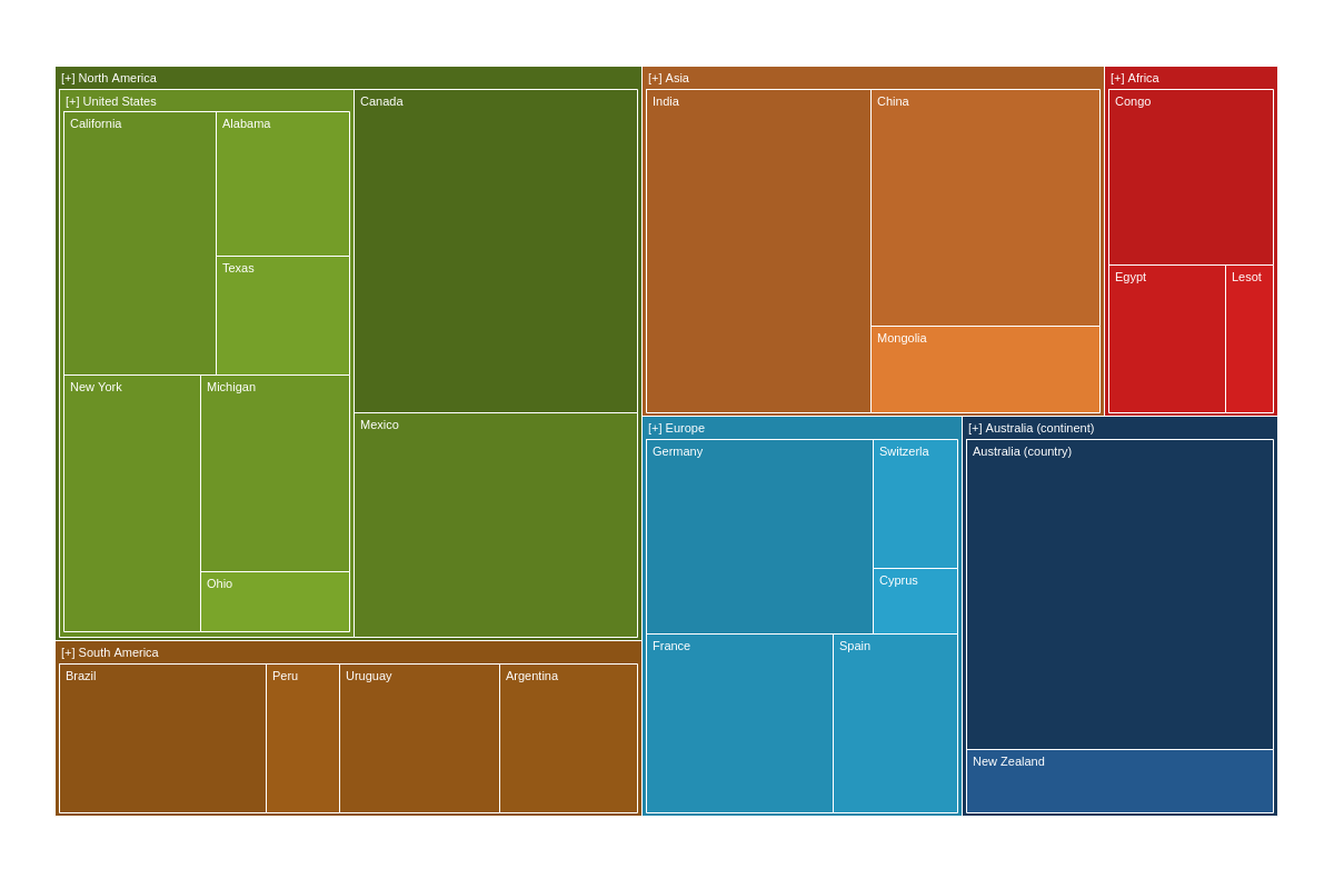
Treemaps
Note: See our Treemap Gallery for inspiration on all the different treemap chart possibilities.
Treemap Chart Type
To specify the chart type, add a type attribute to the chart object. Our standard treemap chart is specified by the treemap value.
{
  type: 'treemap',
}
Data Format
Treemap charts support data in the form of a series array of objects. Unlike other JS charts, JavaScript treemaps use the children array to define the hierarchy and the value attribute to define the associated data.
{
series: [ // Array of objects
  {
    text:(Parent1), // String
    children: [ // Array of objects
      {
        text:(Parent1 -> Child1), // String
        value:val1 // Number
      },
      {
        text:(Parent1 -> Child2), // String
        children: [ // Array of objects
          {
            text:(Parent1 -> Child2 -> Child1), // String
            value:val1 //Number
          }
        ]
      }
    ]
  }
]
}

Chart-Specific Properties
Treemaps include a number of unique chart-specific properties that allow you to manipulate its appearance and behaviors. They can be implemented into your chart by placing them within the options object.
Alpha Aspect
The alphaAspect attribute sets whether alpha will also be applied on the nodes based on the valueAspect values. Enter a value of true or false.
{
  options: {
    alphaAspect: true
  }
}
Min Alpha
The minAlpha attribute sets the minimum value of the alpha applied to the nodes if alphaAspect is set to true.
{
  options: {
    alphaAspect: true,
    minAlpha: 0.2,
  }
}
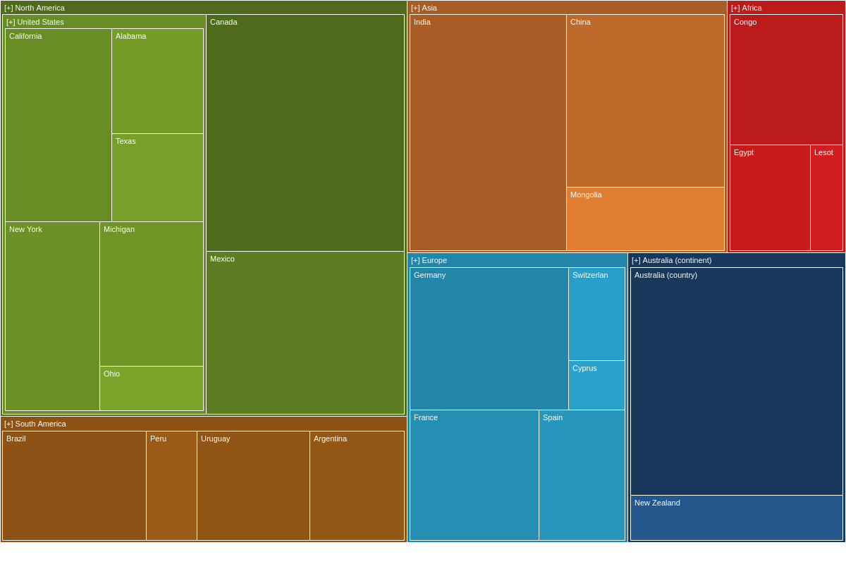
Aspect Type
Use the aspectType attribute to style the chart's rectangles.
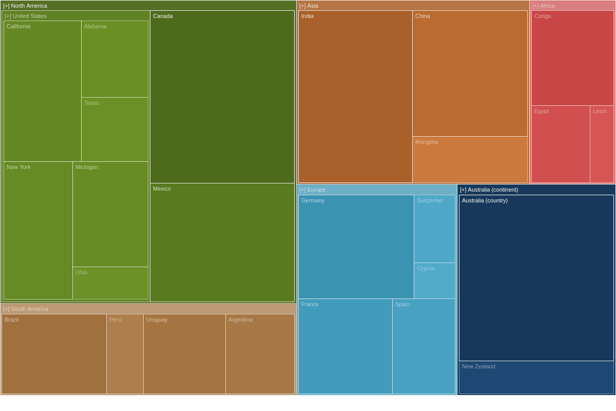
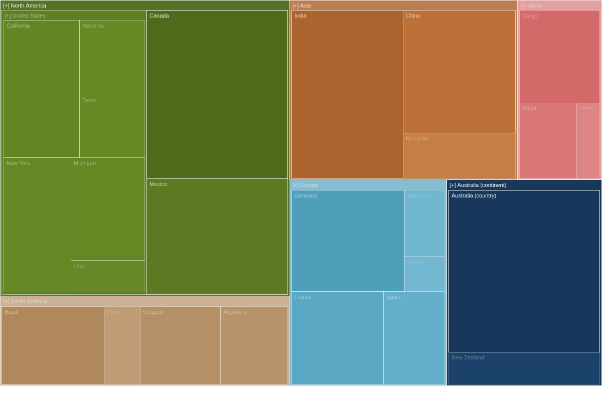
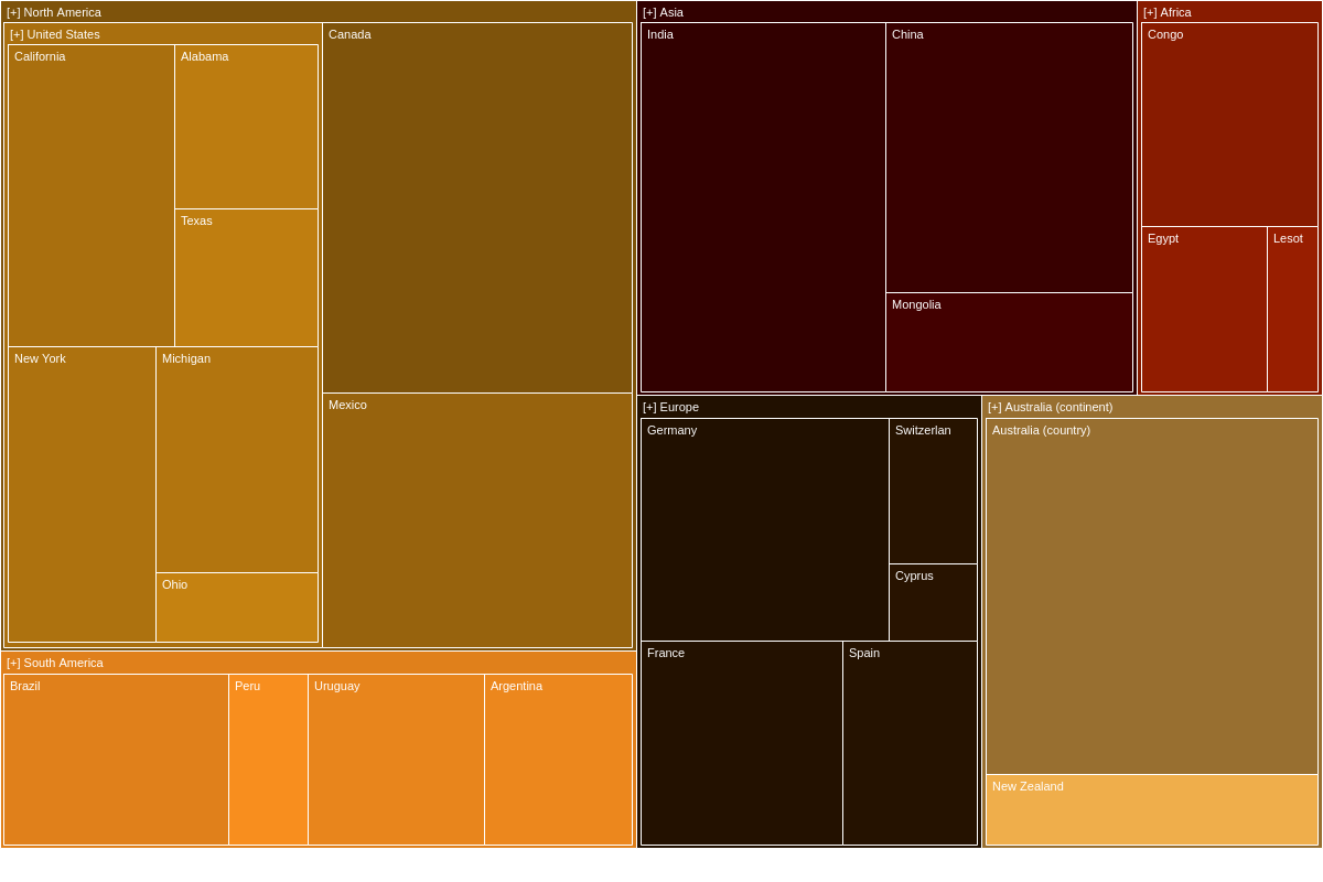
Random
Setting aspectType: 'random' lets the library choose a random color pallette to display each time the chart renders. This is the default for treemap charts so setting this value is optional.
{
  options: {
    aspectType: 'random',
  }
}
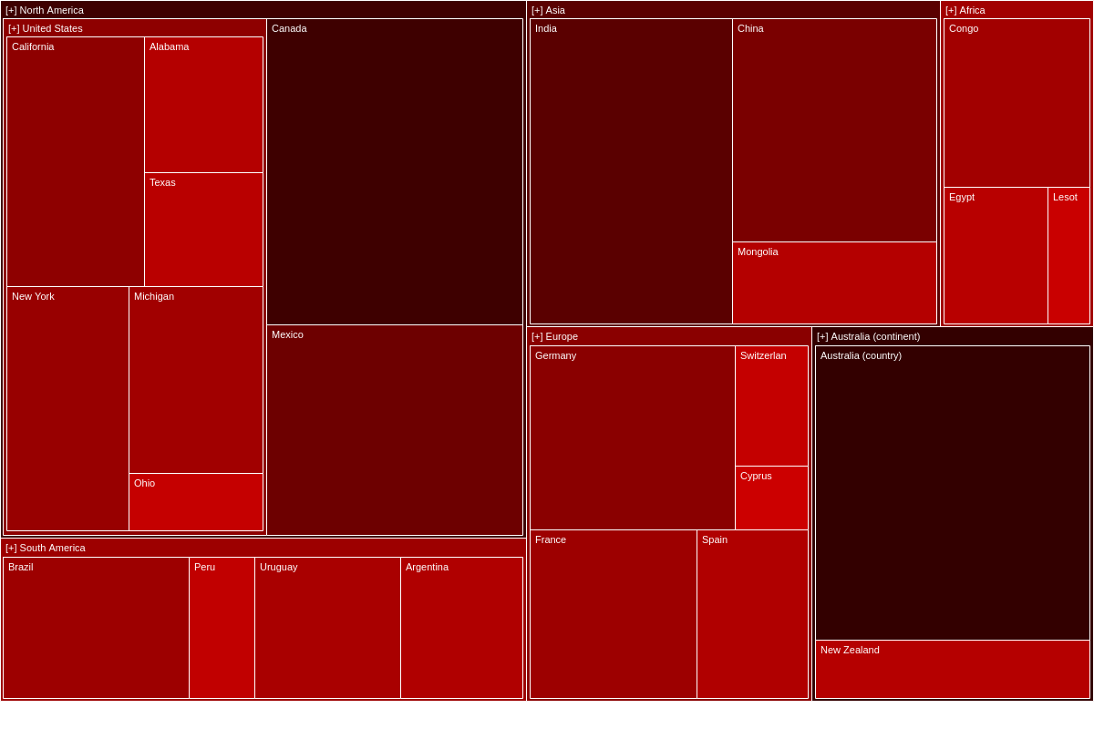
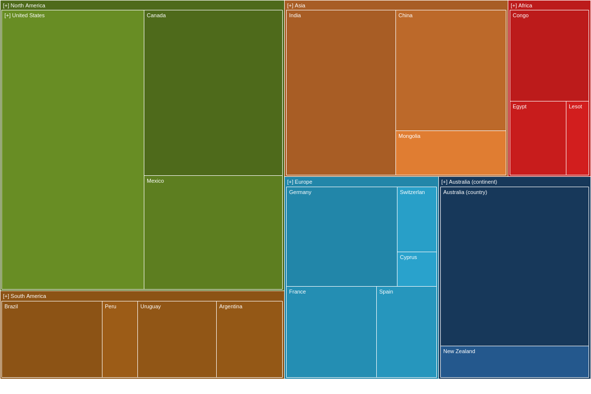
Color Start/End
The colorStart attribute sets the starting color of the color transition used when aspectType is set to transition. The colorEnd attribute sets the ending color of the color transition used when aspectType is set to transition.
{
  options: {
    aspectType: 'transition',
    colorStart: '%c00',
    colorEnd: '#300',
  }
}
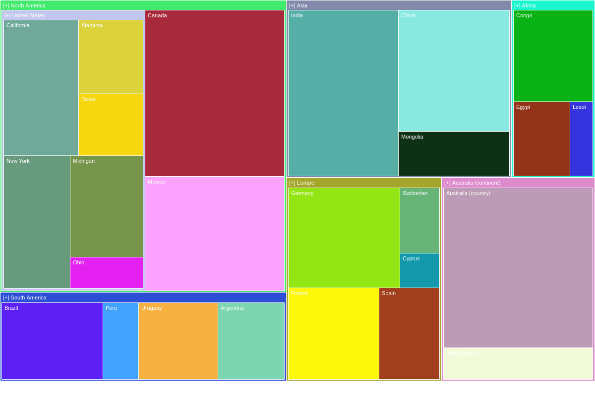
Palette
The palette attribute defines a custom palette used if aspectType is set to palette. It can hold an array of strings representing colors or an array of objects having various styling attributes, such as complex background colors, background images, or gradient definitions.
{
  options: {
    aspectType: 'palette',
    palette: [ '#c98411', '#281300', '#991e00', '#470000', '#ff921f', '#feb950', '#704700', '#8a773c' ]
  }
}
Box
The box attribute sets the styling for the treemap boxes (nodes).
{
  options: {
    box: {
      borderColor: 'red',
    }
  }
}

Decimals
Use the decimals attribute to set the number of places displayed for each value.
{
  options: {
    decimals: 2
  }
}

Decimals Separator
The decimalsSeparator sets the separator to be used in place of the default decimal point. Any string or character can be used to replace the decimal.
{
  options: {
    decimalsSeparator: '--';
  }
}
Group Box
The groupBox attribute styles the treemap nodes that have at least one child.
{
  options: {
    groupBox: {
      backgroundColor: 'purple',
      fontWeight: 'bold',
      fontColor: 'yellow',
    },
  }
}

Hover State
The hoverState attribute sets the styling for the hover-state of the boxes (nodes).
{
  options: {
    hoverState: {
      alpha: 1,
      backgroundColor: 'black'
    }
  }
}
Max Children
The maxChildren attributes sets the maximum number of children each node can have.
{
  options: {
    maxChildren: [8,2,4]
  }
}
Max Depth
The maxDepth attribute sets the maximum depth. Child nodes with levels higher than this setting will be ignored.
{
  options: {
    maxDepth: 2
  }
}
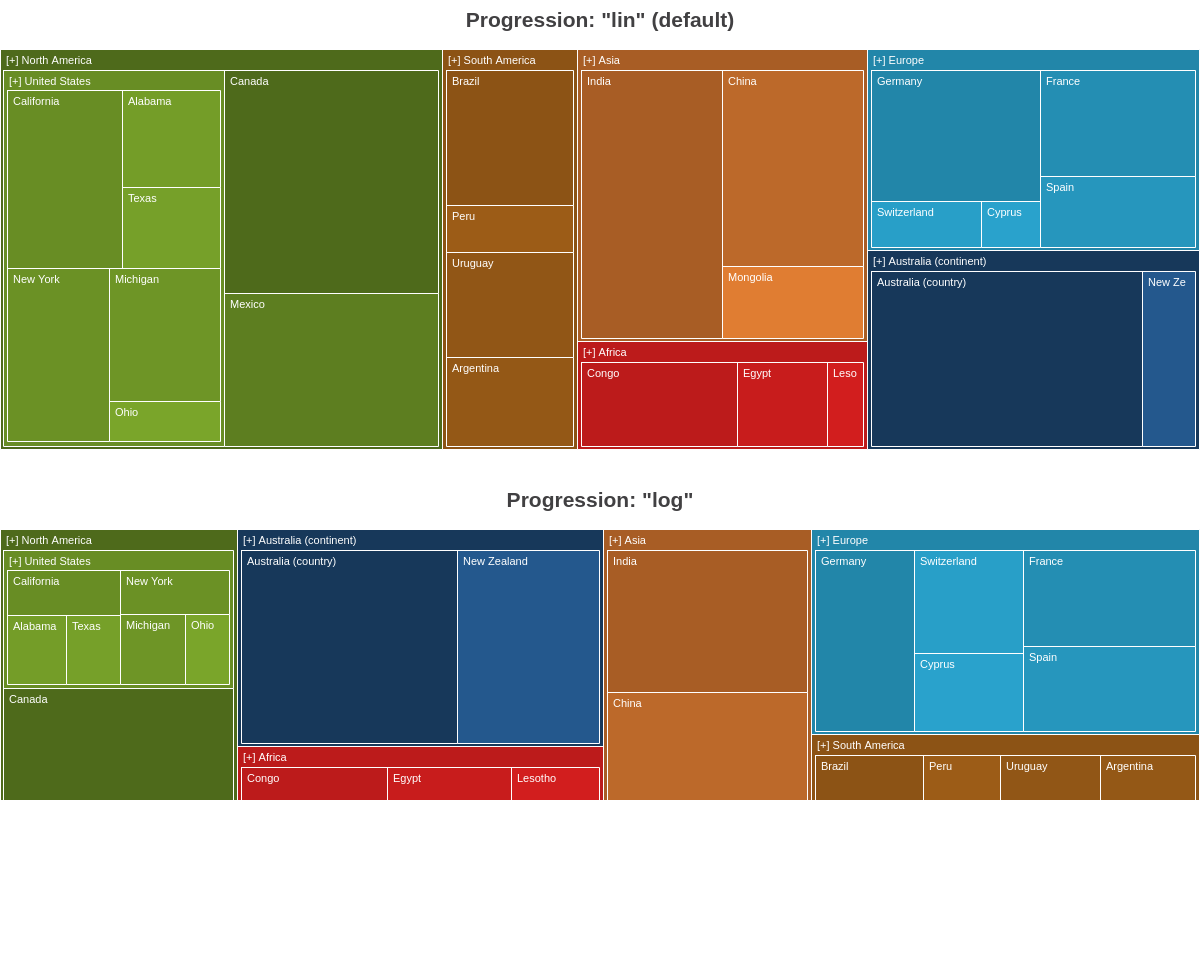
Progression
The progression attribute sets which mathematical progression ('lin' or 'log') to use when calculating sizes of the treemap boxes.
{
  options: {
    progression: 'log', // 'lin' is default
  }
}
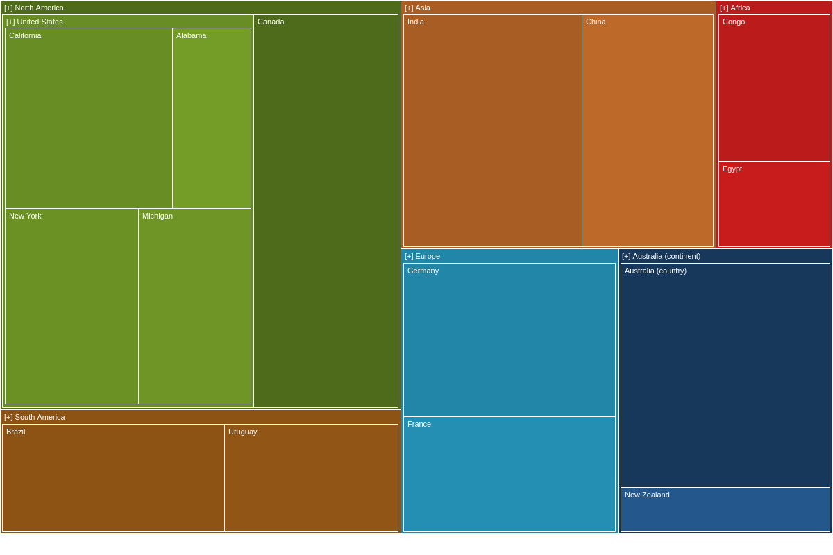
Minimum and Maximum Value
The minValue and maxValue attribute sets minimum and maximum value a box is required to have to be evaluated and displayed in the treemap.
{
  options: {
    minValue: 25,
    maxValue: 100,
  }
}
Paired Children
The pairedChildren attribute adjusts the balancing algorithm used to generate the treemap layout.
This attribute is only relevant when splitType is set to "balancedV2".
{
  options: {
    splitType: 'balancedV2',
    pairedChildren: 4,
  }
}
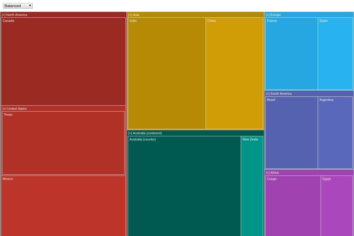
Split Type
The splitType attribute sets the splitting algorithm that draws the treemap. Changing this will adjust how the treemap displays the boxes. Set to balanced by default, you can change the value to: horizontal, vertical, balancedv2, squarify, squarifyv2, random, or alternate.
{
  options: {
    splitType: 'alternate' // balanced (default), balancedv2, horizontal, vertical, squarify, squarifyv2, random, alternate
  },
}
Thousands Separator
The thousandsSeparator attribute sets the given string used to separate thousands.
{
  options: {
    thousandsSeparator: '--'
  },
}
Further Customization
JavaScript Rules
Define a function that returns an object containing styling attributes to be applied to each node.
{
  options: {
    aspectType: 'myfunc()'
  }
}

Tooltip Box
The tooltipBox attribute sets the styling for the tooltip that appears over the final nodes (without children).
{
  options: {
    tooltipBox: {
      backgroundColor: 'red',
      textAlign: 'left',
    }
  }
}

Tooltip Group
The tooltipGroup attribute sets the styling for the tooltip that appears over the nodes that have at least one child.
{
  options: {
    tooltipGroup: {
      backgroundColor: 'red',
      textAlign: 'left'
    }
  }
}
