Chart Plot and Series Styling
Overview
While ZingChart provides default styling themes for all of our chart types, most users want to modify the appearance to better meet the needs of their individual projects. It is in the plot and series objects that you apply attributes to change the styling of data points on your chart. These changes can be applied to affect a single series or the entire series array. We also offer the functionality to style by node or individual data points. Finally, this tutorial explains the different state types, or how data can appear under different conditions (e.g., when data points are hovered over, selected, and so on).
Plot vs. Series
When styling your charts, you can make global changes (to affect all of your series data) or local changes (to affect individual series). These changes are made in the plot object or individual series objects, respectively.
plot: {
  //For global styling, place styling attributes here.
},
series: [
  {
    values: [y0, y1, y2, y3, ..., yN],
      //For local styling, place styling attributes here.
  },
  ...
]
These objects act as containers for your styling attributes, as well as all plot/series-related modifications. These include aspects (spline, histogram, stepped) and chart-specific attributes (bar-width for bar charts, active-area for area charts, offset-r for pie charts). Browse our Plot/Series JSON Attributes/Syntax page for a full list of object and attribute options.
Here is a line chart with three datasets. This is how the chart appears when it is completely unstyled.
{
  type: 'line',
  series: [{
    values: [3, 4, 11, 5, 19, 7]
  }, {
    values: [9, 19, 15, 25, 12, 14]
  }, {
    values: [15, 29, 19, 21, 25, 26]
  }]
}
plot object
Adding styling attributes to the plot object means that all the series in the series array will be affected. In the following chart, a line-color attribute, line-style attribute, and marker object were added to the plot object. All three datasets appear as purple lines in a dash-dot style, and the markers (representing the data points) are colored orange and surrounded with a green border.
Note: What styling attributes to apply varies based on chart type. The below Styling Attributes section provides an overview of the different attribute types.
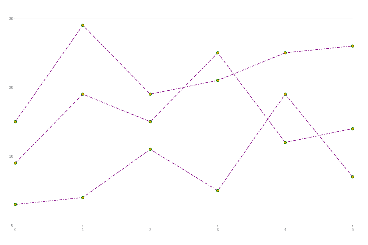
{
  type: 'line',
  plot: {
    lineColor: 'purple',
    lineStyle: 'dashdot',
    marker: {
      backgroundColor: 'orange',
      borderColor: 'green',
      borderWidth: '2px'
    }
  },
  series: [{
    values: [3, 4, 11, 5, 19, 7]
  }, {
    values: [9, 19, 15, 25, 12, 14]
  }, {
    values: [15, 29, 19, 21, 25, 26]
  }]
}
series objects
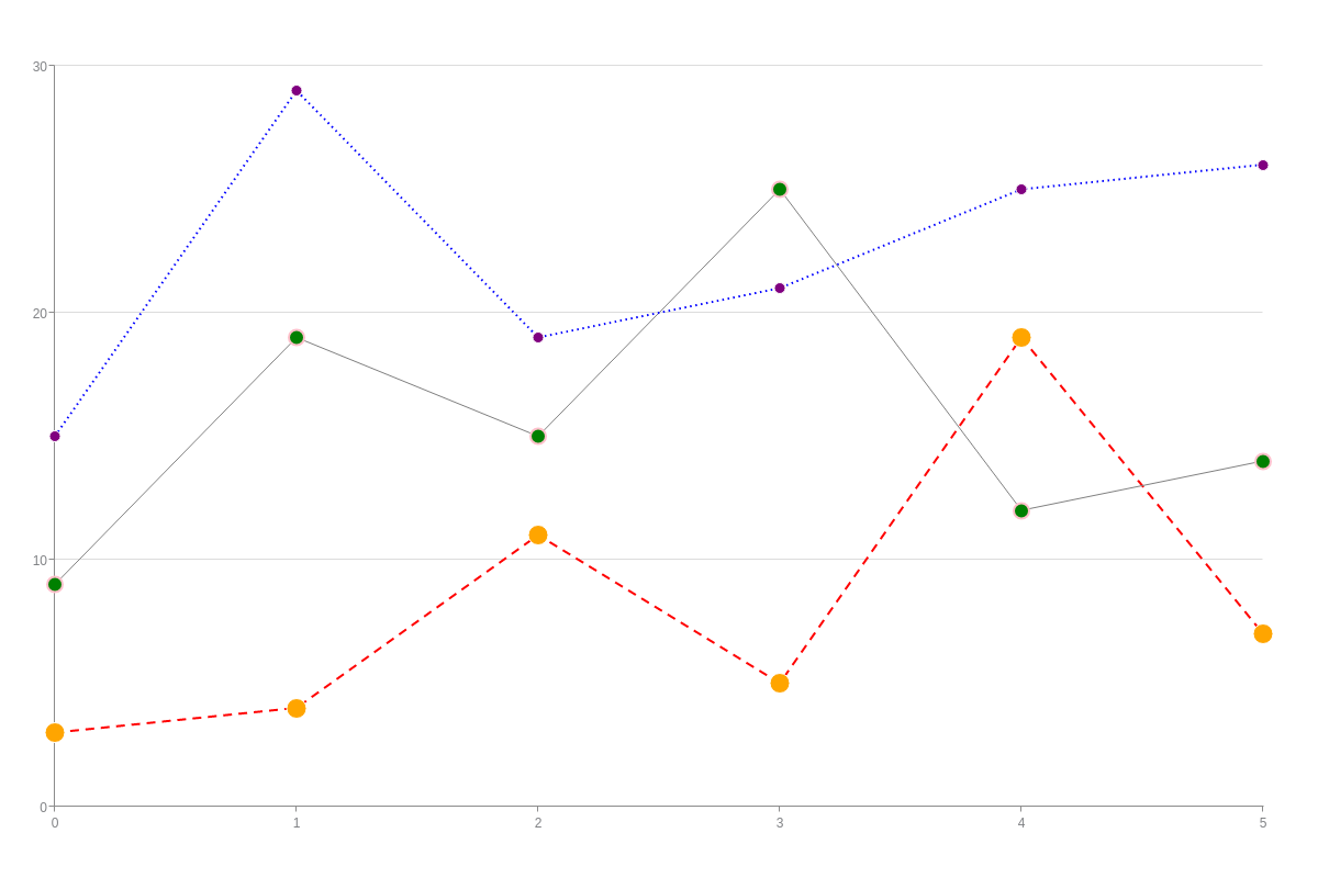
When you want to make changes to a specific series, you'll add the styling attributes to that particular series object. In the following chart, each series contains its own set of unique attributes: series 1 is drawn with a red dashed line and large orange markers; series 2 is a thin gray line with pink-bordered green markers; and series 3 is a dotted blue line with purple markers.
Note: You can place styling attributes in both the plot and/or individual series objects to achieve the appearance that you want. Attributes placed in the latter will override those in the former.
{
  type: 'line',
  series: [{ //Series object 1
    values: [3, 4, 11, 5, 19, 7],
    lineColor: 'red',
    lineStyle: 'dashed',
    marker: {
      backgroundColor: 'orange',
      size: 9
    }
  }, { //Series object 2
    values: [9, 19, 15, 25, 12, 14],
    lineColor: 'gray',
    lineWidth: '1px',
    lineStyle: 'solid',
    marker: {
      backgroundColor: 'green',
      size: 7,
      borderColor: 'pink',
      borderWidth: '2px'
    }
  }, { //Series object 3
    values: [15, 29, 19, 21, 25, 26],
    lineColor: 'blue',
    lineStyle: 'dotted',
    marker: {
      backgroundColor: 'purple',
      size: 5
    }
  }]
}
Series vs. Node
As explained in the above Plot vs. Series section, users generally style by series. They can style all series at once (by placing attributes in the plot object) or individual series (by placing attributes in the applicable series object). However, you also have the option to style by node, or individual data point.
Series
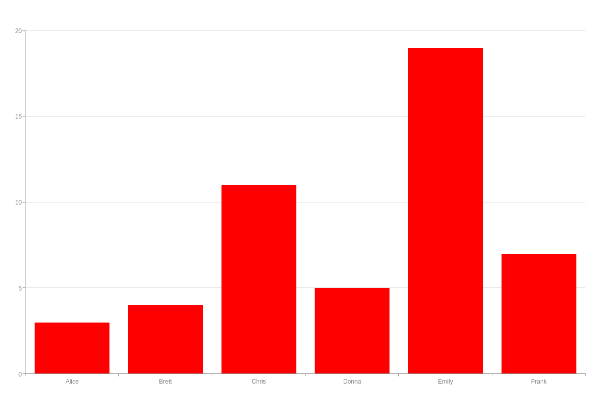
Here is a bar chart. Because it contains a single series (or dataset), any styling attributes added to the plot or series object would apply across all the bars.
{
  type: 'bar',
  plot: {
    backgroundColor: 'red'
  },
  scaleX: {
    labels: [ 'Alice', 'Brett', 'Chris', 'Donna', 'Emily', 'Frank' ]
  },
  scaleY: {
    values: '0:20:5'
  },
  series: [{
    values: [3, 4, 11, 5, 19, 7]
  }]
}
Node
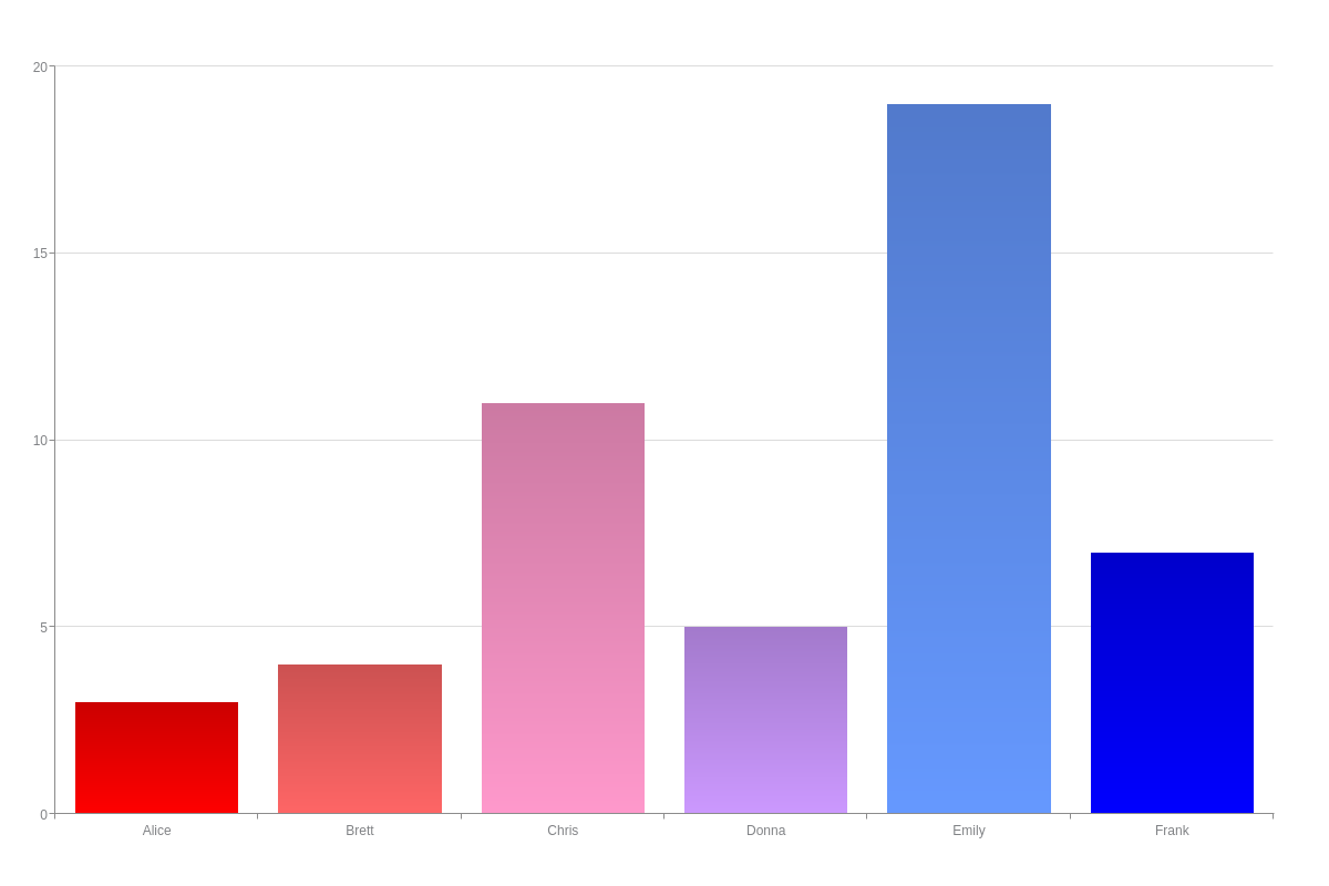
But with this kind of dataset, you may want to style the bars by node index (or individual data point). To do this, create a styles array. In the array, provide your color values by name, hexadecimal, or RGB notation. You can also create an array of objects for more complex styling. See the below Styles Array section for more information. Make sure the number of values corresponds to the number of data points in your chart. (Unspecified data points will otherwise default back to ZingChart's color scheme.)
{
  type: 'bar',
  plot: {
    styles: [ 'red', '#ff6666', '#ff99cc', '#cc99ff', '#6699ff', 'blue' ]
  },
  scaleX: {
    labels: [ 'Alice', 'Brett', 'Chris', 'Donna', 'Emily', 'Frank' ]
  },
  scaleY: {
    values: '0:20:5'
  },
  series: [
    { values: [3,4,11,5,19,7]}
  ]
}
Styling Attributes
What styling attributes to apply varies depending on the chart type. However, there are four basic styling attribute groups: backgrounds, borders, lines, and markers. Bar and pie charts, for example, are made up of backgrounds and borders; line charts are made up of lines and markers; scatter charts are made up of markers; and so on.
Background
Backgrounds are specified with the background-color attribute. Provide a hexadecimal or RGB color value. You can also use the alpha attribute to adjust the background transparency levels. Provide a value between 0-1, and make sure the decimal point is preceded by a zero.
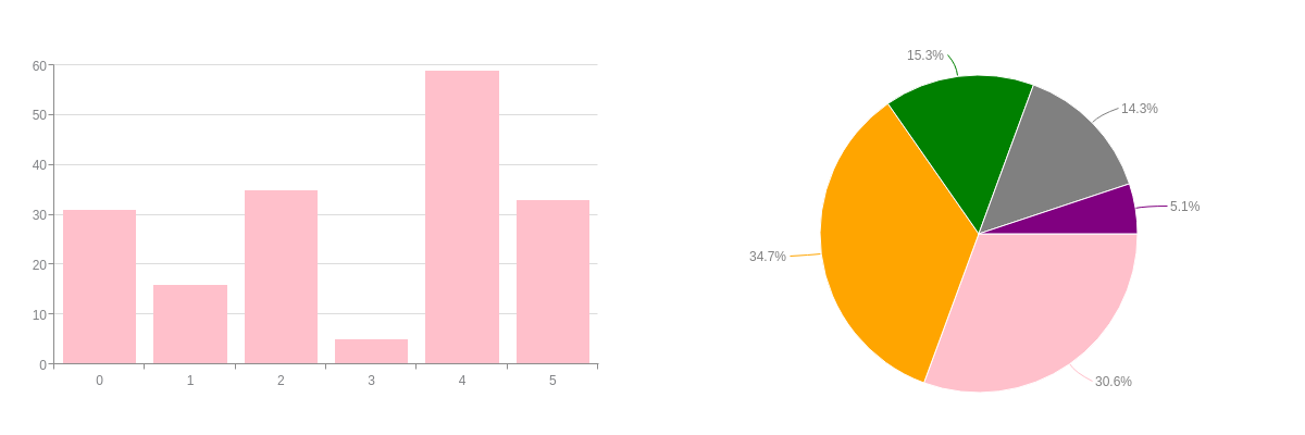
{
  layout: '1x2',
  graphset: [
    {
      type: 'bar',
      plot: {
        backgroundColor: 'pink'
      },
      series: [
        { values: [31,16,35,5,59,33]}
      ]
    },
    {
      type: 'pie',
      plot: {
        backgroundColor: 'pink',
        valueBox: {
          placement: 'out',
          fontColor: 'gray',
          fontSize: 12,
          fontWeight: 'normal'
        }
      },
      series: [
        {
          values: [30],
          backgroundColor: 'pink'
        },
        {
          values: [34],
          backgroundColor: 'orange'
        },
        {
          values: [15],
          backgroundColor: 'green'
        },
        {
          values: [14],
          backgroundColor: 'gray'
        },
        {
          values: [5],
          backgroundColor: 'purple'
        }
      ]
    }
  ]
}
You can add some variation by incorporating gradients into the background. In the background-color attribute, provide two color values to create a horizontal gradient. Refer to the Plot/Series JSON Attributes/Syntax page for additional gradient customization attributes.
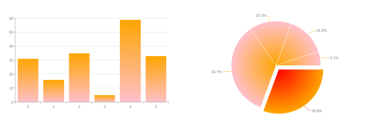
{
  layout: '1x2',
  graphset: [
    {
      type: 'bar',
      plot: {
        backgroundColor: 'orange pink'
      },
      series: [
        { values: [31,16,35,5,59,33]}
      ]
    },
    {
      type: 'pie',
      plot: {
        backgroundColor: 'orange pink',
        valueBox: {
          placement: 'out',
          fontColor: 'gray',
          fontSize: 12,
          fontWeight: 'normal'
        }
      },
      series: [
        {
          values: [30],
          offsetR: '15%',
          backgroundColor: 'red orange'
        },
        { values: [34]},
        { values: [15]},
        { values: [14]},
        { values: [5]}
      ]
    }
  ]
}
Patterns are another way to fill in your background. This is an especially useful option when you want to create black and white charts, or charts without color.
Note: Patterns require the pattern module. Refer to the Patterns Tutorial for more information, as well as a list of the available patterns.
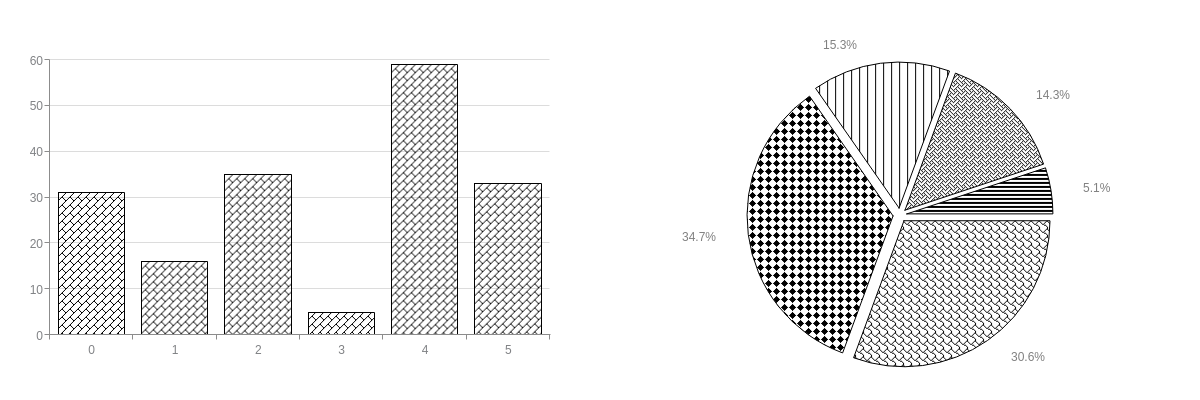
{
  layout: '1x2',
  graphset: [
    {
      type: 'bar',
      plot: {
        backgroundColor: 'none',
        borderWidth: '1px',
        borderColor: 'black',
        backgroundImage: 'PATTERN_DIAGONAL_BRICK'
      },
      series: [
        { values: [31,16,35,5,59,33]}
      ]
    },
    {
      type: 'pie',
      plot: {
        offsetR: '7%',
        backgroundColor: 'none',
        borderWidth: '1px',
        borderColor: 'black',
        valueBox: {
          placement: 'out',
          fontColor: 'gray',
          fontSize: 12,
          fontWeight: 'normal'
        }
      },
      series: [
        {
          values: [30],
          backgroundImage: 'PATTERN_SHINGLE'
        },
        {
          values: [34],
          backgroundImage: 'PATTERN_SOLID_DIAMOND'
        },
        {
          values: [15],
          backgroundImage: 'PATTERN_VERTICAL'
        },
        {
          values: [14],
          backgroundImage: 'PATTERN_WEAVE'
        },
        {
          values: [5],
          backgroundImage: 'PATTERN_DARK_HORIZONTAL'
        }
      ]
    }
  ]
}
Border
Backgrounds can generally be enclosed by borders. Borders apply to closed shapes such as bar and pie charts. Border attributes include border-color, border-width, border-radius, and line-style. (This last attribute can be used with both borders and lines.) There can be some confusion between borders and lines, so refer to the applicable chart types page for information on which styling attributes (borders, lines, both) apply.
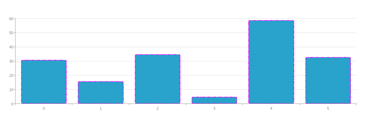
{
  type: 'bar',
  plot: {
    borderColor: '#ff00ff',
    borderWidth: '2px',
    borderRadius: '5px',
    lineStyle: 'dashdot'
  },
  series: [
    { values: [31,16,35,5,59,33]}
  ]
}
Line
Lines apply to non-closed shapes, specifically charts with lines (line, area, range, OHLC). Line attributes include line-color, line-width, and line-style. (This last attribute can be used with both lines and borders.) In the below line chart, note that the markers remain unstyled. They are their own separate group, discussed in the following section.
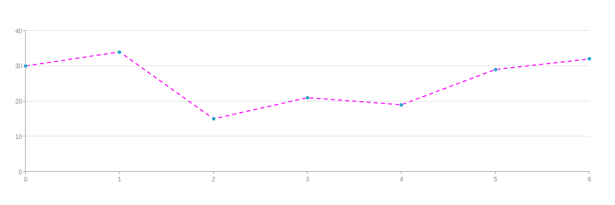
{
  type: 'line',
  plot: {
    lineColor: '#ff00ff',
    lineWidth: '2px',
    lineStyle: 'dashed'
  },
  series: [
    { values: [30,34,15,21,19,29,32]}
  ]
}
Marker
Markers are a component of many chart types (line, area, range, scatter, bubble). They must be styled separately in a marker object. They can also be turned off (in the marker object, add a visible: false attribute). Refer to the Marker JSON Attributes/Syntax page for a full list of styling options.
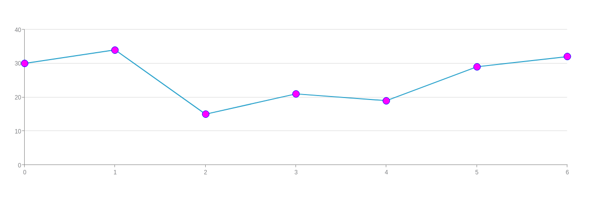
{
  type: 'line',
  plot: {
    marker: {
      backgroundColor: '#ff00ff',
      size: 7,
      borderColor: '#0000ff',
      borderWidth: '1px'
    }
  },
  series: [
    { values: [30,34,15,21,19,29,32]}
  ]
}
ZingChart markers appear as circles by default. However, you can customize the type so they display as squares, diamonds, stars, and so on. Click through the marker type options in the following chart. Based on ZingChart Shapes, refer to that document for information on shape-specific styling.

Styles Array
The styles array allows you to style the chart by node index. Depending on the chart type, you can use a simple array or an array of objects to specify the styling.
Array
A simple styles array suffices for chart types that have a single styling attribute, such as bar charts.
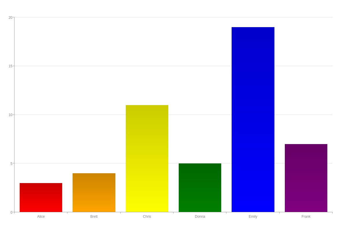
{
  type: 'bar',
  plot: {
    styles: [ 'red', 'orange', 'yellow', 'green', 'blue', 'purple' ]
  },
  scaleX: {
    labels: [ 'Alice', 'Brett', 'Chris', 'Donna', 'Emily', 'Frank' ]
  },
  scaleY: {
    values: '0:20:5'
  },
  series: [{
    values: [3, 4, 11, 5, 19, 7]
  }]
}
The series array is not limited to single series charts. It can be applied across charts with multiple datasets, like in the below bar chart. Notice how the bars are colored according to node index.
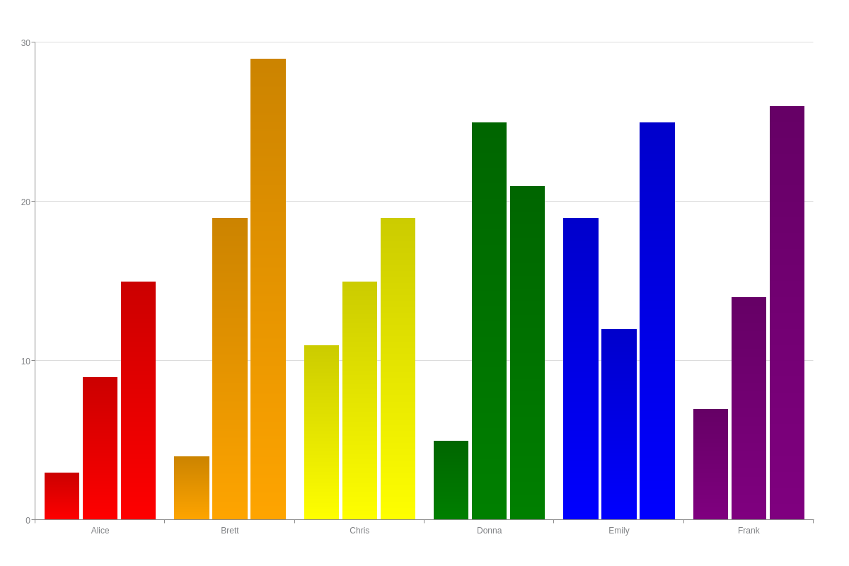
{
  type: 'bar',
  plot: {
    styles: [ 'red', 'orange', 'yellow', 'green', 'blue', 'purple' ]
  },
  scaleX: {
    labels: [ 'Alice', 'Brett', 'Chris', 'Donna', 'Emily', 'Frank' ]
  },
  scaleY: {
    values: '0:30:10'
  },
  series: [{
    values: [3, 4, 11, 5, 19, 7]
  }, {
    values: [9, 19, 15, 25, 12, 14]
  }, {
    values: [15, 29, 19, 21, 25, 26]
  }]
}
Furthermore, by moving styles arrays into individual series objects, you can specify color values for every single node. Note that you can place the arrays in the plot and/or series objects to achieve the appearance that you want.
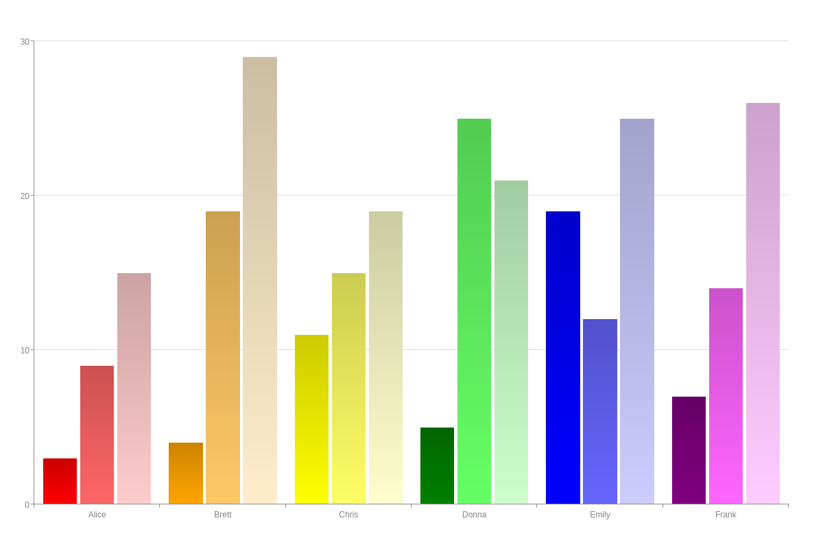
{
  type: 'bar',
  scaleX: {
    labels: [ 'Alice', 'Brett', 'Chris', 'Donna', 'Emily', 'Frank' ]
  },
  scaleY: {
    values: '0:30:10'
  },
  series: [{
    values: [3, 4, 11, 5, 19, 7],
    styles: [ 'red', 'orange', 'yellow', 'green', 'blue', 'purple' ]
  }, {
    values: [9, 19, 15, 25, 12, 14],
    styles: [ '#ff6666', '#ffc966', '#ffff66', '#66ff66', '#6666ff', '#ff66ff' ]
  }, {
    values: [15, 29, 19, 21, 25, 26],
    styles: [ '#ffcccc', '#ffedcc', '#ffffcc', '#ccffcc', '#ccccff', '#ffccff' ]
  }]
}
Array of Objects
The styles array of objects allow you to specify multiple styling attributes per node. In the array, create an object for each node index. In each object, place the styling attributes you want applied. Create additional styles array of objects for the marker object (see the below area chart), goal object (for bullet charts), and more.
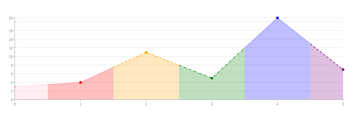
{
  type: 'area',
  plot: {
    styles: [
      { //Node Index 0
        lineColor: 'pink',
        lineStyle: 'dashdot',
        backgroundColor: 'pink'
      },
      { //Node Index 1
        lineColor: 'red',
        lineStyle: 'dotted',
        backgroundColor: 'red'
      },
      { //Node Index 2
        lineColor: 'orange',
        lineStyle: 'dashed',
        backgroundColor: 'orange'
      },
      { //Node Index 3
        lineColor: 'green',
        lineStyle: 'dashdot',
        backgroundColor: 'green'
      },
      { //Node Index 4
        lineColor: 'blue',
        lineStyle: 'dotted',
        backgroundColor: 'blue'
      },
      { //Node Index 5
        lineColor: 'purple',
        lineStyle: 'dashed',
        backgroundColor: 'purple'
      }
    ],
    marker: {
      styles: [
        { //Node Index 0
          backgroundColor: 'pink',
          borderColor: 'pink'
        },
        { //Node Index 1
          backgroundColor: 'red',
          borderColor: 'red'
        },
        { //Node Index 2
          backgroundColor: 'orange',
          borderColor: 'orange'
        },
        { //Node Index 3
          backgroundColor: 'green',
          borderColor: 'green'
        },
        { //Node Index 4
          backgroundColor: 'blue',
          borderColor: 'blue'
        },
        { //Node Index 5
          backgroundColor: 'purple',
          borderColor: 'purple'
        }
      ]
    }
  },
  series: [
    { values: [3,4,11,5,19,7]}
  ]
}
The styles array of objects can be applied across multi-series charts.
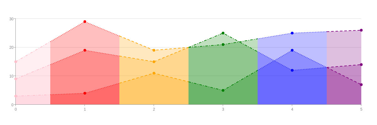
{
  type: 'area',
  plot: {
    styles: [
      { //Node Index 0
        lineColor: 'pink',
        lineStyle: 'dashdot',
        backgroundColor: 'pink'
      },
      { //Node Index 1
        lineColor: 'red',
        lineStyle: 'dotted',
        backgroundColor: 'red'
      },
      { //Node Index 2
        lineColor: 'orange',
        lineStyle: 'dashed',
        backgroundColor: 'orange'
      },
      { //Node Index 3
        lineColor: 'green',
        lineStyle: 'dashdot',
        backgroundColor: 'green'
      },
      { //Node Index 4
        lineColor: 'blue',
        lineStyle: 'dotted',
        backgroundColor: 'blue'
      },
      { //Node Index 5
        lineColor: 'purple',
        lineStyle: 'dashed',
        backgroundColor: 'purple'
      }
    ],
    marker: {
      styles: [
        { //Node Index 0
          backgroundColor: 'pink',
          borderColor: 'pink'
        },
        { //Node Index 1
          backgroundColor: 'red',
          borderColor: 'red'
        },
        { //Node Index 2
          backgroundColor: 'orange',
          borderColor: 'orange'
        },
        { //Node Index 3
          backgroundColor: 'green',
          borderColor: 'green'
        },
        { //Node Index 4
          backgroundColor: 'blue',
          borderColor: 'blue'
        },
        { //Node Index 5
          backgroundColor: 'purple',
          borderColor: 'purple'
        }
      ]
    }
  },
  series: [
    { values: [3,4,11,5,19,7]},
    { values: [9,19,15,25,12,14]},
    { values: [15,29,19,21,25,26]}
  ]
}
And you can style by individual node by moving the styles array of objects into individual series objects. The following chart was made into a stacked area chart to more easily display the node-specific styling.
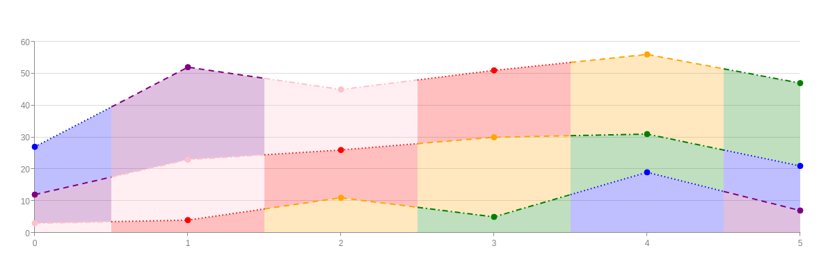
{
  type: 'area',
  plot: {
    stacked: true
  },
  series: [
    {
      values: [3,4,11,5,19,7],
      styles: [
        { //Node Index 0
          lineColor: 'pink',
          lineStyle: 'dashdot',
          backgroundColor: 'pink'
        },
        { //Node Index 1
          lineColor: 'red',
          lineStyle: 'dotted',
          backgroundColor: 'red'
        },
        { //Node Index 2
          lineColor: 'orange',
          lineStyle: 'dashed',
          backgroundColor: 'orange'
        },
        { //Node Index 3
          lineColor: 'green',
          lineStyle: 'dashdot',
          backgroundColor: 'green'
        },
        { //Node Index 4
          lineColor: 'blue',
          lineStyle: 'dotted',
          backgroundColor: 'blue'
        },
        { //Node Index 5
          lineColor: 'purple',
          lineStyle: 'dashed',
          backgroundColor: 'purple'
        }
      ],
      marker: {
        styles: [
          { //Node Index 0
            backgroundColor: 'pink',
            borderColor: 'pink'
          },
          { //Node Index 1
            backgroundColor: 'red',
            borderColor: 'red'
          },
          { //Node Index 2
            backgroundColor: 'orange',
            borderColor: 'orange'
          },
          { //Node Index 3
            backgroundColor: 'green',
            borderColor: 'green'
          },
          { //Node Index 4
            backgroundColor: 'blue',
            borderColor: 'blue'
          },
          { //Node Index 5
            backgroundColor: 'purple',
            borderColor: 'purple'
          }
        ]
      }
    },
    {
      values: [9,19,15,25,12,14],
      styles: [
        { //Node Index 0
          lineColor: 'purple',
          lineStyle: 'dashed',
          backgroundColor: 'purple'
        },
        { //Node Index 1
          lineColor: 'pink',
          lineStyle: 'dashdot',
          backgroundColor: 'pink'
        },
        { //Node Index 2
          lineColor: 'red',
          lineStyle: 'dotted',
          backgroundColor: 'red'
        },
        { //Node Index 3
          lineColor: 'orange',
          lineStyle: 'dashed',
          backgroundColor: 'orange'
        },
        { //Node Index 4
          lineColor: 'green',
          lineStyle: 'dashdot',
          backgroundColor: 'green'
        },
        { //Node Index 5
          lineColor: 'blue',
          lineStyle: 'dotted',
          backgroundColor: 'blue'
        }
      ],
      marker: {
        styles: [
          { //Node Index 0
            backgroundColor: 'purple',
            borderColor: 'purple'
          },
          { //Node Index 1
            backgroundColor: 'pink',
            borderColor: 'pink'
          },
          { //Node Index 2
            backgroundColor: 'red',
            borderColor: 'red'
          },
          { //Node Index 3
            backgroundColor: 'orange',
            borderColor: 'orange'
          },
          { //Node Index 4
            backgroundColor: 'green',
            borderColor: 'green'
          },
          { //Node Index 5
            backgroundColor: 'blue',
            borderColor: 'blue'
          }
        ]
      }
    },
    {
      values: [15,29,19,21,25,26],
      styles: [
        { //Node Index 0
          lineColor: 'blue',
          lineStyle: 'dotted',
          backgroundColor: 'blue'
        },
        { //Node Index 1
          lineColor: 'purple',
          lineStyle: 'dashed',
          backgroundColor: 'purple'
        },
        { //Node Index 2
          lineColor: 'pink',
          lineStyle: 'dashdot',
          backgroundColor: 'pink'
        },
        { //Node Index 3
          lineColor: 'red',
          lineStyle: 'dotted',
          backgroundColor: 'red'
        },
        { //Node Index 4
          lineColor: 'orange',
          lineStyle: 'dashed',
          backgroundColor: 'orange'
        },
        { //Node Index 5
          lineColor: 'green',
          lineStyle: 'dashdot',
          backgroundColor: 'green'
        }
      ],
      marker: {
        styles: [
          { //Node Index 0
            backgroundColor: 'blue',
            borderColor: 'blue'
          },
          { //Node Index 1
            backgroundColor: 'purple',
            borderColor: 'purple'
          },
          { //Node Index 2
            backgroundColor: 'pink',
            borderColor: 'pink'
          },
          { //Node Index 3
            backgroundColor: 'red',
            borderColor: 'red'
          },
          { //Node Index 4
            backgroundColor: 'orange',
            borderColor: 'orange'
          },
          { //Node Index 5
            backgroundColor: 'green',
            borderColor: 'green'
          }
        ]
      }
    }
  ]
}
State Types
There are different "states", or ways your data can appear under different conditions. ZingChart currently has a default state, hover state, selected state, non-selected (or background) state, and legend highlight state.
Note: Our ZingChart library offers over twenty different chart types. What styling attributes you apply depends on what chart type you are creating. That said, the background-color attribute, border-color attribute (for closed shapes), line-color attribute (for non-closed shapes), and marker object (with applicable attributes placed inside) are most commonly used across our chart types.
Default State
The default state is what users see when simply viewing your chart. Styling attributes are placed directly in the plot and/or series object(s). In the below bar chart, the bars are colored in a red-orange gradient. (Providing two color values in a background-color attribute creates a horizontal gradient by default. See our Plot/Series JSON Attributes/Syntax page for more complex gradient options.)
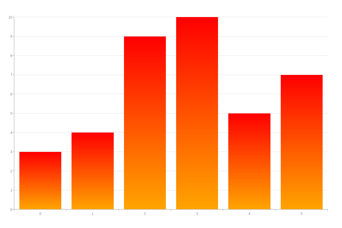
{
  type: 'bar',
  plot: {
    backgroundColor: 'red orange'
  },
  series: [{
    values: [3, 4, 9, 10, 5, 7]
  }]
}
In the below scatter plot, the markers are styled to appear lime green with raspberry borders. Markers require their own objects. The marker object is placed in the plot and/or series object(s) depending on whether you want the styling to apply globally or locally. The styling attributes you want applied (background-color, border-width, border-color) are then placed inside. Refer to the Marker JSON Attributes/Syntax page for a full list of attribute options.
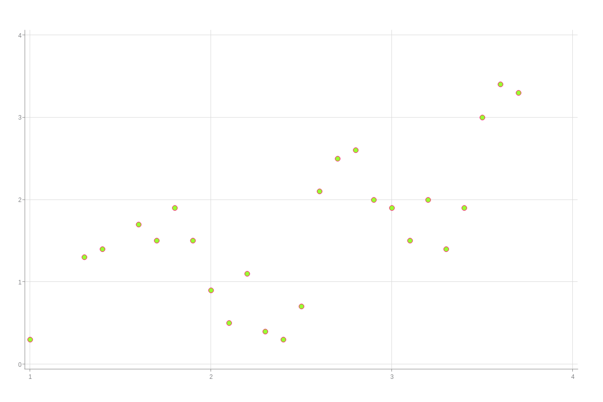
{
  type: 'scatter',
  plot: {
    marker: {
      backgroundColor: '#99ff33',
      borderWidth: '1px',
      borderColor: '#ff0066'
    }
  },
  series: [{
    values: [
      [1, 0.3],
      [1.3, 1.3],
      [1.4, 1.4],
      [1.6, 1.7],
      [1.7, 1.5],
      [1.8, 1.9],
      [1.9, 1.5],
      [2, 0.9],
      [2.1, 0.5],
      [2.2, 1.1],
      [2.3, 0.4],
      [2.4, 0.3],
      [2.5, 0.7],
      [2.6, 2.1],
      [2.7, 2.5],
      [2.8, 2.6],
      [2.9, 2],
      [3, 1.9],
      [3.1, 1.5],
      [3.2, 2],
      [3.3, 1.4],
      [3.4, 1.9],
      [3.5, 3],
      [3.6, 3.4],
      [3.7, 3.3]
    ]
  }]
}
Hover State
The hover-state and hover-marker objects allow you to specify how data points appear when a user hovers over them. You may need one or both objects depending on the chart type. Area charts, for example, require both a hover-state and hover-marker object. Note that all marker-specific attributes are placed in the latter. Hover over the data points in the chart below to see the change.
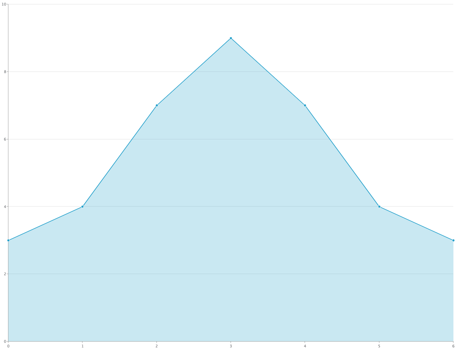
{
  type: 'area',
  scaleY: {
    values: '0:10:2'
  },
  plot: {
    hoverState: {
      lineColor: 'white',
      alpha: 1,
      backgroundColor: 'pink',
      alphaArea: 0.5
    },
    hoverMarker: {
      type: 'star5',
      size: 10,
      backgroundColor: '#FFCCFF #66CCFF'
    }
  },
  series: [{
    values: [3, 4, 7, 9, 7, 4, 3]
  }]
}
You can specify the hover mode for this state type by adding a hover-mode attribute and setting the value to node (default) or plot. See the difference in the below two charts. Bar charts (hover over the bars below to see the change) require only a hover-state object since they have no markers. In addition to background-color, you can style their border-width, border-color, line-style, and more. In this chart, the hover mode is set to the default node value, which means that the styling will apply to only a single data point (or node) at a time.

{
  type: 'bar',
  plot: {
    hoverMode: 'node',
    hoverState: {
      backgroundColor: 'purple green'
    }
  },
  series: [{
    values: [3, 4, 11, 5, 19, 7]
  }, {
    values: [9, 19, 15, 25, 12, 14]
  }, {
    values: [15, 29, 19, 21, 25, 26]
  }]
}
Here, the hover mode is set to plot. That means that when you hover over a data point (or node), the hover styling will apply across that selected series (or dataset).

{
  type: 'bar',
  plot: {
    hoverMode: 'plot',
    hoverState: {
      backgroundColor: 'purple green'
    }
  },
  series: [{
    values: [3, 4, 11, 5, 19, 7]
  }, {
    values: [9, 19, 15, 25, 12, 14]
  }, {
    values: [15, 29, 19, 21, 25, 26]
  }]
}
Refer to the Hover-State JSON Attributes/Syntax page and Hover-Marker JSON Attributes/Syntax page for more attribute options.
Selected State
The selected-state and selected-marker objects allow you to set how data points appear when a user clicks on them. Use one or both objects depending on your chart type. This state also requires you to specify the selection mode. Add a selection-mode attribute to the plot object. Value options are none (default), multiple, plot, and graph.
In the below bubble chart, the selection mode is set to multiple. This means you can select multiple data points on your chart. Since bubble charts are composed of markers, the styling attributes are placed in a selected-marker object. Each selected marker will turn raspberry-peach. Click the bubbles below.
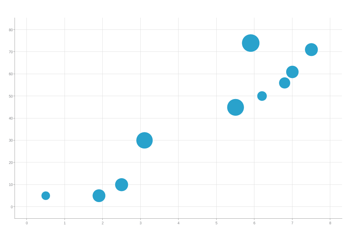
{
  type: 'bubble',
  plot: {
    selectionMode: 'multiple',
    selectedMarker: {
      backgroundColor: '#ff0066 #ff9999'
    }
  },
  series: [{
    values: [
      [0.5, 5, 14],
      [1.9, 5, 33],
      [2.5, 10, 35],
      [3.1, 30, 80],
      [5.5, 45, 87],
      [5.9, 74, 101],
      [6.2, 50, 15],
      [6.8, 56, 21],
      [7, 61, 30],
      [7.5, 71, 34]
    ]
  }]
}
You can also set the selection mode to plot or graph. See the difference in the below two bar charts. Styling attributes are placed in a selected-state object. The selected bars will turn pink with thick dash and dot brown borders. In this chart, the selection mode is set to plot. That means one bar per series (or dataset) can be selected at a time.

{
  type: 'bar',
  plot: {
    selectionMode: 'plot',
    selectedState: {
      backgroundColor: 'pink',
      borderWidth: '5px',
      borderColor: 'brown',
      lineStyle: 'dashdot'
    }
  },
  series: [{
    values: [3, 4, 11, 5, 19, 7]
  }, {
    values: [9, 19, 15, 25, 12, 14]
  }, {
    values: [15, 29, 19, 21, 25, 26]
  }]
}
Here, the selection mode is set to graph. That means only one bar can be selected at a time throughout the entire chart.
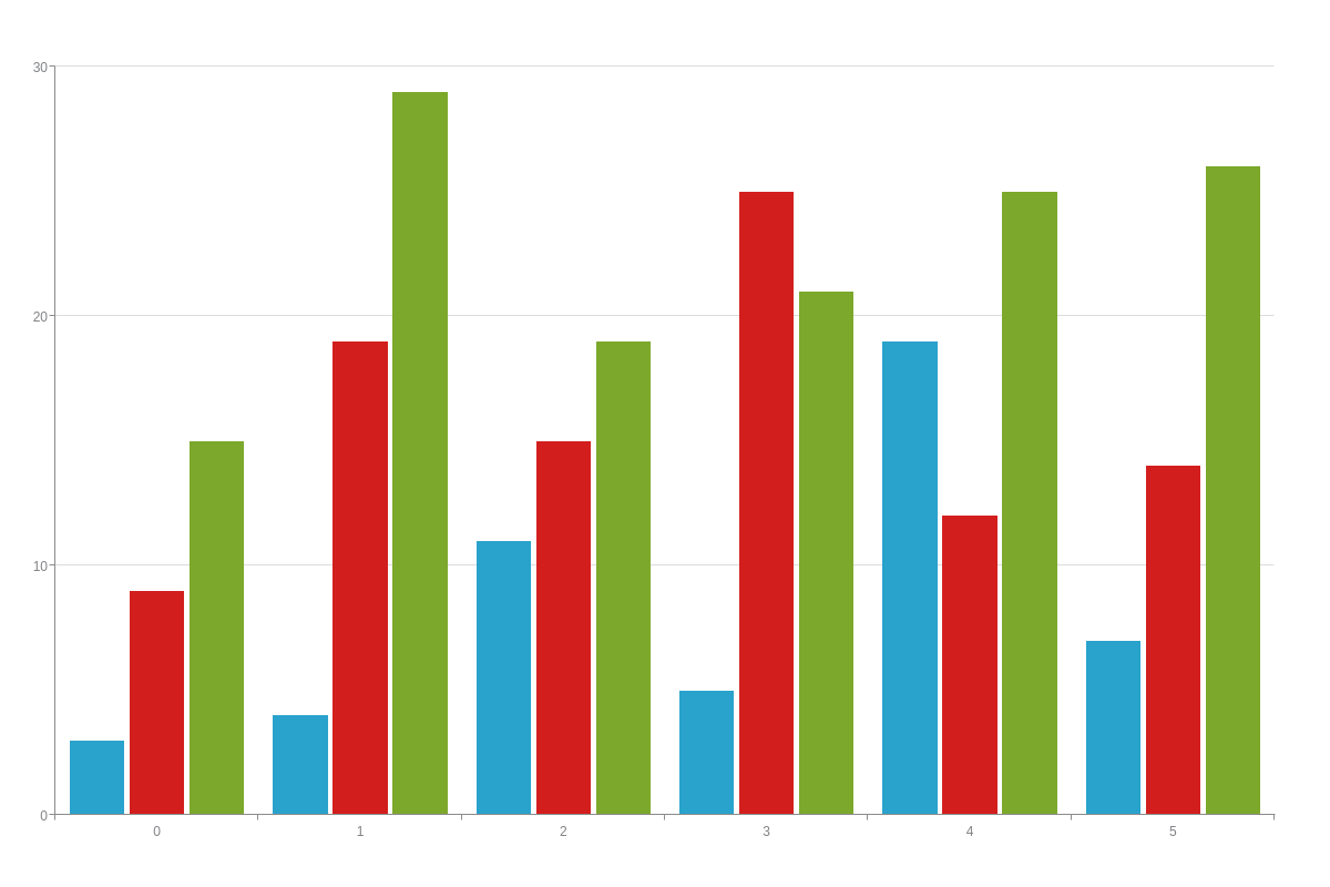
{
  type: 'bar',
  plot: {
    selectionMode: 'graph',
    selectedState: {
      backgroundColor: 'pink',
      borderWidth: '5px',
      borderColor: 'brown',
      lineStyle: 'dashdot'
    }
  },
  series: [{
    values: [3, 4, 11, 5, 19, 7]
  }, {
    values: [9, 19, 15, 25, 12, 14]
  }, {
    values: [15, 29, 19, 21, 25, 26]
  }]
}
Refer to the Selected-State JSON Attributes/Syntax page and Selected-Marker JSON Attributes/Syntax page for more attribute options.
Non-Selected (or Background) State
The background-state and background-marker objects allow you to style non-selected (or background) data points. Use one or both objects depending on your chart type. They are often used with the above selection-state and/or selection-marker objects since you can specify how both selected and non-selected data points appear.
Note: You must specify a selection mode. Add a selection-mode attribute to the plot object. Provide a value of multiple, plot, or graph. (The default value is none.)
In the below stock chart, styling attributes were added to a background-state object to make the non-selected trading days appear raspberry-pink. Click the candlesticks to see the change.
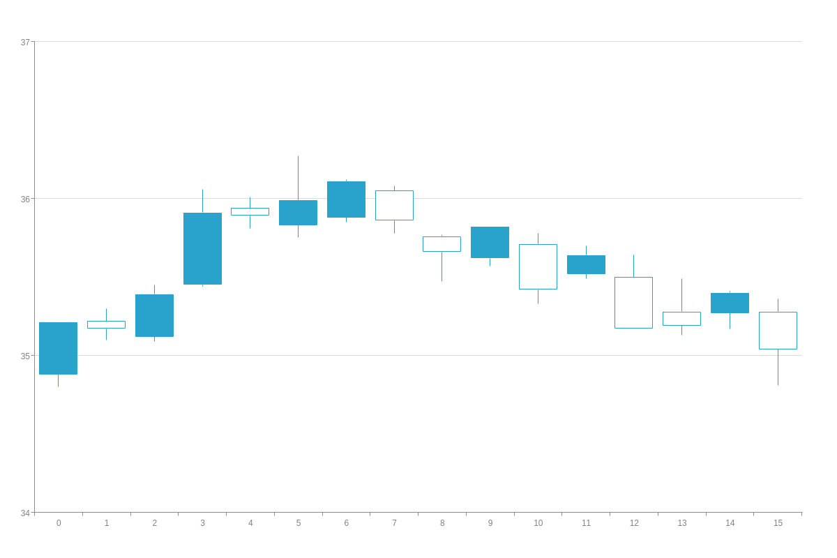
{
  type: 'stock',
  plot: {
    selectionMode: 'multiple',
    backgroundState: {
      backgroundColor: '#ff0080',
      borderColor: '#ff0080',
      lineColor: '#ff0080'
    }
  },
  scaleY: {
    values: '34:37:1'
  },
  series: [{
    values: [
      [34.88, 35.21, 34.80, 35.21],
      [35.22, 35.30, 35.10, 35.17],
      [35.12, 35.45, 35.09, 35.39],
      [35.45, 36.06, 35.44, 35.91],
      [35.94, 36.01, 35.81, 35.89],
      [35.83, 36.27, 35.75, 35.99],
      [35.88, 36.12, 35.85, 36.11],
      [36.05, 36.08, 35.78, 35.86],
      [35.76, 35.77, 35.47, 35.66],
      [35.62, 35.82, 35.57, 35.82],
      [35.71, 35.78, 35.33, 35.42],
      [35.52, 35.70, 35.49, 35.64],
      [35.50, 35.64, 35.17, 35.17],
      [35.28, 35.49, 35.13, 35.19],
      [35.27, 35.41, 35.17, 35.40],
      [35.28, 35.36, 34.81, 35.04]
    ]
  }]
}
You can specify the background mode of unselected data points. Add a background-mode attribute and set the value to plot (default) or graph. See the difference in the below two charts. Styling attributes are placed in a background-state object. The non-selected bars will appear orange-yellow with dotted purple borders. In this chart, the background mode is set to plot. That means the non-selected styling will apply to the selected series (or dataset).

{
  type: 'bar',
  plot: {
    selectionMode: 'multiple',
    backgroundMode: 'plot',
    backgroundState: {
      backgroundColor: 'orange yellow',
      borderWidth: '1px',
      borderColor: 'purple',
      lineStyle: 'dotted'
    }
  },
  series: [{
    values: [3, 4, 11, 5, 19, 7]
  }, {
    values: [9, 19, 15, 25, 12, 14]
  }, {
    values: [15, 29, 19, 21, 25, 26]
  }]
}
Here, the background mode is set to graph. That means the non-selected styling will apply across the entire chart.

{
  type: 'bar',
  plot: {
  selectionMode: 'multiple',
    backgroundMode: 'graph',
    backgroundState: {
      backgroundColor: 'orange yellow',
      borderWidth: '1px',
      borderColor: 'purple',
      lineStyle: 'dotted'
    }
  },
  series: [{
    values: [3, 4, 11, 5, 19, 7]
  }, {
    values: [9, 19, 15, 25, 12, 14]
  }, {
    values: [15, 29, 19, 21, 25, 26]
  }]
}
Refer to the Background-State JSON Attributes/Syntax page and the Background-Marker JSON Attributes/Syntax page for more attribute options.
Legend Highlight State
The highlight-state and highlight-marker objects allow you to specify how data points appear when a user hovers over the corresponding series in the legend. Depending on your chart type, you would use one or both objects. Make sure a legend is added to your chart. (Simply create a legend object. Refer to the Legend Tutorial for more information on customizing and styling the legend.)
This state requires you to add a highlight attribute to the plot object or a highlight-plot attribute to the legend object. Set the value to true. In the below pie chart, you can see how the legend highlight feature works when you hover over the series items in the legend. The corresponding pie slices will light up to appear lime-purple with thick dash and dot borders.
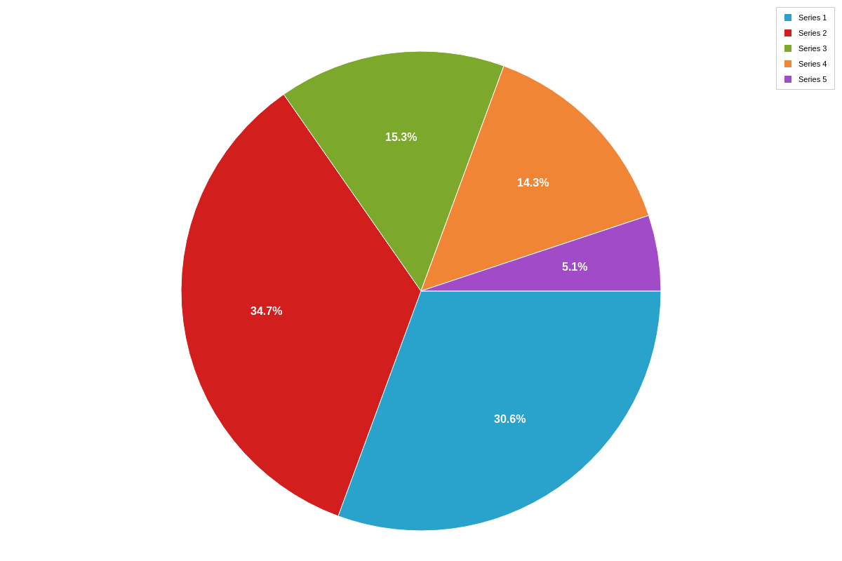
{
  type: 'pie',
  legend: {
    highlightPlot: true
  },
  plot: {
    highlightState: {
      backgroundColor: '#ccccff #ccff33',
      borderWidth: '5px',
      borderColor: '#6666ff',
      lineStyle: 'dashdot'
    }
  },
  series: [{
    values: [30]
  }, {
    values: [34]
  }, {
    values: [15]
  }, {
    values: [14]
  }, {
    values: [5]
  }]
}
Line charts require both a highlight-state and highlight-marker object. Note that all marker-specific attributes are placed in the latter. Hover over the series items in the legend to see the change.
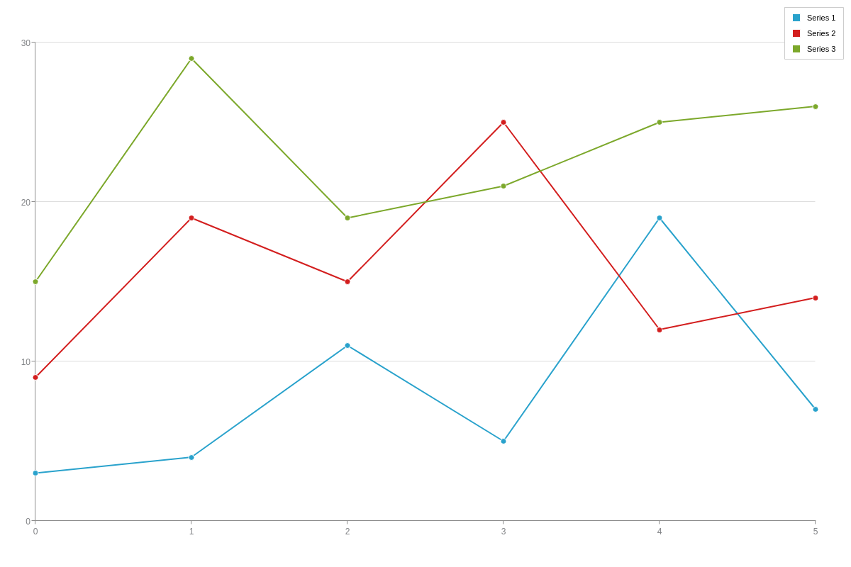
{
  type: 'line',
  legend: {
    highlightPlot: true
  },
  plot: {
    highlightState: {
      lineColor: 'black',
      lineWidth: '3px',
      lineStyle: 'dashdot'
    },
    highlightMarker: {
      type: 'gear5',
      size: 7,
      backgroundColor: 'black white',
      borderWidth: '3px',
      borderColor: 'black',
      shadow: false
    }
  },
  series: [{
    values: [3, 4, 11, 5, 19, 7]
  }, {
    values: [9, 19, 15, 25, 12, 14]
  }, {
    values: [15, 29, 19, 21, 25, 26]
  }]
}
Refer to the Highlight-State JSON Attributes/Syntax page and the Highlight-Marker JSON Attributes/Syntax page for more attribute options.
Summary
You can set styling globally in the defaults, plot-wide in the plot element, and series-wide in the series element. Different stylings allow users to discern your plot/series items from each other and make your chart more readable.
For a full list of plot attributes, see the JSON configuration page. For a full list of series attributes, see the JSON configuration page.