Funnel Charts
Overview
ZingChart supports two funnel chart types:
- Vertical
- Horizontal
Note: See our Funnel Chart Gallery for inspiration on all the different funnel chart possibilities.
Funnel Chart Types
ZingChart offers two different funnel chart types: a vertical funnel chart and a horizontal funnel chart.
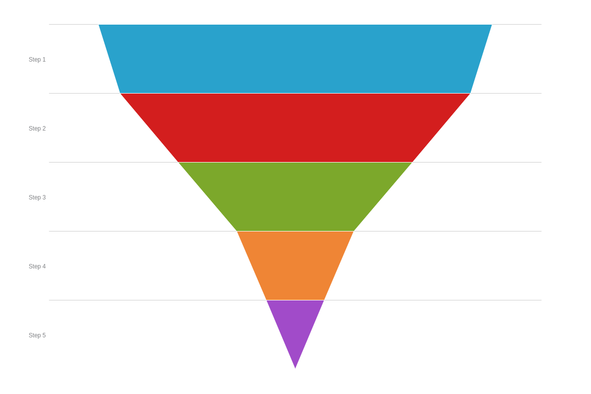
Vertical Funnel Chart
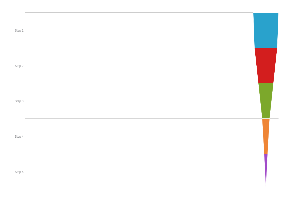
To create a standard (vertical) funnel chart, add a type attribute, and set the value to funnel or vfunnel. Without further modification, a funnel chart with five stages or levels looks like this:
{
  type: 'funnel'
}
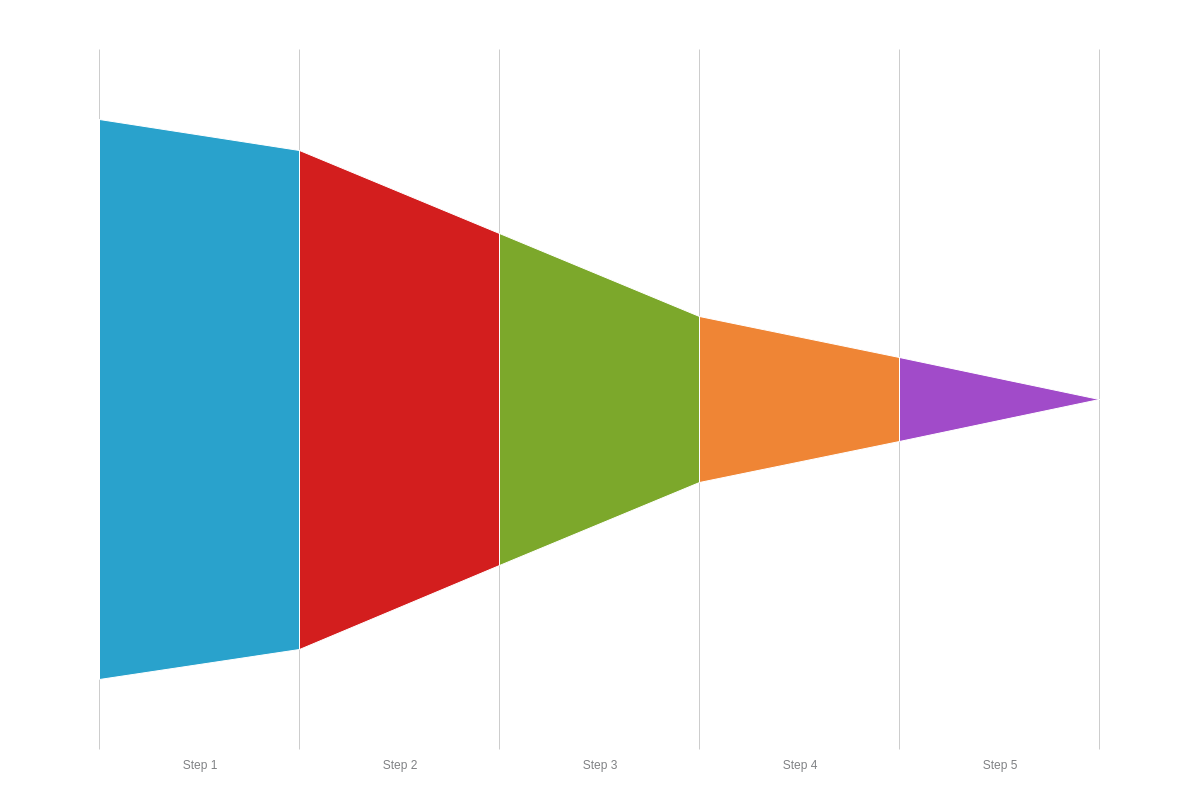
Horizontal Funnel Chart
To create a horizontal funnel chart, add a type attribute, and set the value to hfunnel.
{
  type: 'hfunnel'
}
Data
Our funnel charts support single or multiple funnels per chart. Each values array corresponds to a funnel chart step, so you'll provide your data in the following format:
Single Funnel
{ values: [step1]},
{ values: [step2]},
...,
{ values: [stepN]}
Multiple Funnels
{ values: [funnel1-step1, funnel2-step1, ..., funnelN-step1]},
{ values: [funnel1-step2, funnel2-step2, ..., funnelN-step2]},
...,
{ values: [funnel1-stepN, funnel2-stepN, ..., funnelN-stepN]}
Null or Zero Values
This chart type supports null or zero values for missing or unavailable funnel steps, or to accommodate for different size funnels in a single chart.
{
  type: 'funnel',
  series: [
    { values: [101]},
    { values: [90, 99]},
    { values: [60, 77, 59]},
    { values: [30, 55, 34]},
    { values: [15, 33, 29]}
  ]
}
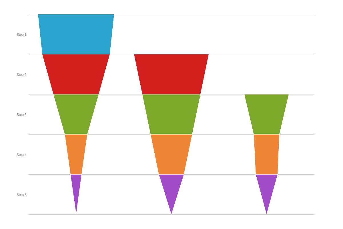
Chart-Specific Properties
Once you have your basic funnel chart, you can modify the funnel tip and/or incorporate arrows to illustrate movement between your funnels.
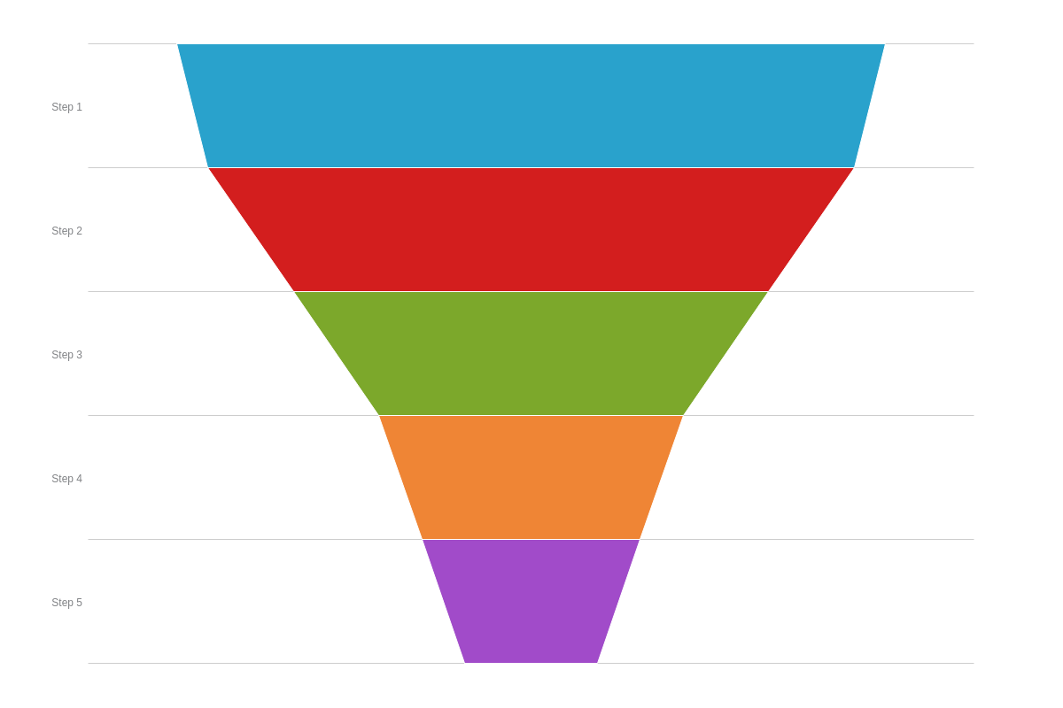
Funnel Tip Modification
You can modify the appearance of your funnel tip, which appears pointed by default. In your plot object, add a min-exitattribute. You can provide a pixel value, which will correspond to the width of your funnel base, or you can provide a percentage (0%-100%) or decimal (between 0-1) value, which is sized in relation to the funnel plot area.
{
  type: 'funnel',
  plot: {
    minExit: '15%'   //To adjust the appearance of your funnel tip.
  }
}
Entry and Exit Arrows
You can use arrows to indicate external inputs or outputs at specific stages or steps on your funnel chart. We have two types of arrows: entry arrows, which appear on the left side of the funnel, and exit arrows, which appear on the right side of the funnel. To create them, you need to keep in mind how data is formatted with this chart type:
{
  series: [
    {
      values: [funnel1-step1, funnel2-step1, ..., funnelN-step1
    },
    {
      values: [funnel1-step2, funnel2-step2, ..., funnelN-step2]
    },
    ...,
    {
      values: [funnel1-stepN, funnel2-stepN, ..., funnelN-stepN]
    }
  ]
}
Each values array corresponds to a funnel step, whether your chart has single or multiple funnels. The entry and/or exit objects are added to the applicable series object, and then you'll specify which of your funnels (values array) the arrow will be applied to, and what text (labels array) you want displayed with it. For example:
{
  series: [
    {
      values: [funnel1-step1, funnel2-step1, ..., funnelN-step1],   //Series data.
      entry: {      //or "exit" object
        values: [funnel1, funnel2, ..., funnelN], //Specify whether an arrow applies (null or 1).
        labels: [ 'text1', 'text2', ..., 'textN' ]  //Provide text, if applicable.
      }
    }
  ]
}
See the funnel chart below to understand how the arrows correspond to the funnel steps. To add multiple arrows to a single funnel step, create an entry or exit array in lieu of an object. In the array, add an object for each arrow. See the example array in Step 4 below.
Note: You can increase the padding around your text by adding a padding attribute with a pixel value.
{
  series: [
    {   //Step 1
      values: [101],
      entry: {
        values: [1],
        labels: [ 'Start' ],
        padding: '4px'
      }
    },
    {   //Step 2
      values: [90,99],
      exit: {
        values: [1],
        labels: [ 'Next' ]
      }
    },
    {   //Step 3
      values: [60,77,59],
      entry: {
        values: [null,1],
        labels: [null, 'Surplus' ]
      }
    },
    {   //Step 4
      values: [30,55,34,30],
      entry: [  //Array, with two arrow objects inside.
        {
          values: [null,null,1],
          labels: [null,null, 'Carryover' ]
        },
        {
          values: [null,null,1],
          labels: [null,null, 'New' ]
        }
      ],
      exit: {
        values: [null,null,1],
        labels: [null,null, 'Remaining' ]
      }
    },
    {   //Step 5
      values: [15,33,29,11],
      exit: {
        values: [null,null,null,1],
        labels: [null,null,null, 'End' ]
      }
    }
  ]
}

Entry and Exit Space
The space of in funnel sections can be modified with two attributes.
The spaceEntry attribute modifies the space before funnel sections.
To modify the width of the after funnel sections, use the spaceExit attribute.
{
  type: 'funnel',
  plot: {
    spaceEntry: 1,  // default is 0.1
    spaceExit: 1,   // default is 0.1
  },
}
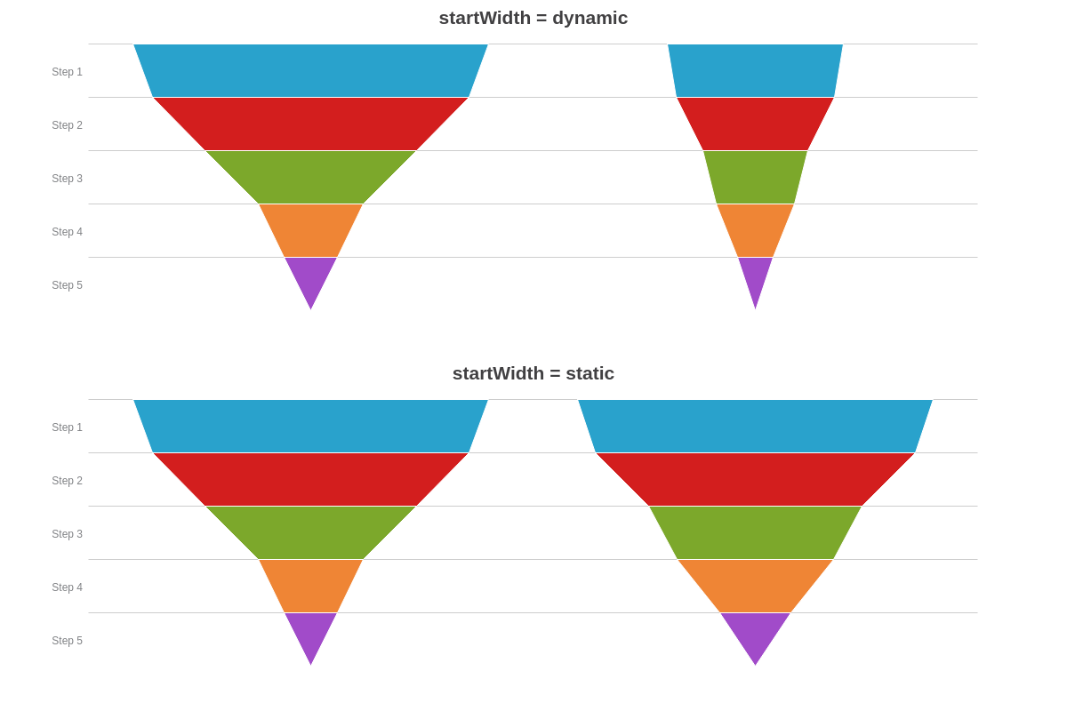
Start Width
The startWidth attribute determines how the funnels are scaled when plotting multiple funnels.
When set to 'dynamic', the funnels are scaled relative to the maximum.
On the other hand, 'static' results in funnels starting with the same size.
{
  type: 'funnel',
  plot: {
    startWidth: 'static', // default is 'dynamic'
  }
}
Further Customization
Further customize your funnel chart by configuring your scales, styling your funnel steps (colors, borders, hover states), and incorporating value boxes and tooltips.
Scale Configuration
Our funnel charts are set against an x/y-axis scale, and can be configured accordingly. You can change the placement of your scale(s), add scale labels, and style your text, axis lines, tick marks, guides, and more.
Note: See our Configuring Your Scales Tutorial for more information on scales.
Note: The x-axis is not visible by default. To make it visible, create a scale-x object. Add a visible attribute, and set the value to true. The same scale configuration options apply.
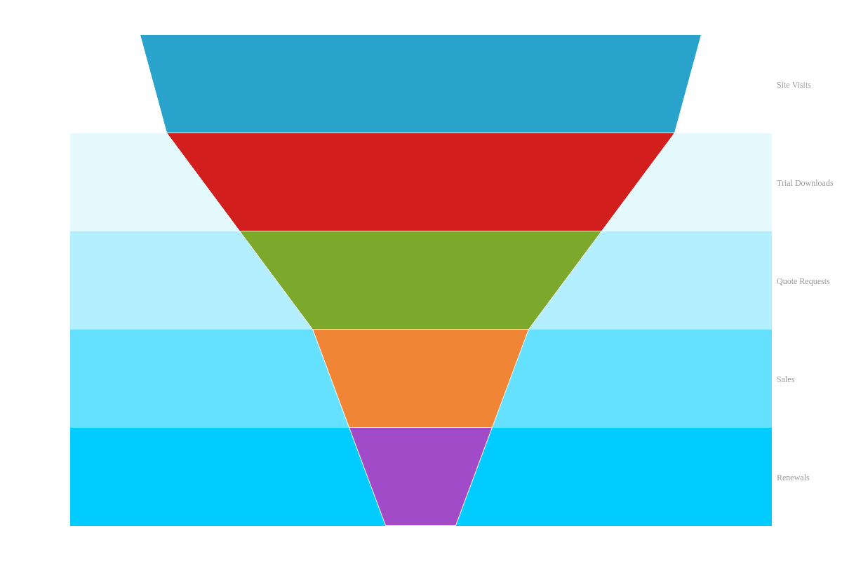
{
  type: 'funnel',
  scaleY: {
    placement: 'opposite',
    labels: [ 'Site Visits', 'Trial Downloads', 'Quote Requests', 'Sales', 'Renewals' ],
    item: {
      fontColor: '#999999',
      fontFamily: 'Georgia'
    },
    guide: {
      lineColor: 'none',
      items: [
        {backgroundColor: '#fff'},
        {backgroundColor: '#e5faff'},
        {backgroundColor: '#b3efff'},
        {backgroundColor: '#66e0ff'},
        {backgroundColor: '#00ccff'}
      ]
    }
  },
  plot: {
    minExit: '10%'
  }
}
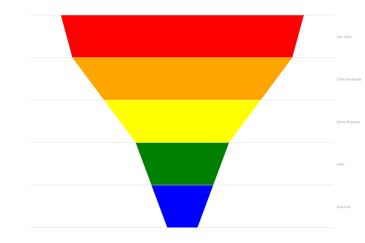
Styling
You can style the background colors, borders, and hover states of your funnel steps. To make global changes, place your styling attributes in the plot object. For local changes, place the attributes in the applicable series object. Commonly used styling attributes include: background-color, border-color, and border-width.
To specify how a step appears when a user hovers over it, create a hover-state object. Place the styling attributes you want applied inside the object.
Note: For more styling options, see our Plot/Series JSON Attributes/Syntax page.
{
  plot: {// global changes
    minExit: '10%',
    hoverState: {
      backgroundColor: 'purple',
      borderColor: 'gray',
      borderWidth: '3px',
      lineStyle: 'dashdot'
    }
  },
  series: [
    {
      values: [101],
      backgroundColor: 'red'
    },
    {
      values: [90],
      backgroundColor: 'orange'
    }
  ]
}
Value Boxes
To add value boxes to your funnel chart, create a value-box object within the plot object. You can specify what text and/or tokens to display with the text attribute. Commonly used tokens with this chart type include: %v (node value), %t (plot text), %npv (percentage of the current node value relative to the sum of all nodes), or %output-percent-value (percentage of the current node value relative to the previous node value).
With the placement attribute, your value options are: auto/in (default), top, bottom, left, right, left-out, and right-out.
Note: Read more on tokens with our ZingChart Tokens page. See the Value Boxes JSON Attributes/Syntax page for more attribute options.
{
  plot: {
    valueBox: {
      text: '%v',
      placement: 'left-out', //'auto'/'in' (default), 'top', 'bottom', 'left', 'right', 'left-out', or 'right-out'
      fontColor: 'gray',
      fontFamily: 'Georgia',
      fontSize: 12,
      fontWeight: 'normal'
    }
  }
}

Tooltips
Tooltips appear when you hover over a funnel step. You can specify what text and/or tokens to display and incorporate custom styling with a tooltip object.
Use the text attribute to provide your tooltip text. You can use standard tokens such as %v(to show funnel step values) and %t (to show funnel step text). You can also use the following percentage tokens: %node-percent-value (to show the percentage of the value relative to the sum of all values) and %output-percent-value (to show the percentage of the current value relative to the previous value).
For tooltip styling, available attributes include font-color, font-family, font-size, background-color, and so on.
Note: Read more on tokens with our ZingChart Tokens page. See the Tooltips JSON Attributes/Syntax page for more stylingattribute options.

{
  plot: {
    tooltip: {
      text: 'Value: %v<br>Text: %t<br>Percentage (relative to sum of all values): %node-percent-value%<br>Percentage (relative to previous node): %output-percent-value%',
      fontFamily: 'Georgia',
      fontSize: 12
    }
  }
}