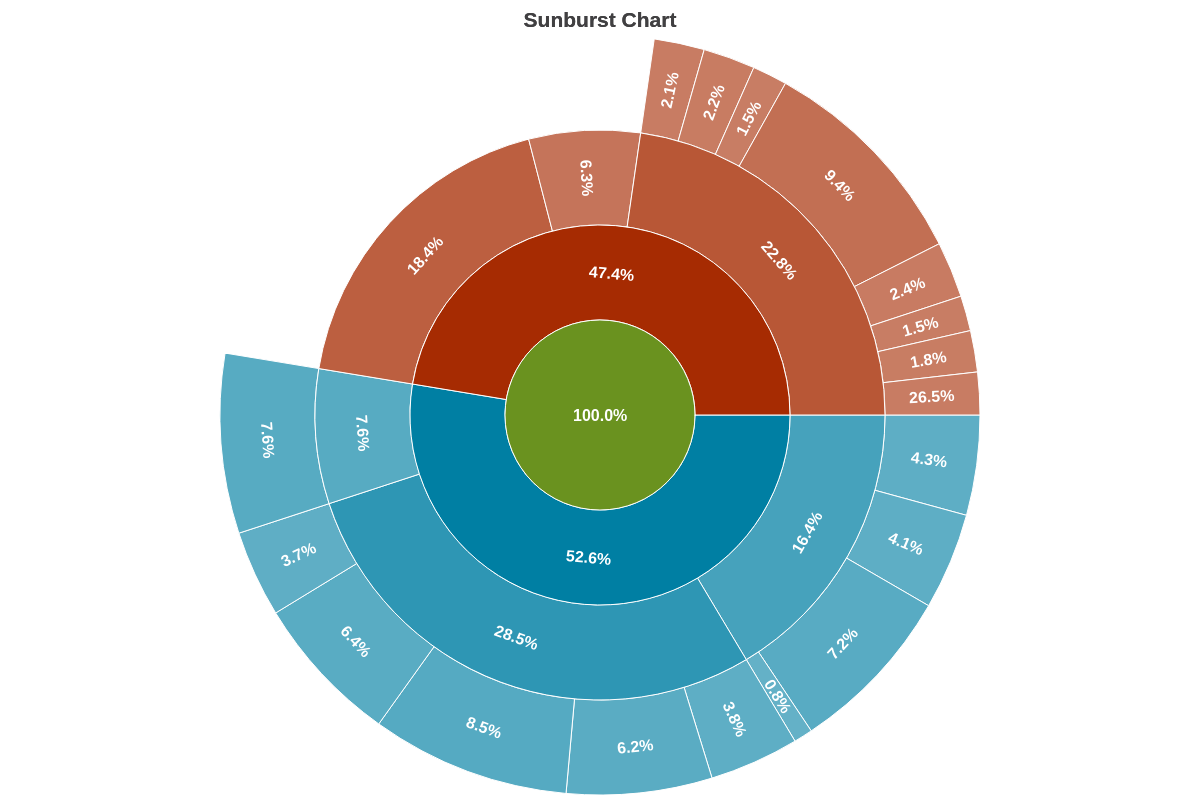
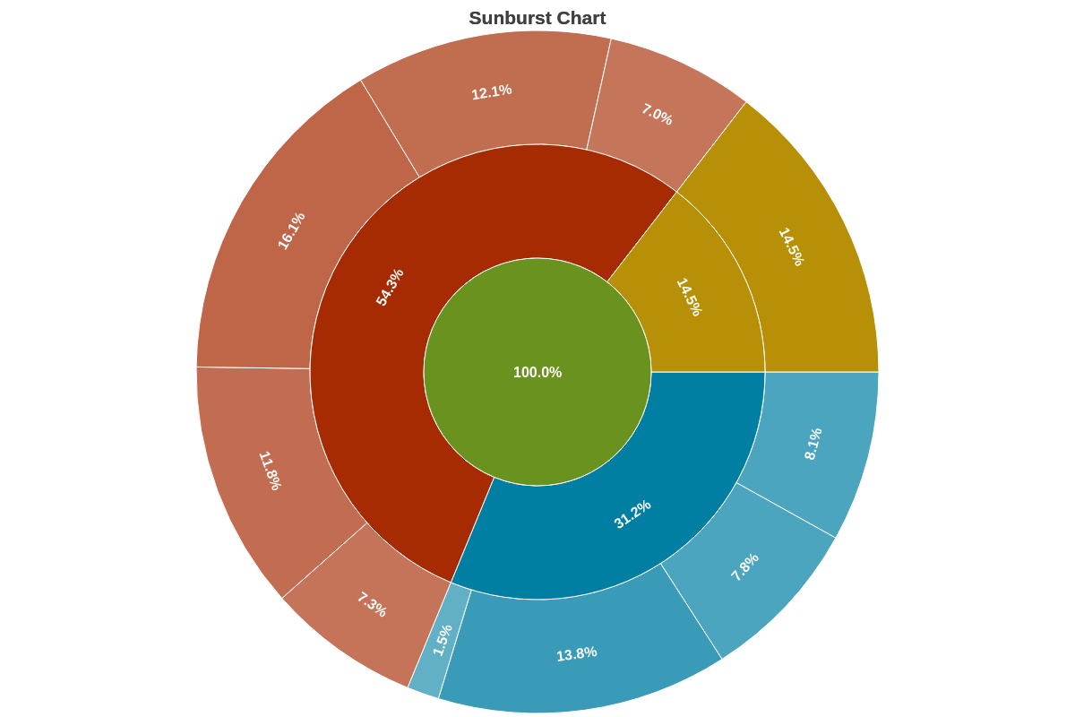
Sunburst Charts
Note: See our Sunburst Chart Gallery for inspiration on all the different sunburst chart possibilities.
Sunburst Chart Type
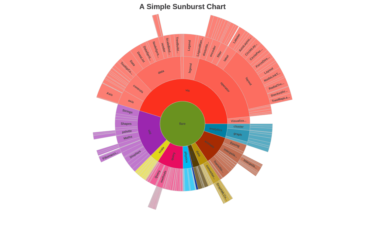
To specify the chart type, add a type attribute to the chart object. Our standard sunburst chart is specified by the sunburst value. Without further modification, here is how the default sunburst chart appears:
{
  type: 'sunburst',
}
Data
Provide your chart data in the series array. In the array, create an object and assign a value to id, text, parent, and the optional value attribute.
id is the section where the series data object will be placed; text is the text that will be displayed in that section; parent is the parent section of the section you are adding data to; and value is the numerical value of the data object being added.
{
  series: [
    {id: 'flare', text: 'flare', parent: ''},
    {id: 'analytics', text: 'analytics', parent: 'flare'},
    {id: 'cluster', text: 'cluster', parent: 'analytics'},
    {id: 'agglomerativecluster', text: 'AgglomerativeCluster', parent: 'cluster', value: 3938},
    ...,
    {id: 'someId', text: 'someText', parent: 'someParent', values: [someValue]}
  ]
}
Note: ZingChart can automatically order your sunburst slices, from largest to smallest. Create a plot object and add a layout attribute. Set the value to auto. (This attribute also sets the sunburst chart’s default reference angle to 12 o'clock, or zero degrees. For more information, see the Reference Angle section below.)
Chart-Specific Properties
Once you've provided your chart type and data, you can configure the chart's elements such as offset, donut ring size, how pie slices are detached and/or clicked, and more.
Flat
Use the flat attribute to turn off drilldown when clicking on sunburst nodes.
{
  options: {
    'flat': true
  }
}

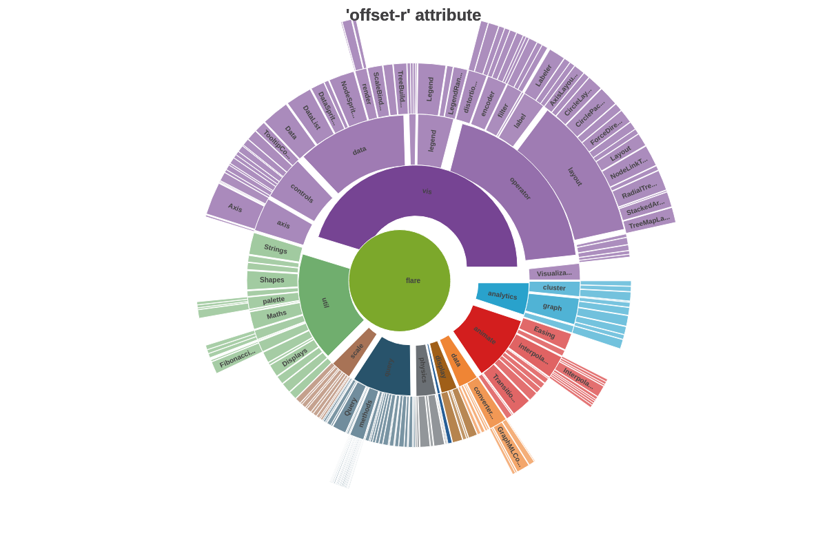
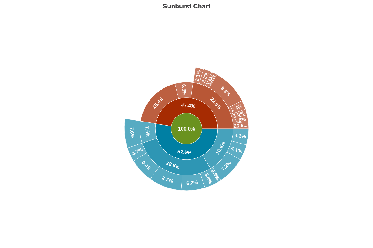
Offset Slices
Use the offsetR attribute to pull out one or more slices from the rest of the sunburst. Often referred to as an exploded sunburst chart, the attribute can be applied globally in the plot object or locally in the applicable series object. Provide the sunburst slice offset as a percentage or pixel value.
{
  plot: {
    offsetR: '10%'
  }
}
Root
Sets the root (or center) of the sun chart. Specify the root by the id of the data.
{
  options: {
    root: 'analytics',
  }
}
Size Factor
The sizeFactor attribute sets the size factor to apply to the chart.
{
  options: {
    sizeFactor: 0.5
  }
}
Slice
The slice attribute sets the slice size (accepts numeric or percentages), which applies to the radius of the sunburst center.
{
  options: {
    slice: 0.5
  }
}
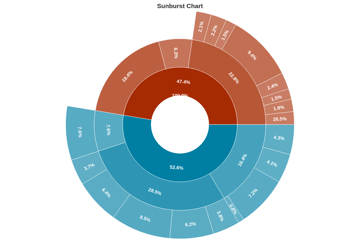
Space
The space attribute sets the spacing between the sunburst layers/rings.
{
  options: {
    space: 10
  }
}
Widths
The widths attribute sets the individual widths of each band level.
{
  options: {
    widths: [40, 60, 70, 30]
  }
}
Further Customization
Palette
Use the palette array to specify colors to be used by the slices. Provide the color values as strings inside the array.
{
  options: {
    palette: ['#2196F3', '#3F51B5', '#42A5F5', '#5C6BC0', '#64B5F6', '#7986CB', '#90CAF9', '#9FA8DA', '#BBDEFB', '#C5CAE9'],
  },
}
Scale Configuration
Use the scaleR object to set the sunburst chart's aperture and reference angle. Use the scale object to set the size factor.
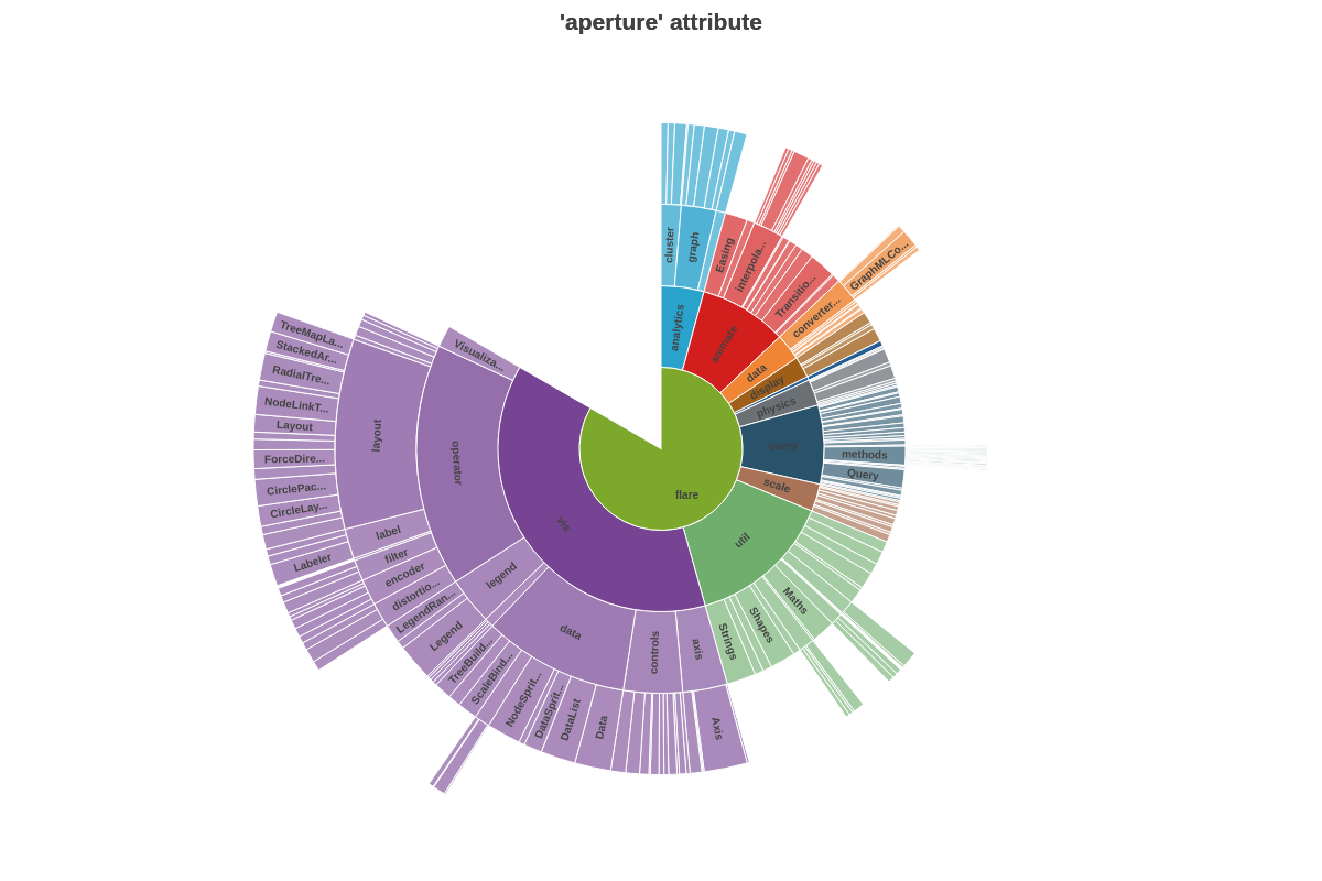
Aperture
The sunburst chart is sized to 360 degrees (i.e., a circle) by default. You can change this by adding an aperture attribute to the scaleR object. Provide the desired aperture value (e.g., 180 is a half circle, 90 is a quarter circle, and so on).
{
  scaleR: {
    aperture: 300
  },
}
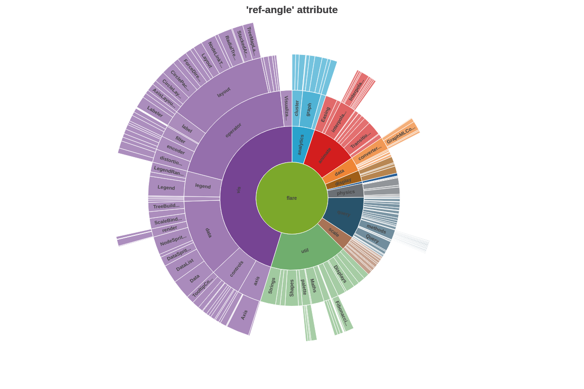
Reference Angle
The reference angle (or starting point) of our sunburst charts is set to 90 degrees (or 3 o'clock) by default. Add a refAngle attribute to the scaleR object to change this. Provide the desired value, keeping in mind that the value is relative to the default starting angle. For example, providing a value of 270 would make the first sunburst slice appear at the 12 o'clock position. See the following chart:
{
  scaleR: {
    refAngle: 270 //relative to the starting 90 degree position.
  },
}
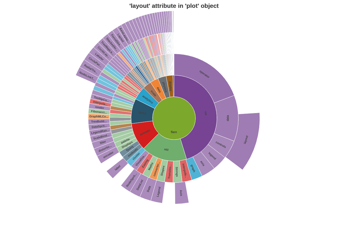
Alternatively, you can have the reference angle automatically set to zero and have the sunburst slices automatically sorted by size, from largest to smallest, by adding a 'layout': 'auto' attribute to the plot object. See the following chart:
{
  plot: {
    layout: 'auto' //to order pie slices by size and have reference angle start at zero.
  },
}
Plot/Series Styling
Style the borders of the sunburst slices by adding borderWidth, borderColor, lineStyle, alpha, and other styling attributes to your plot object.
Note: Refer to the Plot/Series Styling Tutorial and the plot / series JSON Configuration page for further information and a full attribute list.
{
  plot: {
    borderWidth: '1px',
    borderColor: '#cccccc',
    lineStyle: 'dotted'
  },
}
Tokens
Tokens (or string interpolation) are highly useful when customizing sunburst chart tooltips and value boxes. Commonly used sunburst chart tokens include:
| Token | Description |
|---|---|
| %data-_____ | Format for custom tokens. The custom token is defined in the plot or series object as an attribute or array using the "data" prefix (e.g., data-year). It is then recalled in the tooltips or value boxes (e.g., %data-year). |
| %node-percent-value %npv | The percentage value of the sunburst slice (node) relative to the entire pie (sum of all nodes) |
| %node-value %v | The sunburst slice (node) value |
| %pie-total-value | The sum of all the sunburst slice (node) values |
| %plot-description | The description of the current plot, pulled from the description attribute in the plot/series object |
| %plot-text %t | The text of the current plot, pulled from the text attribute in the plot/series object |
Note: Refer to the Tokens Tutorial for a full list of available tokens.
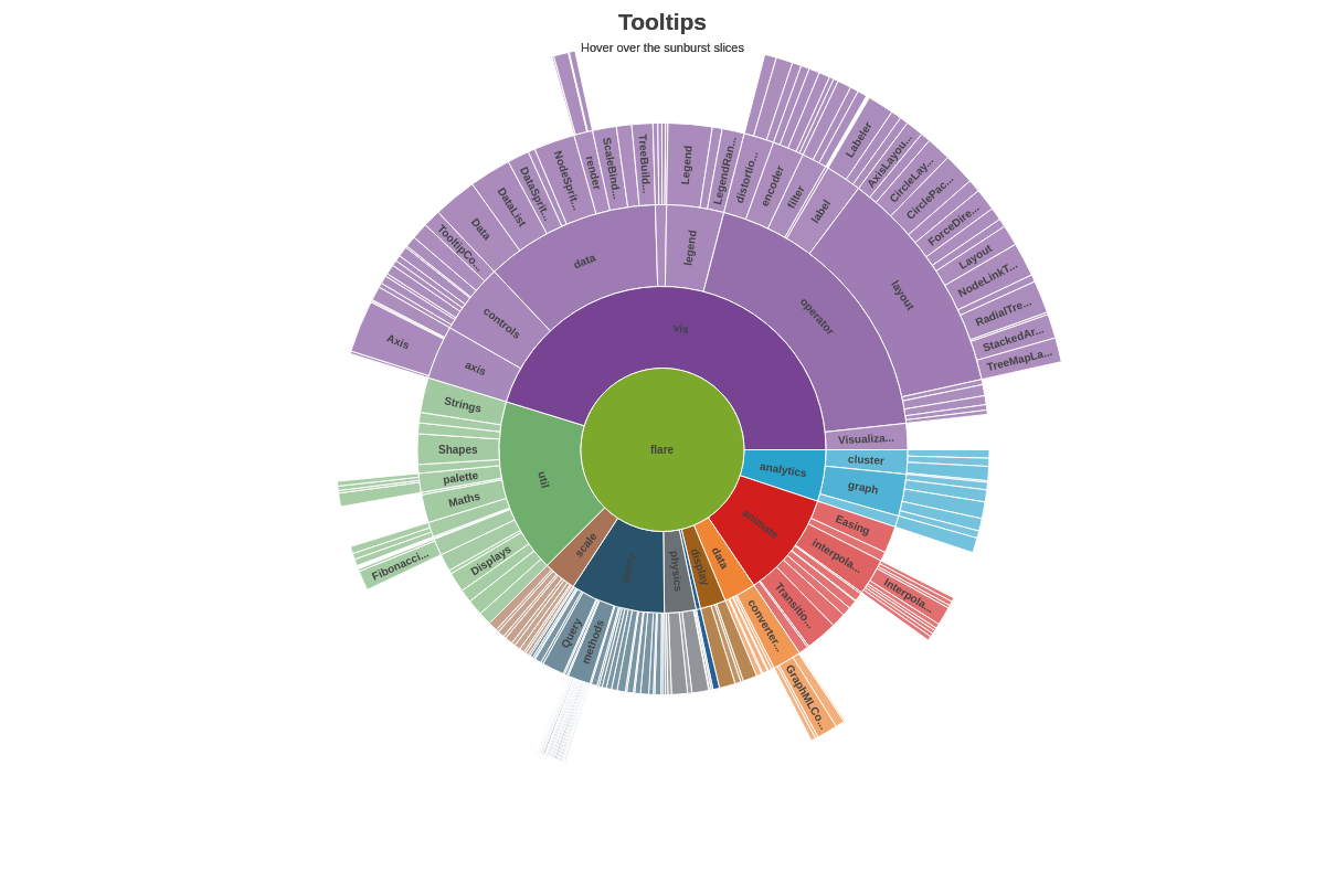
Tooltips
Tooltips appear when you hover over the sunburst slices. Create a tooltip object in the plot object to customize the text and styling. Customize the tooltip's text with a text attribute and then provide your desired combination of text and tokens inside a string.
Note: Refer to the Tooltips Tutorial and tooltip JSON Configuration page for more information and a full attribute list.
{
  plot: {
    tooltip: {
      text: '%t: %v (%npv%)',
      alpha: 0.7,
      backgroundColor: 'white',
      borderColor: '#cccccc',
      borderRadius: '10px',
      borderWidth: '1px',
      fontColor: 'black',
      fontFamily: 'Georgia',
      lineStyle: 'dotted',
      padding: '10%',
      placement: 'node:out', //'node:out' or 'node:center'
      textAlpha: 1,
    },
  },
}
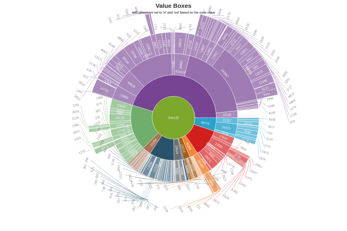
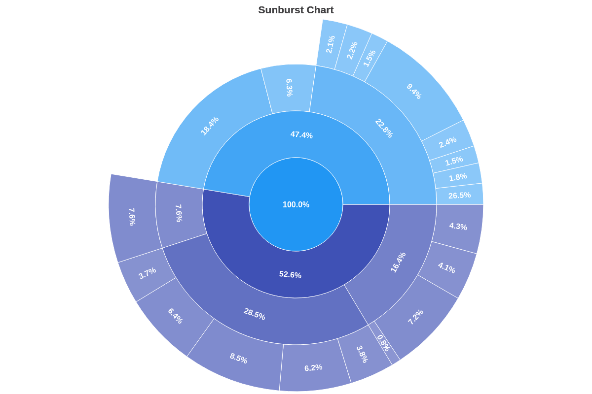
Value Boxes
Value boxes are fixed labels that appear adjacent to the sunburst slices. Create a value-box object in the plot object to customize the text, placement (in, out, center), and styling. You can also incorporate rules.
Note: Refer to the Value Boxes Tutorial and the value-box JSON Configuration page for more information and a full attribute list.
In the following chart, rules were used to place value boxes in or out of the chart based on their value.
Note: Value boxes placed outside the sunburst slices are automatically drawn with connecting lines. To remove them, add a connected attribute and set the value to false.
{
  plot: {
    valueBox: {
      text: '%v',
      fontFamily: 'Georgia',
      fontSize: 12,
      fontWeight: 'normal',
      rules: [
        {
          rule: '%v > 6000',
          fontColor: 'white',
          offsetR: '50%',
          placement: 'in',
        },
        {
          rule: '%v <= 6000',
          fontColor: 'gray',
          placement: 'out',
        }
      ]
    },
  }
}