Legend
Overview
The legend helps users better understand a chart by identifying what each series (dataset) represents. ZingChart supports many interactive legend features, including: legend toggling, dragging, minimization, pagination, scrolling, highlighting, sharing, and more. Refer to the Legend JSON page for a full list of objects and attributes.
Setup
Basic chart legend setup includes creating the object, specifying the legend item text, and overall layout and positioning.
Default Legend
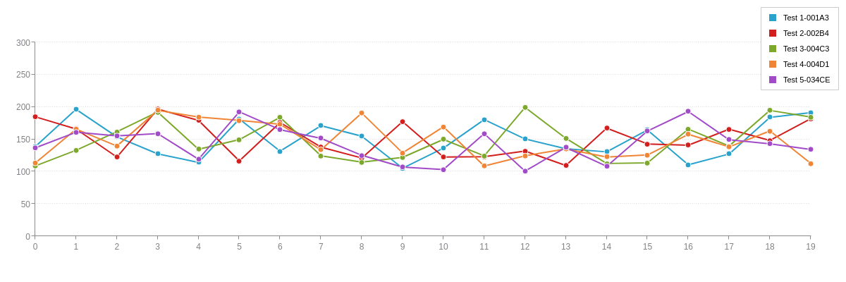
To add a legend, create a legend object. The default legend appears like so, with each legend item corresponding to a series from your chart.
{
  type: "line",
  legend: {

  },
  'scale-y': {
    values: "0:300:50",
    guide: {
      'line-style': "dotted"
    }
  },
  series: [
    {
      values: [138.6,196.3,153.6,127.4,114.1,181.4,131.5,170.9,154.7,105.2,136.3,180.4,150.5,135.3,130.5,164.3,110.5,127.2,183.9,191.3]
    },
    {
      values: [184.8,165.8,122.4,196.6,179.1,116.4,175.9,137.8,120.9,177.3,122.5,123.1,131.7,109.4,167.2,142.7,140.7,165.5,148.1,181.9]
    },
    {
      values: [108.7,132.9,161.6,192.1,134.5,149.4,183.9,124.4,114.5,121.9,149.7,124.3,199.3,151.4,112.5,113.5,165.6,139.5,194.6,184.4]
    },
    {
      values: [113.2,165.6,139.5,194.6,184.4,179.2,173.1,133.7,190.5,128.9,169.3,108.5,124.3,135.1,122.5,125.7,157.6,138.1,162.8,112.6]
    },
    {
      values: [136.6,160.8,155.2,158.7,119.1,192.4,164.8,151.4,125.1,106.9,103.2,158.6,100.7,137.2,108.1,162.7,192.8,149.2,142.8,134.3]
    }
  ]
}
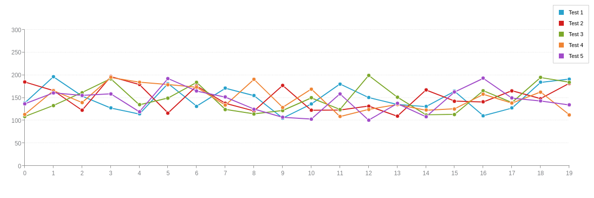
Text
Specify the text you want to appear for each legend item by adding a text attribute to each series object. (Without the text attribute, the legend item displays the series number of each dataset by default, as seen in the above chart.)
{
  type: "line",
  legend: {

  },
  plot: {
    tooltip: {
      text: "%t<br>%v"
    }
  },
  'scale-y': {
    values: "0:300:50",
    guide: {
      'line-style': "dotted"
    }
  },
  series: [
    {
      values: [138.6,196.3,153.6,127.4,114.1,181.4,131.5,170.9,154.7,105.2,136.3,180.4,150.5,135.3,130.5,164.3,110.5,127.2,183.9,191.3],
      text: "Test 1-001A3"
    },
    {
      values: [184.8,165.8,122.4,196.6,179.1,116.4,175.9,137.8,120.9,177.3,122.5,123.1,131.7,109.4,167.2,142.7,140.7,165.5,148.1,181.9],
      text: "Test 2-002B4"
    },
    {
      values: [108.7,132.9,161.6,192.1,134.5,149.4,183.9,124.4,114.5,121.9,149.7,124.3,199.3,151.4,112.5,113.5,165.6,139.5,194.6,184.4],
      text: "Test 3-004C3"
    },
    {
      values: [113.2,165.6,139.5,194.6,184.4,179.2,173.1,133.7,190.5,128.9,169.3,108.5,124.3,135.1,122.5,125.7,157.6,138.1,162.8,112.6],
      text: "Test 4-004D1"
    },
    {
      values: [136.6,160.8,155.2,158.7,119.1,192.4,164.8,151.4,125.1,106.9,103.2,158.6,100.7,137.2,108.1,162.7,192.8,149.2,142.8,134.3],
      text: "Test 5-034CE"
    }
  ]
}
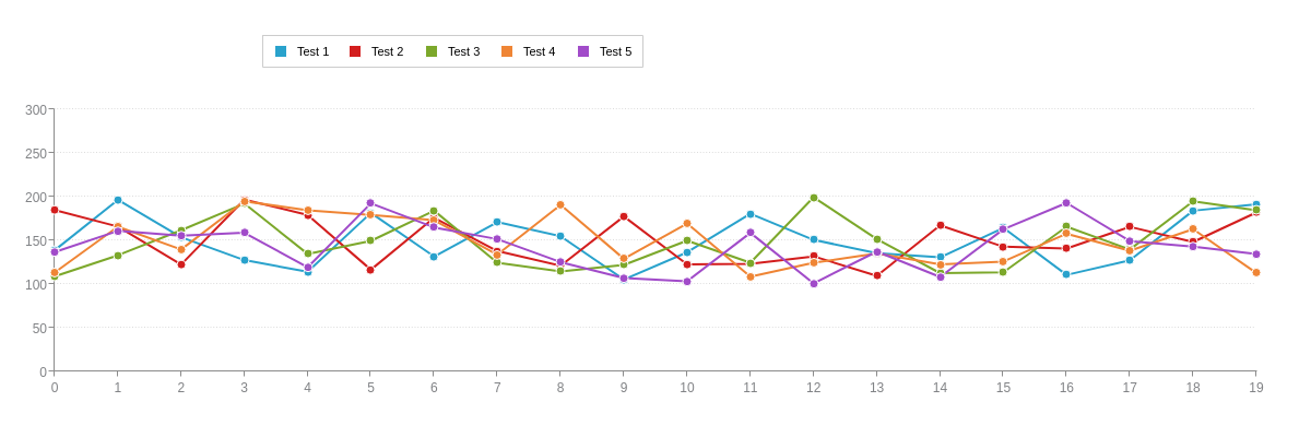
Alternatively, you can use the legend-text attribute in each series object to specify the legend item text. This method is useful when you want to differentiate the node text from the legend item text, such as using shorthand or abbreviated names. See the following chart.
{
  type: "line",
  legend: {

  },
  plot: {
    tooltip: {
      text: "%t<br>%v"
    }
  },
  'scale-y': {
    values: "0:300:50",
    guide: {
      'line-style': "dotted"
    }
  },
  series: [
    {
      values: [138.6,196.3,153.6,127.4,114.1,181.4,131.5,170.9,154.7,105.2,136.3,180.4,150.5,135.3,130.5,164.3,110.5,127.2,183.9,191.3],
      text: "Test 1-001A3",
      'legend-text': "Test 1"
    },
    {
      values: [184.8,165.8,122.4,196.6,179.1,116.4,175.9,137.8,120.9,177.3,122.5,123.1,131.7,109.4,167.2,142.7,140.7,165.5,148.1,181.9],
      text: "Test 2-002B4",
      'legend-text': "Test 2"
    },
    {
      values: [108.7,132.9,161.6,192.1,134.5,149.4,183.9,124.4,114.5,121.9,149.7,124.3,199.3,151.4,112.5,113.5,165.6,139.5,194.6,184.4],
      text: "Test 3-004C3",
      'legend-text': "Test 3"
    },
    {
      values: [113.2,165.6,139.5,194.6,184.4,179.2,173.1,133.7,190.5,128.9,169.3,108.5,124.3,135.1,122.5,125.7,157.6,138.1,162.8,112.6],
      text: "Test 4-004D1",
      'legend-text': "Test 4"
    },
    {
      values: [136.6,160.8,155.2,158.7,119.1,192.4,164.8,151.4,125.1,106.9,103.2,158.6,100.7,137.2,108.1,162.7,192.8,149.2,142.8,134.3],
      text: "Test 5-034CE",
      'legend-text': "Test 5"
    }
  ]
}
Layout and Positioning
You can customize the layout and positioning of the legend. For legend layout, use the layout attribute to specify how many columns and rows the legend items should be organized into (e.g., 1x5 would equal one row with five columns). For legend positioning, you can use the align (left, center, right) and vertical-align (top, middle, bottom) attributes for automatic legend alignment and adjustment of the plot area margins. Alternatively, you can use the x and/or yattributes (provide percentage or pixel values) to position the legend, and then use margin attributes (see the Plotarea JSON page) in the plotarea object to position the plot area.
{
  type: "line",
  legend: {
    layout: "1x5", //row x column
    x: "20%",
    y: "8%",
  },
  plotarea: {
    'margin-bottom': "15%",
    'margin-top': "25%"
  },
  'scale-y': {
    values: "0:300:50",
    guide: {
      'line-style': "dotted"
    }
  },
  series: [
    {
      values: [138.6,196.3,153.6,127.4,114.1,181.4,131.5,170.9,154.7,105.2,136.3,180.4,150.5,135.3,130.5,164.3,110.5,127.2,183.9,191.3],
      text: "Test 1"
    },
    {
      values: [184.8,165.8,122.4,196.6,179.1,116.4,175.9,137.8,120.9,177.3,122.5,123.1,131.7,109.4,167.2,142.7,140.7,165.5,148.1,181.9],
      text: "Test 2"
    },
    {
      values: [108.7,132.9,161.6,192.1,134.5,149.4,183.9,124.4,114.5,121.9,149.7,124.3,199.3,151.4,112.5,113.5,165.6,139.5,194.6,184.4],
      text: "Test 3"
    },
    {
      values: [113.2,165.6,139.5,194.6,184.4,179.2,173.1,133.7,190.5,128.9,169.3,108.5,124.3,135.1,122.5,125.7,157.6,138.1,162.8,112.6],
      text: "Test 4"
    },
    {
      values: [136.6,160.8,155.2,158.7,119.1,192.4,164.8,151.4,125.1,106.9,103.2,158.6,100.7,137.2,108.1,162.7,192.8,149.2,142.8,134.3],
      text: "Test 5"
    }
  ]
}
Top Layer
By default, when crosshair(s) and legend are both enabled the crosshairs are painted over the legend.
To have the crosshair lines appear behind the legend, set the topLayer attribute to 'legend'.
{
  type: 'bar',
  topLayer: 'legend',
  ...
}
Legend Elements
The legend consists of multiple elements (or parts) that can be customized to meet your charting needs. Refer to the Legend JSON page for a full list of objects and attributes.
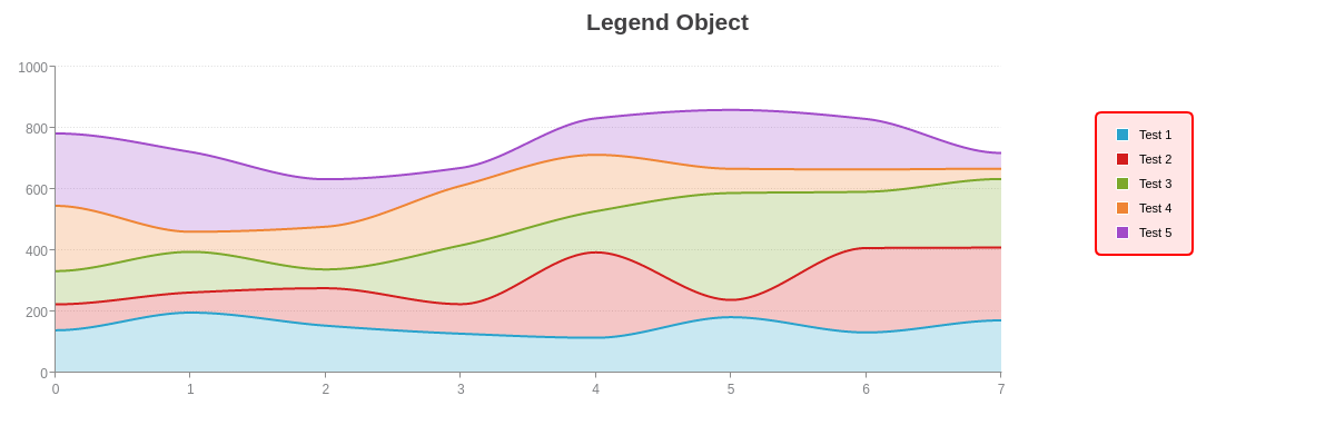
Legend Object
Use the legend object to style and control the overall legend container. Refer to the Legend Object JSON page for a full attribute list.
{
  type: "area",
  title: {
    text: "Legend Object"
  },
  legend: {
    'background-color': "#ffe6e6",
    'border-width':2,
    'border-color': "red",
    'border-radius': "5px",
    padding: "10%",
    layout: "5x1",
    x: "82%",
    y: "25%",
  },
  plot: {
    aspect: "spline",
    stacked: true,
    marker: {
      visible: false
    }
  },
  plotarea: {
    'margin-right': "25%",
  },
  'scale-y': {
    values: "0:1000:200",
    guide: {
      'line-style': "dotted"
    }
  },
  series: [
    {
      values: [138.6,196.3,153.6,127.4,114.1,181.4,131.5,170.9],
      text: "Test 1"
    },
    {
      values: [84.8,65.8,122.4,96.6,279.1,56.4,275.9,237.8],
      text: "Test 2"
    },
    {
      values: [108.7,132.9,61.6,192.1,134.5,349.4,183.9,224.4],
      text: "Test 3"
    },
    {
      values: [213.2,65.6,139.5,194.6,184.4,79.2,73.1,33.7],
      text: "Test 4"
    },
    {
      values: [236.6,260.8,155.2,58.7,119.1,192.4,164.8,51.4],
      text: "Test 5"
    }
  ]
}
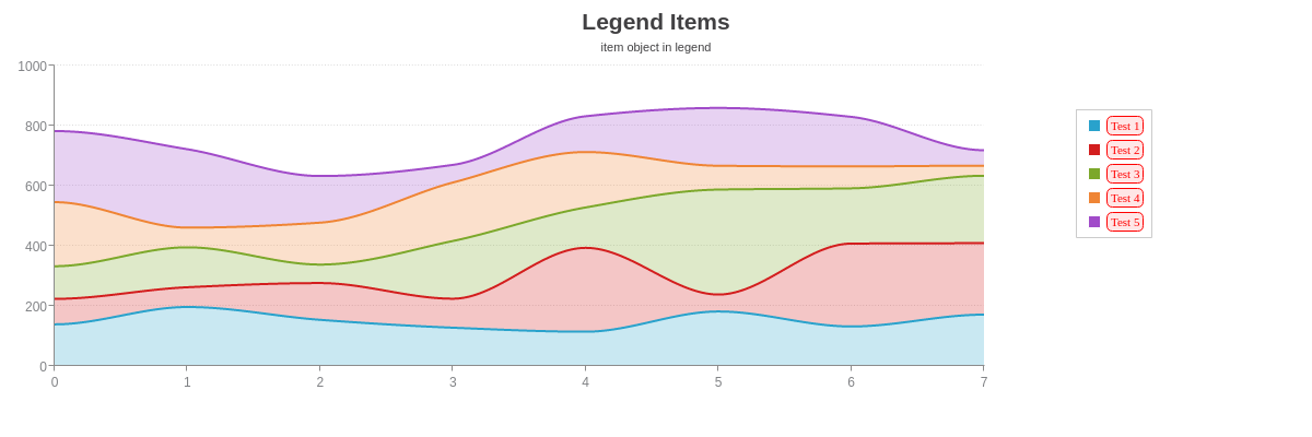
Legend Items
Use the item and item-off objects to style the legend text. You can customize the font, background, and borders. Refer to the Legend Item and Legend Item-Off JSON pages for a full list of attributes.
{
  type: "area",
  title: {
    text: "Legend Items"
  },
  subtitle: {
    text: "item object in legend",
    'font-weight': "normal"
  },
  legend: {
    item: {
      'background-color': "#ffe6e6",
      'font-color': "red",
      'font-family': "Georgia",
      'border-width': 1,
      'border-color': "red",
      'border-radius': "5px"
    },
    layout: "5x1",
    x: "82%",
    y: "25%",
  },
  plot: {
    aspect: "spline",
    stacked: true,
    marker: {
      visible: false
    }
  },
  plotarea: {
    'margin-right': "25%",
  },
  'scale-y': {
    values: "0:1000:200",
    guide: {
      'line-style': "dotted"
    }
  },
  series: [
    {
      values: [138.6,196.3,153.6,127.4,114.1,181.4,131.5,170.9],
      text: "Test 1"
    },
    {
      values: [84.8,65.8,122.4,96.6,279.1,56.4,275.9,237.8],
      text: "Test 2"
    },
    {
      values: [108.7,132.9,61.6,192.1,134.5,349.4,183.9,224.4],
      text: "Test 3"
    },
    {
      values: [213.2,65.6,139.5,194.6,184.4,79.2,73.1,33.7],
      text: "Test 4"
    },
    {
      values: [236.6,260.8,155.2,58.7,119.1,192.4,164.8,51.4],
      text: "Test 5"
    }
  ]
}
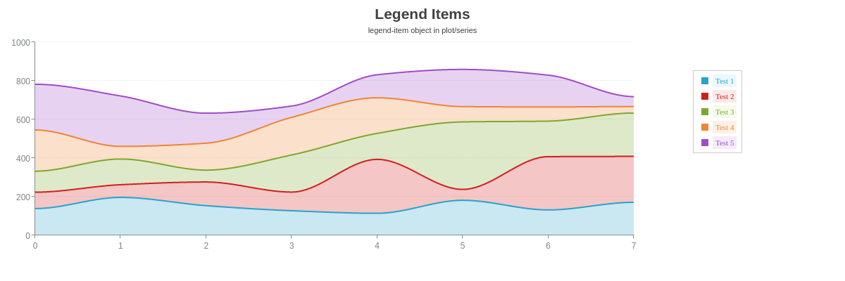
Alternatively, you can use the legend-item object in the plot and/or series objects to set the styling. This option is especially useful when you want to apply series-specific styling. See the following chart, and refer to the Legend-Item JSON page for a full attribute list.
{
  type: "area",
  title: {
    text: "Legend Items"
  },
  subtitle: {
    text: "legend-item object in plot/series",
    'font-weight': "normal"
  },
  legend: {
    layout: "5x1",
    x: "82%",
    y: "25%",
  },
  plot: {
    aspect: "spline",
    stacked: true,
    marker: {
      visible: false
    },
    'legend-item': {
      'font-family': "Georgia"
    }
  },
  plotarea: {
    'margin-right': "25%",
  },
  'scale-y': {
    values: "0:1000:200",
    guide: {
      'line-style': "dotted"
    }
  },
  series: [
    {
      values: [138.6,196.3,153.6,127.4,114.1,181.4,131.5,170.9],
      text: "Test 1",
      'legend-item': {
        'font-color': "#29A2CC",
        'background-color': "#eaf7fb"
      }
    },
    {
      values: [84.8,65.8,122.4,96.6,279.1,56.4,275.9,237.8],
      text: "Test 2",
      'legend-item': {
        'font-color': "#D31E1E",
        'background-color': "#fce9e9"
      }
    },
    {
      values: [108.7,132.9,61.6,192.1,134.5,349.4,183.9,224.4],
      text: "Test 3",
      'legend-item': {
        'font-color': "#7CA82B",
        'background-color': "#f5faeb"
      }
    },
    {
      values: [213.2,65.6,139.5,194.6,184.4,79.2,73.1,33.7],
      text: "Test 4",
      'legend-item': {
        'font-color': "#EF8535",
        'background-color': "#fdf1e7"
      }
    },
    {
      values: [236.6,260.8,155.2,58.7,119.1,192.4,164.8,51.4],
      text: "Test 5",
      'legend-item': {
        'font-color': "#A14BC9",
        'background-color': "#f5ebf9"
      }
    }
  ]
}
Legend Markers
Use the marker object to style the legend markers. You can change the marker type, size, color, and more. Refer to the Legend Markers JSON page for a full attribute list.

{
  type: "area",
  title: {
    text: "Legend Markers"
  },
  subtitle: {
    text: "marker object in legend",
    'font-weight': "normal"
  },
  legend: {
    marker: {
      'background-color': "#ffe6e6",
      'border-width': 1,
      'border-color': "red",
      type: "circle",
      'show-line': true,
      'line-color': "red"
    },
    layout: "5x1",
    x: "82%",
    y: "25%",
  },
  plot: {
    aspect: "spline",
    stacked: true,
    marker: {
      visible: false
    }
  },
  plotarea: {
    'margin-right': "25%",
  },
  'scale-y': {
    values: "0:1000:200",
    guide: {
      'line-style': "dotted"
    }
  },
  series: [
    {
      values: [138.6,196.3,153.6,127.4,114.1,181.4,131.5,170.9],
      text: "Test 1"
    },
    {
      values: [84.8,65.8,122.4,96.6,279.1,56.4,275.9,237.8],
      text: "Test 2"
    },
    {
      values: [108.7,132.9,61.6,192.1,134.5,349.4,183.9,224.4],
      text: "Test 3"
    },
    {
      values: [213.2,65.6,139.5,194.6,184.4,79.2,73.1,33.7],
      text: "Test 4"
    },
    {
      values: [236.6,260.8,155.2,58.7,119.1,192.4,164.8,51.4],
      text: "Test 5"
    }
  ]
}
Alternatively, you can use the legend-marker object in the plot and/or series objects to set the styling. This option is especially useful when you want to apply series-specific styling. See the following chart, and refer to the Legend-Marker JSON page for a full attribute list.

{
  type: "area",
  title: {
    text: "Legend Markers"
  },
  subtitle: {
    text: "legend-marker object in plot/series",
    'font-weight': "normal"
  },
  legend: {
    layout: "5x1",
    x: "82%",
    y: "25%",
  },
  plot: {
    aspect: "spline",
    stacked: true,
    marker: {
      visible: false
    },
    'legend-marker': {
      'show-line': true,
    }
  },
  plotarea: {
    'margin-right': "25%",
  },
  'scale-y': {
    values: "0:1000:200",
    guide: {
      'line-style': "dotted"
    }
  },
  series: [
    {
      values: [138.6,196.3,153.6,127.4,114.1,181.4,131.5,170.9],
      text: "Test 1",
      'legend-marker': {
        type: "square",
        'background-color': "#eaf7fb",
        'border-color': "#29A2CC",
        'border-width':2
      }
    },
    {
      values: [84.8,65.8,122.4,96.6,279.1,56.4,275.9,237.8],
      text: "Test 2",
      'legend-marker': {
        type: "circle",
        'background-color': "#fce9e9",
        'border-color': "#D31E1E",
        'border-width':2
      }
    },
    {
      values: [108.7,132.9,61.6,192.1,134.5,349.4,183.9,224.4],
      text: "Test 3",
      'legend-marker': {
        type: "diamond",
        'background-color': "#f5faeb",
        'border-color': "#7CA82B",
        'border-width':2
      }
    },
    {
      values: [213.2,65.6,139.5,194.6,184.4,79.2,73.1,33.7],
      text: "Test 4",
      'legend-marker': {
        type: "star5",
        'background-color': "#fdf1e7",
        'border-color': "#EF8535",
        'border-width':2
      }
    },
    {
      values: [236.6,260.8,155.2,58.7,119.1,192.4,164.8,51.4],
      text: "Test 5",
      'legend-marker': {
        type: "rpoly5",
        'background-color': "#f5ebf9",
        'border-color': "#A14BC9",
        'border-width':2
      }
    }
  ]
}
Header
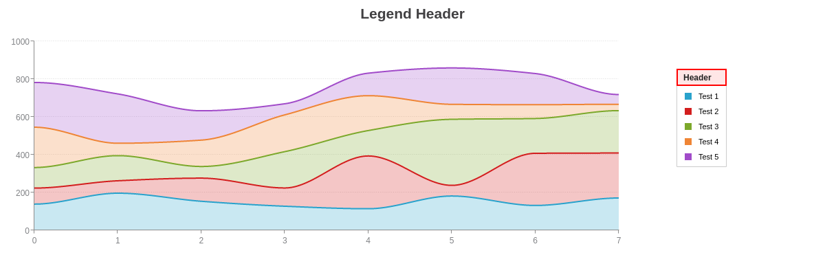
Use the header object to add and style the legend header. Add a text attribute to specify the text you want displayed. Refer to the Legend Header JSON page for a full attribute list.
{
  type: "area",
  title: {
    text: "Legend Header"
  },
  legend: {
    header: {
      text: "Header",
      'background-color': "#ffe6e6",
      'border-left': "2px solid red",
      'border-right': "2px solid red",
      'border-top': "2px solid red",
      'border-bottom': "2px solid red"
    },
    layout: "5x1",
    x: "82%",
    y: "25%",
  },
  plot: {
    aspect: "spline",
    stacked: true,
    marker: {
      visible: false
    }
  },
  plotarea: {
    'margin-right': "25%",
  },
  'scale-y': {
    values: "0:1000:200",
    guide: {
      'line-style': "dotted"
    }
  },
  series: [
    {
      values: [138.6,196.3,153.6,127.4,114.1,181.4,131.5,170.9],
      text: "Test 1"
    },
    {
      values: [84.8,65.8,122.4,96.6,279.1,56.4,275.9,237.8],
      text: "Test 2"
    },
    {
      values: [108.7,132.9,61.6,192.1,134.5,349.4,183.9,224.4],
      text: "Test 3"
    },
    {
      values: [213.2,65.6,139.5,194.6,184.4,79.2,73.1,33.7],
      text: "Test 4"
    },
    {
      values: [236.6,260.8,155.2,58.7,119.1,192.4,164.8,51.4],
      text: "Test 5"
    }
  ]
}
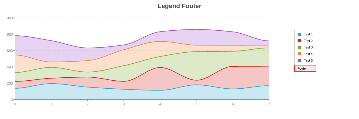
Footer
Use the footer object to add and style the legend footer. Add a text attribute to specify the text you want displayed. Refer to the Legend Footer JSON page for a full attribute list.
{
  type: "area",
  title: {
    text: "Legend Footer"
  },
  legend: {
    'footer': {
      text: "Footer",
      'background-color': "#ffe6e6",
      'border-left': "2px solid red",
      'border-right': "2px solid red",
      'border-top': "2px solid red",
      'border-bottom': "2px solid red"
    },
    layout: "5x1",
    x: "82%",
    y: "25%",
  },
  plot: {
    aspect: "spline",
    stacked: true,
    marker: {
      visible: false
    }
  },
  plotarea: {
    'margin-right': "25%",
  },
  'scale-y': {
    values: "0:1000:200",
    guide: {
      'line-style': "dotted"
    }
  },
  series: [
    {
      values: [138.6,196.3,153.6,127.4,114.1,181.4,131.5,170.9],
      text: "Test 1"
    },
    {
      values: [84.8,65.8,122.4,96.6,279.1,56.4,275.9,237.8],
      text: "Test 2"
    },
    {
      values: [108.7,132.9,61.6,192.1,134.5,349.4,183.9,224.4],
      text: "Test 3"
    },
    {
      values: [213.2,65.6,139.5,194.6,184.4,79.2,73.1,33.7],
      text: "Test 4"
    },
    {
      values: [236.6,260.8,155.2,58.7,119.1,192.4,164.8,51.4],
      text: "Test 5"
    }
  ]
}
Tooltips
Use the tooltip object to add and style the legend tooltips. These are labels that appear when the user hovers over the legend items. Refer to the Legend Tooltips JSON page for a full attribute list. The following tokens can be used with legend tooltips:
| Token | Description |
|---|---|
| %plot-description | The description of the current plot, pulled from the description attribute in the plot/series object. |
| %plot-text %t | The text of the current plot, pulled from the text attribute in the plot/series object. |
The following chart demonstrates how tokens can be used with the legend tooltips.

{
  type: "area",
  title: {
    text: "Legend Tooltips"
  },
  subtitle: {
    text: "Hover over the legend items.",
    'font-weight': "normal"
  },
  legend: {
    tooltip: {
      text: "%t was performed by %plot-description.",
      'background-color': "#ffe6e6",
      'font-color': "red",
      'font-family': "Georgia",
      'border-width': 1,
      'border-color': "red",
      'border-radius': "5px"
    },
    layout: "5x1",
    x: "82%",
    y: "25%",
  },
  plot: {
    aspect: "spline",
    stacked: true,
    marker: {
      visible: false
    }
  },
  plotarea: {
    'margin-right': "25%",
  },
  'scale-y': {
    values: "0:1000:200",
    guide: {
      'line-style': "dotted"
    }
  },
  series: [
    {
      values: [138.6,196.3,153.6,127.4,114.1,181.4,131.5,170.9],
      text: "Test 1",
      description: "Dr. Abel"
    },
    {
      values: [84.8,65.8,122.4,96.6,279.1,56.4,275.9,237.8],
      text: "Test 2",
      description: "Dr. Bernard"
    },
    {
      values: [108.7,132.9,61.6,192.1,134.5,349.4,183.9,224.4],
      text: "Test 3",
      description: "Dr. Chang"
    },
    {
      values: [213.2,65.6,139.5,194.6,184.4,79.2,73.1,33.7],
      text: "Test 4",
      description: "Dr. Diaz"
    },
    {
      values: [236.6,260.8,155.2,58.7,119.1,192.4,164.8,51.4],
      text: "Test 5",
      description: "Dr. Eugene"
    }
  ]
}
Interactive Features
ZingChart supports many interactive legend features, including: legend toggling, dragging, minimization, pagination, scrolling, highlighting, sharing, and more.
Legend Toggling
You can set what happens when the user clicks a legend item/marker. Add a toggle-action attribute to the legend object, and provide one of the following values:
hide(default): hides the selected noderemove: repaints the chart without the selected series (can be used with animation)disabled: disables legend togglingnone: disables legend toggling but fires the event
Tip: To apply the toggling effect to all the _un_selected nodes, press the Shift key and click the legend item/marker. Note that this feature is currently available for desktop/laptop users only.
In the following chart, the toggle setting is set to remove, and so the chart is repainted without the selected node each time the user clicks on a legend item/marker. You can also incorporate animation with this setting. See the following chart.

{
  type: 'pie',
  title: {
    text: "Legend Toggling"
  },
  subtitle: {
    text: "Click the legend items or markers.",
    'font-weight': "normal"
  },
  legend: {
    'toggle-action': "remove", //"hide" (default), "remove", or "disabled"
    x: "75%",
    y: "25%"
  },
  plotarea: {
    'margin-right': "30%",
    'margin-top': "15%"
  },
  plot: {
    'value-box': {
      'font-size':11,
      'font-weight': "normal",
      'offset-r': "50%"
    }
  },
  series: [
    { values: [234]},
    { values: [121]},
    { values: [77]},
    { values: [65]},
    { values: [59]},
    { values: [35]},
    { values: [34]},
    { values: [31]},
    { values: [16]},
    { values: [14]}
  ]
}
To incorporate legend toggling animation, first make sure the toggle-action attribute is set to remove in the legend object. Next, create an animation object in the plot object. Add the following attributes:
on-legend-toggleattribute, and set the value totrueeffectattributemethodattributesequenceattributespeedattribute
Refer to the Animation Tutorial and Animation JSON page for information and demos on the different animation effects, methods, sequences, and speeds.

{
  type: 'pie',
  title: {
    text: "Legend Toggling with Animation"
  },
  subtitle: {
    text: "Reload the chart to view animation.",
    'font-weight': "normal"
  },
  legend: {
    'toggle-action': "remove", //to enable toggling animation
    x: "75%",
    y: "25%"
  },
  plotarea: {
    'margin-right': "30%",
    'margin-top': "15%"
  },
  plot: {
    animation: {
      'on-legend-toggle': true, //to enable toggling animation
      effect: 2, //the animation effect
      method: 0, //how the animation behaves
      sequence: 1, //the order of the animation
      speed: 1000 //the animation speed, in milliseconds
    },
    'value-box': {
      'font-size':11,
      'font-weight': "normal",
      'offset-r': "60%"
    }
  },
  series: [
    { values: [234]},
    { values: [121]},
    { values: [77]},
    { values: [65]},
    { values: [59]},
    { values: [35]},
    { values: [34]},
    { values: [31]},
    { values: [16]},
    { values: [14]}
  ]
}
The toggle-action attribute can also be applied to the item and/or marker object(s). This option is useful when you want to restrict legend toggling to just the items or markers. See the following chart.

{
  type: 'pie',
  title: {
    text: "Legend Toggling"
  },
  subtitle: {
    text: "Click the legend markers (set to hide). (The legend items are set to disabled.)",
    'font-weight': "normal"
  },
  legend: {
    marker: {
      'toggle-action': "hide"
    },
    item: {
      'toggle-action': "disabled"
    },
    x: "75%",
    y: "25%"
  },
  plotarea: {
    'margin-right': "30%",
    'margin-top': "15%"
  },
  plot: {
    'value-box': {
      'font-size':11,
      'font-weight': "normal",
      'offset-r': "50%"
    }
  },
  series: [
    { values: [234]},
    { values: [121]},
    { values: [77]},
    { values: [65]},
    { values: [59]},
    { values: [35]},
    { values: [34]},
    { values: [31]},
    { values: [16]},
    { values: [14]}
  ]
}
Legend Dragging
The legend can be dragged by the header or with a dragging icon. To enable legend dragging, you need to:
- Add a
draggableattribute, and set the value totrue. - Add a
drag-handlerattribute, and set the value toheaderoricon.
Use the header object to style the legend header. Use the icon object to style the dragging icon. Refer to the Legend Header and Legend Icon JSON pages for a full attribute list.

{
  type: 'pie',
  title: {
    text: "Legend Dragging"
  },
  subtitle: {
    text: "Drag the legend around the chart area.",
    'font-weight': "normal"
  },
  legend: {
    'draggable': true, //automatically adds header
    'drag-handler': "icon", //"header" (default) or "icon"
    'icon': {
      'line-color': "red"
    },
    header: {
      'background-color': "#ffe6e6",
      'border-left': "1px solid red",
      'border-right': "1px solid red",
      'border-top': "1px solid red",
      'border-bottom': "1px solid red"
    },
    x: "75%",
    y: "25%"
  },
  plotarea: {
    'margin-right': "30%",
    'margin-top': "15%"
  },
  plot: {
    'value-box': {
      'font-size':11,
      'font-weight': "normal",
      'offset-r': "50%"
    }
  },
  series: [
    { values: [234]},
    { values: [121]},
    { values: [77]},
    { values: [65]},
    { values: [59]},
    { values: [35]},
    { values: [34]},
    { values: [31]},
    { values: [16]},
    { values: [14]}
  ]
}
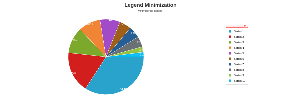
Legend Minimization
To enable legend minimization, add a minimize attribute to the legend object, and set the value to true. Use the icon object to style the minimizing icon. Refer to the Legend Icon JSON page for a full attribute list.
{
  type: 'pie',
  title: {
    text: "Legend Minimization"
  },
  subtitle: {
    text: "Minimize the legend.",
    'font-weight': "normal"
  },
  legend: {
    'minimize': true, //automatically adds header
    'icon': {
      'line-color': "red"
    },
    header: {
      'background-color': "#ffe6e6",
      'border-left': "1px solid red",
      'border-right': "1px solid red",
      'border-top': "1px solid red",
      'border-bottom': "1px solid red"
    },
    x: "75%",
    y: "25%"
  },
  plotarea: {
    'margin-right': "30%",
    'margin-top': "15%"
  },
  plot: {
    'value-box': {
      'font-size':11,
      'font-weight': "normal",
      'offset-r': "50%"
    }
  },
  series: [
    { values: [234]},
    { values: [121]},
    { values: [77]},
    { values: [65]},
    { values: [59]},
    { values: [35]},
    { values: [34]},
    { values: [31]},
    { values: [16]},
    { values: [14]}
  ]
}
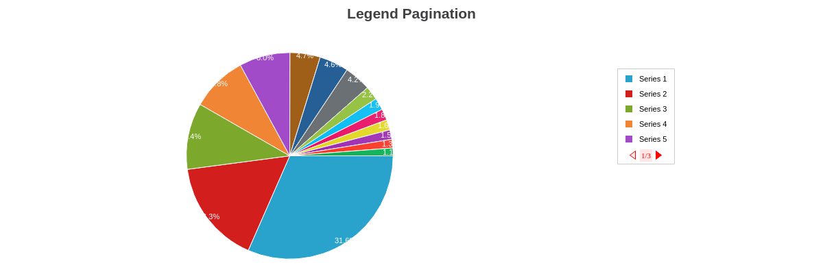
Legend Pagination
To enable legend pagination, you need to:
- Add a
max-itemsattribute, and specify the maximum number of legend items you want displayed. - Add an
overflowattribute, and set the value topage.
You can style the paging arrows and pagination status text with the page-on, page-off, and page-status objects. Refer to the Legend Page-On, Legend Page-Off, and/or Legend Page-Status JSON pages for a full list of attributes.
{
  type: 'pie',
  title: {
    text: "Legend Pagination"
  },
  legend: {
    'max-items':5,
    'overflow': "page",
    'page-on': {
      'background-color': "red",
      'border-width': 1,
      'border-color': "red"
    },
    'page-off': {
      'background-color': "#ffe6e6",
      'border-width': 1,
      'border-color': "red"
    },
    'page-status': {
      'font-color': "red",
      'font-size':11,
      'font-family': "Georgia",
      'background-color': "#ffe6e6",
    },
    x: "75%",
    y: "25%"
  },
  plotarea: {
    'margin-right': "30%",
    'margin-top': "15%"
  },
  plot: {
    'value-box': {
      'font-size':11,
      'font-weight': "normal",
      'offset-r': "50%"
    }
  },
  series: [
    { values: [234]},
    { values: [121]},
    { values: [77]},
    { values: [65]},
    { values: [59]},
    { values: [35]},
    { values: [34]},
    { values: [31]},
    { values: [16]},
    { values: [14]},
    { values: [13]},
    { values: [12]},
    { values: [11]},
    { values: [10]},
    { values: [9]}
  ]
}
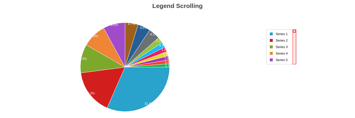
Legend Scrolling
To enable legend scrolling, you need to:
- Add a
max-itemsattribute, and specify the maximum number of legend items you want displayed. - Add an
overflowattribute, and set the value toscroll.
You can style the scroll bar and handle with the bar and handle objects. Refer to the Legend Scroll Bar and Legend Scroll Handle JSON pages for a full list of attributes.
{
  type: 'pie',
  title: {
    text: "Legend Scrolling"
  },
  legend: {
    'max-items':5,
    'overflow': "scroll",
    'scroll': {
      'bar': {
        'background-color': "#ffe6e6",
        'border-left': "1px solid red",
        'border-right': "1px solid red",
        'border-top': "1px solid red",
        'border-bottom': "1px solid red",
      },
      'handle': {
        'background-color': "#ffe6e6",
        'border-left': "2px solid red",
        'border-right': "2px solid red",
        'border-top': "2px solid red",
        'border-bottom': "2px solid red",
        'border-radius': "15px"
      }
    },
    x: "75%",
    y: "25%"
  },
  plotarea: {
    'margin-right': "30%",
    'margin-top': "15%"
  },
  plot: {
    'value-box': {
      'font-size':11,
      'font-weight': "normal",
      'offset-r': "50%"
    }
  },
  series: [
    { values: [234]},
    { values: [121]},
    { values: [77]},
    { values: [65]},
    { values: [59]},
    { values: [35]},
    { values: [34]},
    { values: [31]},
    { values: [16]},
    { values: [14]},
    { values: [13]},
    { values: [12]},
    { values: [11]},
    { values: [10]},
    { values: [9]}
  ]
}
Legend Highlight
To enable legend highlighting, you need to:
- Add a
highlight-plotattribute, and set the value totrue. - Alternatively: add a
highlightattribute to theplotobject, and set the value totrue.
Use the highlight-state and/or highlight-marker objects in the plot object to style how the highlighted legend items appear. Refer to the Legend Highlight State and Legend Highlight Marker JSON pages for a full list of styling attributes.
{
type: "ring",
title: {
text: "Legend Highlight"
},
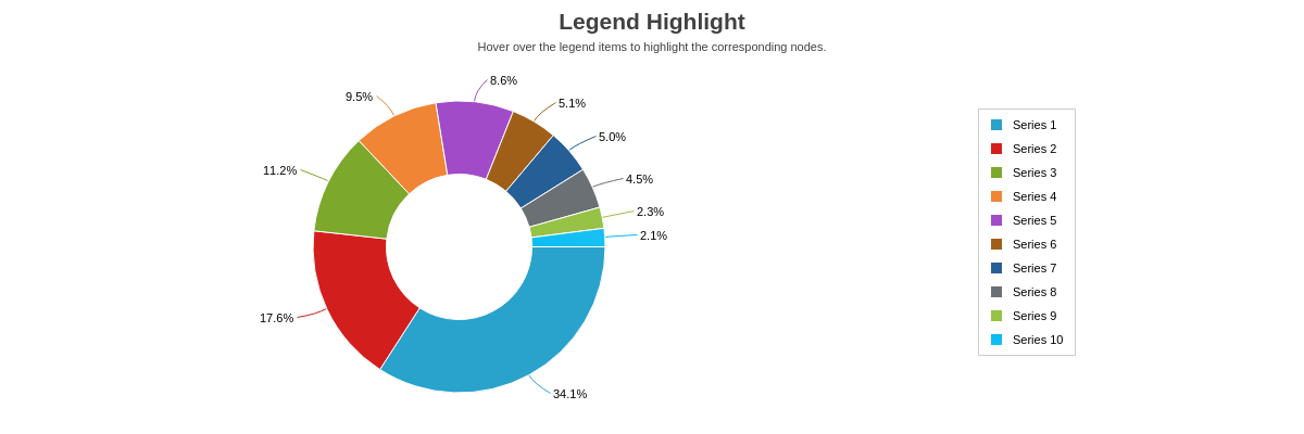
subtitle: {
text: "Hover over the legend items to highlight the corresponding nodes.",
'font-weight': "normal"
},
legend: {
'highlight-plot': true,
x: "75%",
y: "25%"
},
plotarea: {
'margin-right': "30%",
'margin-top': "15%"
},
plot: {
'highlight-state': {
'background-color': "red #ffe6e6",
'border-width': 1,
'border-color': "red",
'line-style': "dotted"
},
slice: "50%",
'value-box': {
placement: "out",
'font-color': "black",
'font-size':11,
'font-weight': "normal"
}
},
series: [
{ values: [234]},
{ values: [121]},
{ values: [77]},
{ values: [65]},
{ values: [59]},
{ values: [35]},
{ values: [34]},
{ values: [31]},
{ values: [16]},
{ values: [14]}
]
}
Shared Legends
To enabled legend sharing between two or more charts, you need to:
- Add a
sharedattribute to each chart'slegendobject, and set the value totrue. - Style the last
legendobject (andlegend-itemand/orlegend-markerobject(s) in plot/series, if applicable), which will apply across all shared charts.
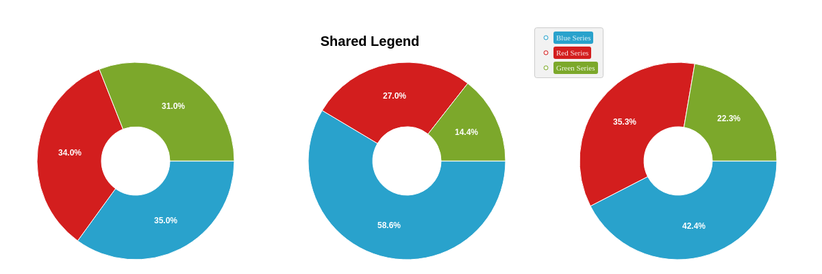
See the following chart, where a shared attribute was added to all three pie charts. The legend positioning and styling was set in the final chart object. For more information on using the graphset array and shared interactions between two or more charts, refer to our documentation on Adding Additional Charts and Shared Interactions.
{
  graphset: [
    {
      labels: [
        {
          text: "Shared Legend",
          'font-size':20,
          'font-weight': "bold",
          height: "20%",
          width: "100%",
          x: "40%",
          y: "20%"
        }
      ]
    },
    { //Chart 1
      type: "ring",
      legend: {
        shared: true
      },
      height: "90%",
      width: "33%",
      x: "0%",
      y: "10%",
      plot: {
        'value-box': {
          'font-size':12
        }
      },
      series: [
        {
          values: [35],
          text: "Blue Series"
        },
        {
          values: [34],
          text: "Red Series"
        },
        {
          values: [31],
          text: "Green Series"
        }
      ]
    },
    { //Chart 2
      type: "ring",
      legend: {
        shared: true
      },
      height: "90%",
      width: "33%",
      x: "33%",
      y: "10%",
      plot: {
        'value-box': {
          'font-size':12
        }
      },
      series: [
        {
          values: [65],
          text: "Blue Series"
        },
        {
          values: [30],
          text: "Red Series"
        },
        {
          values: [16],
          text: "Green Series"
        }
      ]
    },
    { //Chart 3
      type: "ring",
      legend: {
        shared: true,
        x: "65%",
        y: "10%",
        'background-color': "#f2f2f2",
        'border-width': 1,
        'border-color': "#cccccc",
        'border-radius': "3px",
        item: {
          'font-family': "Georgia",
          'border-radius': "3px"
        },
        marker: {
          type: "circle",
          size:3
        }
      },
      height: "90%",
      width: "33%",
      x: "66%",
      y: "10%",
      plot: {
        'value-box': {
          'font-size':12
        }
      },
      series: [
        {
          values: [59],
          text: "Blue Series",
          'legend-item': {
            'background-color': "#29A2CC",
            'font-color': "#eaf7fb"
          },
          'legend-marker': {
            'border-color': "#29A2CC",
            'background-color': "#eaf7fb"
          }
        },
        {
          values: [49],
          text: "Red Series",
          'legend-item': {
            'background-color': "#D31E1E",
            'font-color': "#fce9e9"
          },
          'legend-marker': {
            'border-color': "#D31E1E",
            'background-color': "#fce9e9"
          }
        },
        {
          values: [31],
          text: "Green Series",
          'legend-item': {
            'background-color': "#7CA82B",
            'font-color': "#f5faeb"
          },
          'legend-marker': {
            'border-color': "#7CA82B",
            'background-color': "#f5faeb"
          }
        }
      ]
    }
  ]
}
Bubble Legend Module
Use the bubble-legend module to display an appropriate legend for bubble charts. Refer to the Legend Object JSON page for a full attribute list.
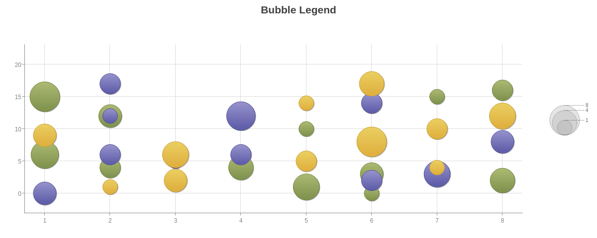
Bubble Legend Usage
To use the bubble-legend module, you first need to load the module using zingchart.loadModules(). Refer to the ZingChart Modules documentation for more information on how to load a module for usage.
Once the module is loaded, add a bubbleLegend object to the root of your chart object.
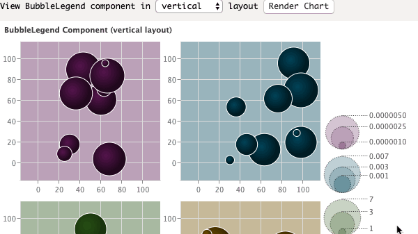
Bubble Legend Options
There are multiple configuration options for the bubble legend object. Refer to the Legend Object JSON page for a full attribute list.
| Value | Description |
|---|---|
| connector | Formats the display of the line connectors between the bubbles on the legend |
| item | Formats the display of the numbers on the legend |
| layout | Sets the layout of the bubble legend to be horizontal ('h') or vertical ('v') |
| margin | Sets the margin of the bubble legend |
| marker | Formats the display of the bubble markers the legend |
| padding | Sets the padding between legend objects |
{
  type: 'bubble',
  title: {
    text: 'Bubble Legend',
  },
  bubbleLegend: {
    layout: 'v',
    marker: {},
    connector: {},
    item: {}
  },
  plotarea: {
    margin: '90px 100px 50px 50px',
    alpha: 0.3,
    backgroundColor: '#fff'
  },
  scaleY: {
    values: '0:20:5'
  },
  tooltip: {
    text: 'Y-Axis Value: %v0<br>X-Axis Value: %v1<br>Bubble Size: %v2',
    textAlign: 'left'
  },
  series: chartData
}
Summary
ZingChart legends are completely customizable. Not only can you label the different series in your chart, showing your users the information they need to know in order to read your chart. You can style the legend as well as the individual legend item and add click-to-hide toggling, scrolling, or paging. For bubble charts, you can use the bubble legend module.
For a full list of legend attributes, see the JSON configuration page.