Bubble Pie Charts
Note: See our Bubble Pie Gallery for inspiration on all the different bubble pie chart possibilities.
Modules Addition
Our bubble pie chart type requires additional modules to properly load. Before getting started, you'll need to add a modules script to your script reference and a load modules method to wrap around your render method(s).
1. Modules Script
In the document <head>, add the following script to your script reference, enclosed in <script> tags:
zingchart.MODULESDIR = "/path/to/modules/folder"
Or, if using CDN:
zingchart.MODULESDIR = "https://cdn.zingchart.com/modules"
Note: If a specific ZingChart version is included in your core script, you should also specify the same version in your modules script (e.g., https://cdn.zingchart.com/2.1.4/modules).
2. Load Modules Method
Next, in the document <body>, add a load modules method that will call your specific chart type. This load modules method will wrap around your render method(s) like so:
zingchart.loadModules('bubblepie', function(){      //Load Modules Method
  zingchart.render({      //Render Method
    id: 'myChart1',
    data: myConfig1,
    height: '400px',
    width: '600px'
  });
  zingchart.render({      //Render Method
    id: 'myChart2',
    data: myConfig2,
    height: '400px',
    width: '600px'
  });
});
Note: Learn more about modules with our ZingChart Modules page.
Bubble Pie Chart Type
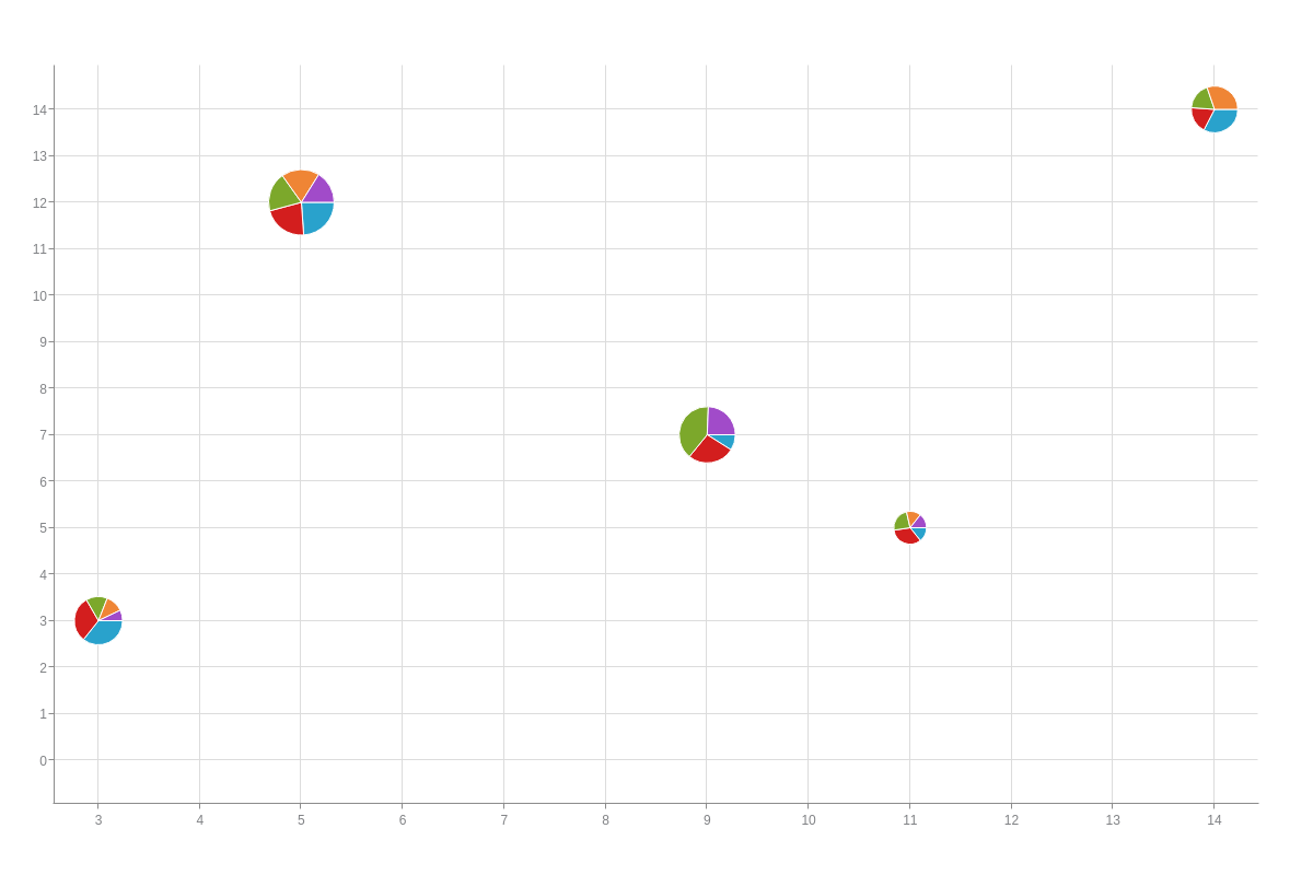
Get started by specifying your chart type. In your chart object, add a type attribute and set the value to bubble-pie. A basic chart with five bubble pies looks like this:
{
  type: 'bubble-pie',   //Specify your chart type.
  plot: {
    values: [         //(1) Provide your bubble chart data.
      [3,3,34],                   //for bubble-pie 1
      [5,12,101],                 //for bubble-pie 2
      [9,7,59],                   //for bubble-pie 3
      [11,5,15],                  //for bubble-pie 4
      [14,14,30]                  //for bubble-pie 5
    ]
  },
  series: [             //(2) Provide your pie chart data.
    {dataV: [15,37,7,3,14]},     //slice1
    {dataV: [13,34,21,7,8]},     //slice2
    {dataV: [6,30,31,5,8]},      //slice3
    {dataV: [5,29,null,3,13]},   //slice4
    {dataV: [3,25,19,3,null]}    //slice5
  ]
}
Bubble and Pie Values Data
Providing the data for your bubble pie chart is a two-step process. First, you have to provide the bubble chart portion (x- and y-axis coordinates and bubble size values). Second, you have to provide the pie chart portion (pie slice values for each bubble pie).
1. Bubble Chart Data
Your bubble chart data will be placed in the plot object. Create a values array and provide your data in the following format:
plot: {
  values: [
    [x1, y1, size1],    //for bubblepie1
    [x2, y2, size2],    //for bubblepie2
    [x3, y3, size3],    //for bubblepie3
    ...,
    [xN, yN, sizeN]     //for bubblepieN
  ]
}
2. Pie Chart Data
Your pie chart data will be placed in the series array. Create a data-v array for each pie slice and provide your data in the following format:
series: [
  {dataV: [slice1-bubblepie1, slice1-bubblepie2, ..., slice1-bubblepieN]}, //for slice1
  {dataV: [slice2-bubblepie1, slice2-bubblepie2, ..., slice2-bubblepieN]}, //for slice2
  {dataV: [slice3-bubblepie1, slice3-bubblepie2, ..., slice3-bubblepieN]}, //for slice3
  ...,
  {dataV: [sliceN-bubblepie1, sliceN-bubblepie2, ..., sliceN-bubblepieN]}  //for sliceN
]
Note: This chart type supports null values for missing or unavailable pie slices. See our example from the Bubble Pie Chart Type section above.
Chart-Specific Properties
Once you've set up your bubble pie chart's data, you can provide your corresponding text and adjust the sizing and/or scaling of your bubble pies.
Bubble and Pie Text
Note: Chart text can later be recalled with the %data-bubble (bubble pie text) and %data-pie (pie slice text) tokens when working with value boxes and tooltips. See our Custom Tokens page to learn more.
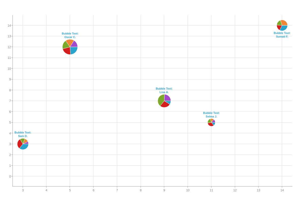
To add text to the bubble chart portion, add a data-bubble array to your plot object. In the array, provide the text for each of your bubbles contained in quotes and separated by a comma (e.g., 'bubblepie1', 'bubblepie2', 'bubblepie3', etc).
{
  type: 'bubble-pie',
  plot: {
    dataBubble: [ 'Sam D.', 'Oscar C.', 'Lisa A.'], //Text for Bubble Pies. Shortened for brevity.
    tooltip: {
      text: 'Pie Text:<br>%data-pie'
    }
  }
}
For the pie chart portion, you'll provide text for each of your slice types ('slice1', 'slice2', 'slice3', etc). In your series array, add a data-pie attribute to each of your series objects. Provide your pie slice text.
{
  series: [
    {
      dataV: [15,37,7,3,14],
      dataPie: 'Apple',                        //Text for Pie Slice 1.
      valueBox: {
        text: 'Bubble Text:<br>%data-bubble',
        placement: 'top'
      }
    },
    {
      dataV: [13,34,21,7,8],
      dataPie: 'Pumpkin'                       //Text for Pie Slice 2.
    },
    {
      dataV: [6,30,31,5,8],
      dataPie: 'Cherry'                        //Text for Pie Slice 3.
    }
  //shortened for brevity- click following bubble pie demo to view full configuration
  ]
}
Minimum and Maximum Size
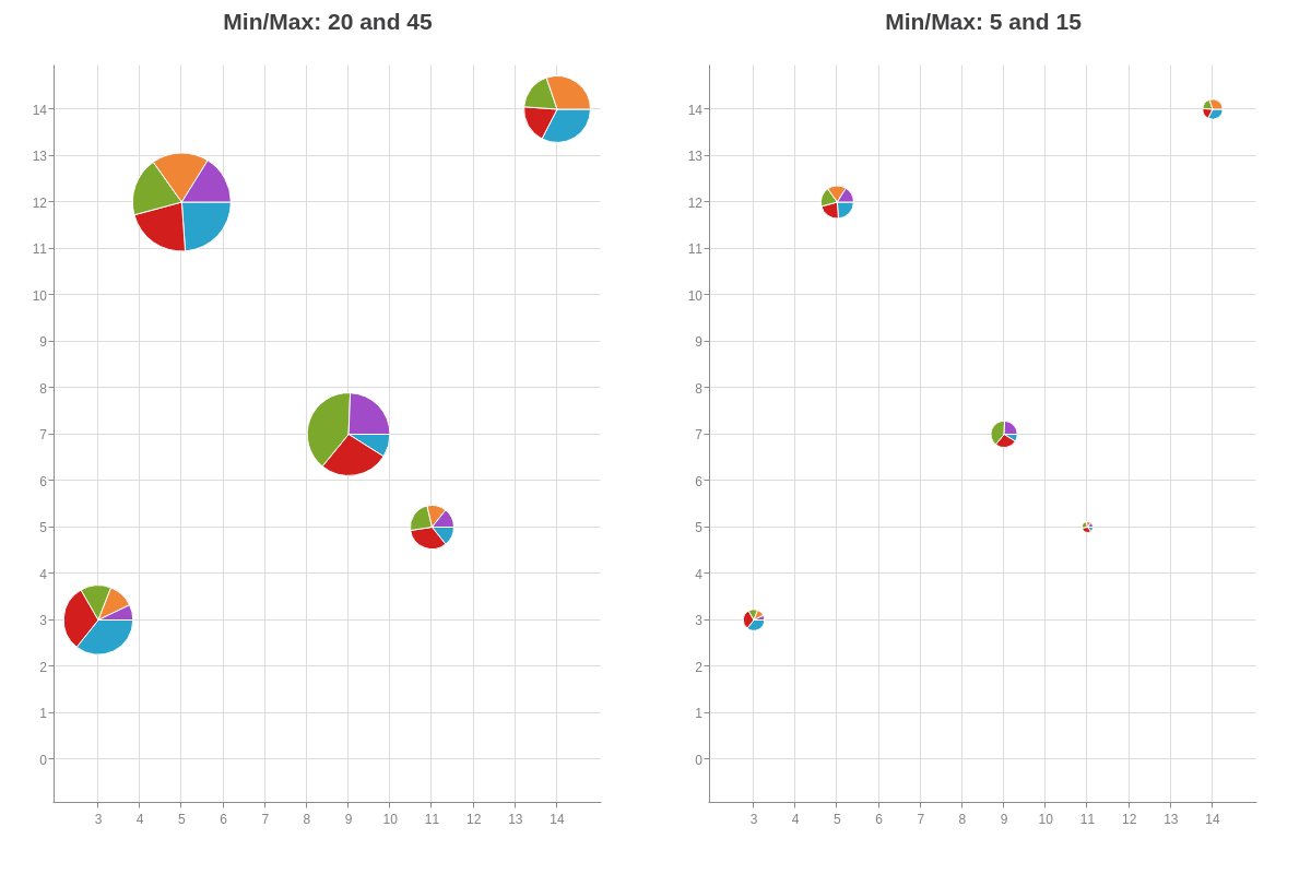
You can modify the appearance of your bubble pie chart by changing the minimum and/or maximum size of your bubbles. Add the min-size and/or max-size attributes to your plot object and provide a pixel value.
{
  type: 'bubble-pie',
  plot: {
    minSize: 20,
    maxSize: 45
  }
}
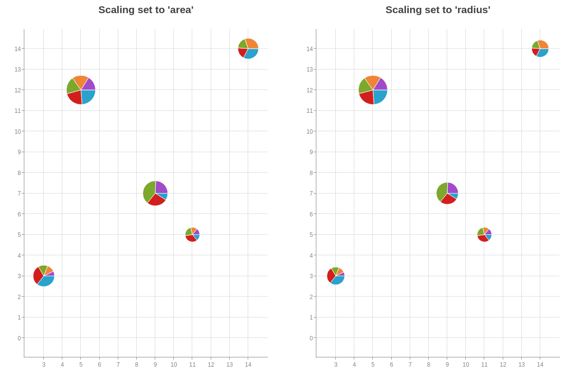
Scaling
Adjust the scaling of your bubble pies with the scaling attribute. Depending on your data range and the number of data values, it can make a difference in how your bubble pies appear in relation to each other.
Place the attribute in your plot object. Provide a value of area (default) or radius (the square root of area).
{
  type: 'bubble-pie',
  plot: {
    scaling: 'area' // or "radius"
  }
}
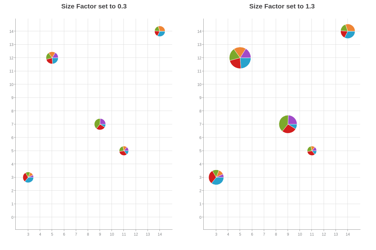
Size Factor
You can also use the size-factor attribute to change the size of your bubble pies. Add the attribute to your plot object and provide a value in relation to 1. Values greater than 1 will increase your bubble size and values less than 1 will decrease it. Note that decimal values should be preceded by a zero.
{
  type: 'bubble-pie',
  plot: {
    sizeFactor: 0.3
  }
}
Further Customization
Further customize your bubble pie chart by configuring your scales, styling your bubble pie slices, and incorporating value boxes, tooltips, and/or a legend.
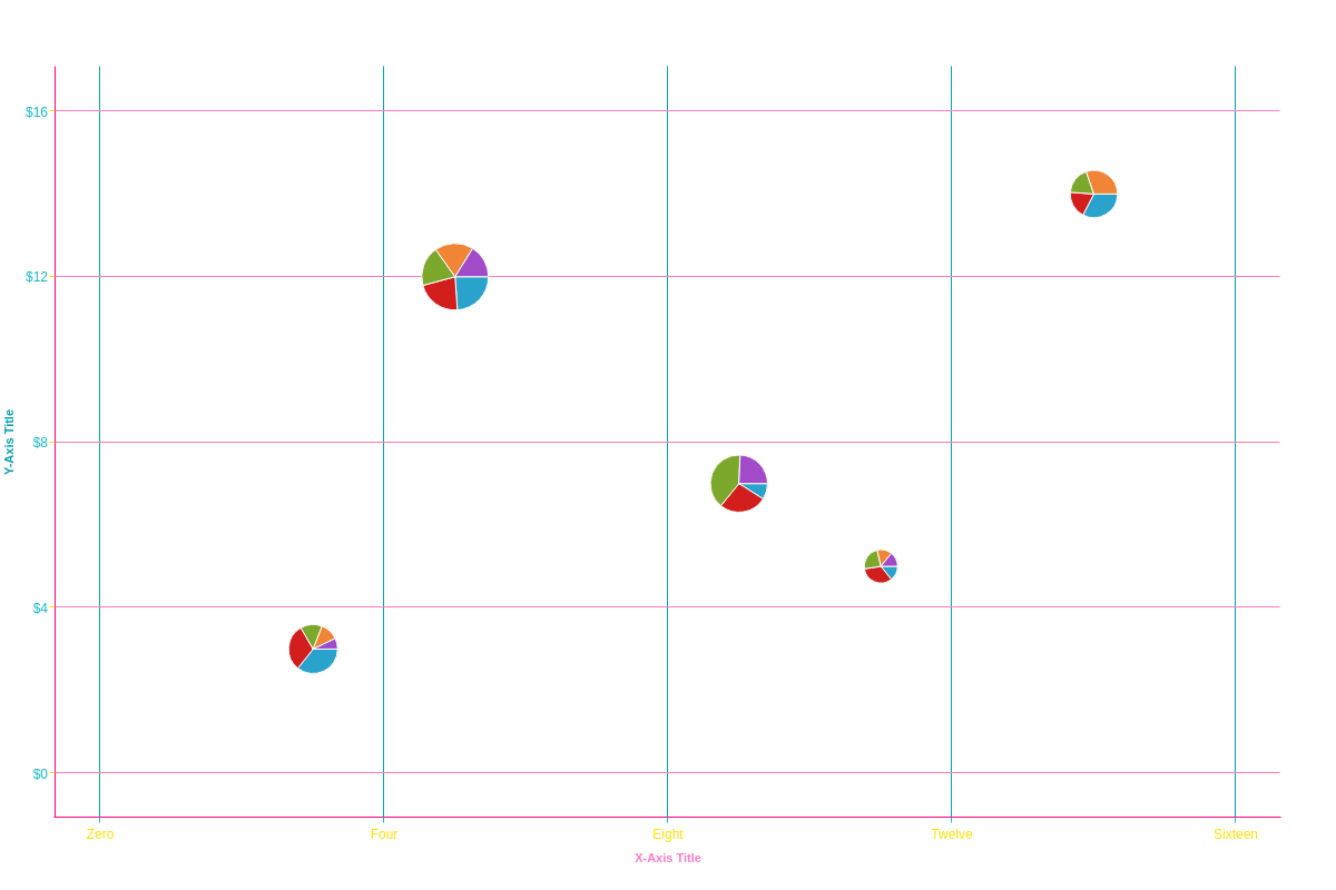
Scale Configuration
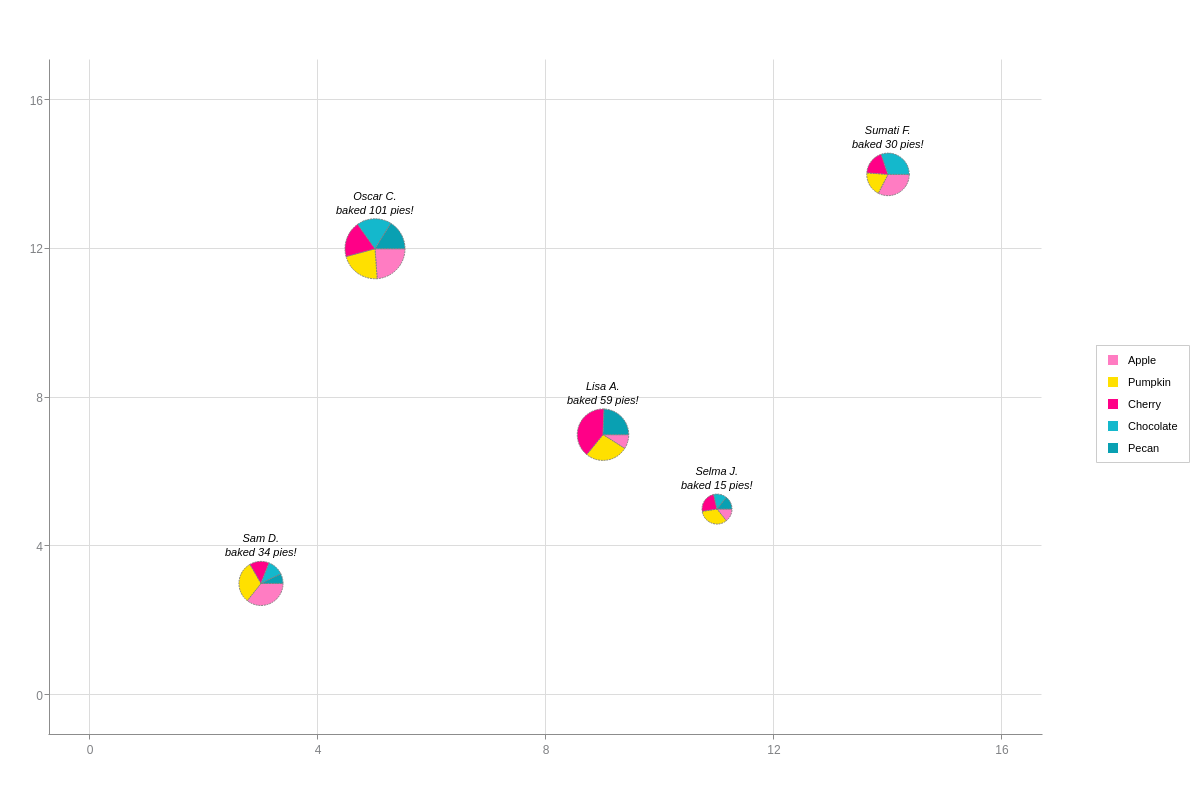
You can specify your minimum, maximum, and step scale values with the values attribute. Add scale labels with the labels array (see scale-x in the following chart). Format your scale values with the format attribute (see scale-y).
Note: See our Scales Tutorial for more comprehensive information about scale configuration. Our JSON Attribute/Syntax pages for scale-x and scale-y offer the complete list of available attributes.
{
  type: 'bubble-pie',
  scaleX: {
    values: '0:16:4', //Min, Max, and Step
    label: {          //Scale Title
      text: 'X-Axis Title',
      fontColor: '#FF7CC2'
    },
    labels: [ 'Zero', 'Four', 'Eight', 'Twelve', 'Sixteen' ],   //Scale Labels
    item: {           //Scale Label Styling
      fontColor: '#FFE000'
    },
    lineColor: '#FF0087',    //Axis Lines
    tick: {           //Tick Marks
      lineColor: '#14B8CC'
    },
    guide: {          //Plot Lines
      lineColor: '#09A0B2'
    }
  },
  scaleY: {
    values: '0:16:4', //Min, Max, and Step
    label: {          //Scale Title
      text: 'Y-Axis Title',
      fontColor: '#09A0B2'
    },
    format: '$%v',    //Scale Value Formatting
    item: {           //Scale Label Styling
      fontColor: '#14B8CC'
    },
    lineColor: '#FF0087',    //Axis Lines
    tick: {           //Tick Marks
      lineColor: '#FFE000'
    },
    guide: {          //Plot Lines
      lineColor: '#FF7CC2'
    }
  }
}
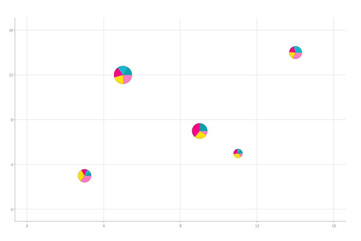
Pie Slice Styling
When styling your pie slices, use marker (for pie slices) and hover-marker (how they appear when a user hovers over a specific slice) objects to make your changes. Similar to how bubble charts style their markers, you can place these objects in the plot object for global changes and in a specific series object for local changes.
Specify the color of your pie slices with the background-color attribute and use attributes such as alpha, border-color, border-width, and line-style for additional styling.
Note: Learn more about markers with our Markers Tutorial. See the Marker and Hover-Marker JSON Attributes/Syntax pages for more attribute options.
{
  type: 'bubble-pie',
  plot: {
    marker: {
      borderColor: 'gray',
      borderWidth: '1px',
      lineStyle: 'dotted'
    },
    hoverMarker: {
      backgroundColor: 'blue',
      borderColor: 'pink',
      borderWidth: '2px',
      lineStyle: 'dashed'
    }
  },
  scaleX: {
    values: '0:16:4'
  },
  scaleY: {
    values: '0:16:4'
  },
  series: [
    {
      dataV: [15,37,7,3,14],
      dataPie: 'Apple',
      marker: {
        backgroundColor: '#FF7CC2'
      }
    },
    {
      dataV: [13,34,21,7,8],
      dataPie: 'Pumpkin',
      marker: {
        backgroundColor: '#FFE000'
      }
    },
    {
      dataV: [6,30,31,5,8],
      dataPie: 'Cherry',
      marker: {
        backgroundColor: '#FF0087'
      }
    }
  ]
}
Note: Remember that in your series array, each data-v array corresponds to slice1 across all your bubble pies, slice2 across all your bubble pies, and so on.
Value Boxes
To include value boxes in your bubble pie chart, create a value-box object. With this chart type, make sure to add the object to your first series object.
Note: Do not add it to your plot object. This will cause value boxes for each pie slice to appear, creating overlapping value boxes.
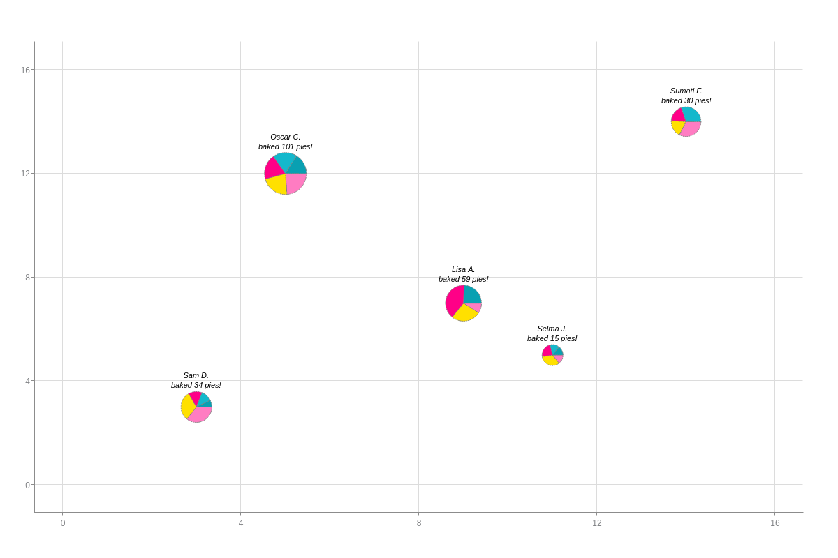
You can specify your value box text with the text attribute. Provide your choice of text and tokens inside a string. The relevant tokens to use in this section are %data-bubble (to show bubble pie text) and %node-size-value (to show bubble pie size).
To specify where your value boxes are placed in relation to your bubble pies, add a placement attribute. Value options are: over (default), top, bottom, left, and right. You can also style your value box text (font-color, font-weight, font-style).
Note: Learn more about value boxes with our Value Boxes Tutorial. For a list of available attributes, see our Value Boxes JSON Attributes/Syntax page.
{
  series: [
    {
      valueBox: {  //Place your value-box object in your first series object.
        text: '%data-bubble<br>baked %node-size-value pies!',
        placement: 'top', //'over' (default), 'top', 'bottom', 'left', or 'right'.
        fontColor: 'black',
        fontWeight: 'normal',
        fontStyle: 'italic'
      }
    }
  ]
}
Tooltips
By default, tooltip text appears in the following format: %t: %data-v (%data-pv%). You can change this by placing a tooltip object in your plot object. Add a text attribute, and then provide your desired combination of text and tokens inside a string. Relevant tokens to use in this section include: %data-pie (to show pie slice text), %data-v (to show pie slice values), and %data-pv (to show pie slice percentages).
Once you've decided your tooltip text, you can apply styling attributes such as font-color, background-color, border-color, border-width, and line-style.
Note: Learn more about tooltips with our Tooltips Tutorial. For more tooltip styling options, see our Tooltips JSON Attributes/Syntax page.
{
  plot: {
    tooltip: {    //Place your "tooltip" object in your "plot" object.
      text: 'And of those %node-size-value pies, %data-v (or %data-pv%) were %data-pie pies!',
      fontColor: 'blue',
      fontFamily: 'Georgia, serif',
      backgroundColor: 'white',
      borderColor: 'pink',
      borderWidth: '2px',
      lineStyle: 'dashed'
    }
  }
}

Legend
To include a legend in your bubble pie chart, add a legend object. Make sure that your pie slice text properly displays by inserting an item object. Add a text attribute, and then provide a value of %data-pie. You can specify where your legend is placed by using the align (left, center, or right) and vertical-align (top, middle, or bottom) attributes.
Note: Learn more about legends with our Legend Tutorial. See our Legend JSON Attributes/Syntax page for more information on legend styling and customization.
{
  legend: {
    item: {
      text: '%data-pie'
    },
    align: 'right',
    verticalAlign: 'middle'
  }
}
