Pie Charts
Overview
These chart types can then be modified to appear as:
- Exploded
- Semicircle Donut
Note: We also offer two pie chart module variations: the nested pie chart and the bubble pie chart.
Note: See our Pie Chart Gallery for inspiration on all the different pie chart possibilities.
Pie Chart Types
To specify the chart type, add a type attribute to the chart object and provide one of the following values: navpie, pie, pie3d, ring, or ring3d. This section also explains how to create small multiples and exploded pie charts.
Note: Learn more about how to create 3D charts with our 3D Charts Tutorial.
Pie Chart
Our standard pie chart is specified by the pie value. Without further modification, here is how the default pie chart appears:
{
  type: 'pie'
}

Nav Pie Chart
Our navpie pie chart groups pie slices that fall under a specified threshold into a single pie slice and turns that slice into a drilldown pie chart. To create one, first add a graphset array. Inside, add the type attribute with navpie as its value. Next, add an options object and use the threshold attribute to specify a threshold value. To style the back-button that appears after you drill down, use the back object.
}
  graphset: [
    {
      type: 'navpie',
      options: {
        threshold: '15%',
        others: {
          backgroundColor: '#999 #333'
        },
        slice: 0.65,
        back: {
          padding: 10,
          fontWeight: 'bold',
          color: '#fff',
          fontSize: 12,
          border: '3px solid #47a',
          borderRadius: 9,
          backgroundColor: '#369',
          shadow: true,
          shadowAlpha: 0.5
        }
      },
    }
  ]
}

Donut Chart
The donut chart (also known as a doughnut chart) is specified by the ring value. It’s a pie chart with a hole in the center (the donut ring or hole), which by default is sized to be 0.35, or 35% of the pie’s radius.
Note: You can modify the donut ring size. Create a plot object and insert a slice attribute. Specify your desired ring size as a percentage or pixel value.
{
  type: ring,
  title: {
    text: "Donut Chart"
  },
  plot: {
    //Use the "slice" attribute to adjust the size of the donut ring.
  },

Semicircle Donut Chart
The donut chart can also be modified into a semicircle donut chart (aka semicircle pie). Commonly used in dashboards, the main advantage of the semicircle donut chart is that it displays the same amount of data while only using half the space.
To create one, you'll need to add a scaleR object. Set refAngle and aperture to 180.
{
  type : 'ring',
  scaleR : {
    // Set to half ring
    refAngle : 180,
    aperture : 180
  },
}
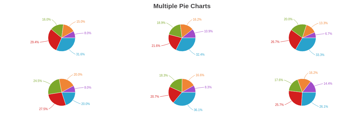
Small Multiples
You can create small multiples (also known as a trellis chart) using our different pie chart types. While small multiples are generally created by using a layout attribute (to organize the columns and rows) and the graphset array (to contain the charts), there is a shortcut method that allows you to create multiple pie charts in a single chart object.
To create multiple pie charts, you need to:
-
Add a
scaleobject -
Use the
layoutattribute to specify how many columns and rows the pie charts should be organized into (e.g.,1x2would equal one column with two rows and2x3would equal two columns with three rows).
When providing your data, each values array corresponds to a pie slice (or node). With multiple pie charts, assign your values in the following format:
series: [
  { values: [pie1Slice1, pie2Slice1, pie3Slice1, ..., pieNSlice1]},
  { values: [pie1Slice2, pie2Slice2, pie3Slice2, ..., pieNSlice2]},
  ...,
  { values: [pie1SliceN, pie2SliceN, pie3SliceN, ..., pieNSliceN]}
]
See the following chart. Note that in addition to the layout, you can modify the size of all of the charts by adding a size-factorattribute to the scale object and providing a decimal or percentage value.
{
  type: 'pie', //'pie', "pie3d", ring:", or ring:3d"
  title: {
    text: "Multiple Pie Charts"
  },
  scale: {
    layout: "2x3", //specify the layout by rows and columns
    'size-factor':0.5 //provide a decimal or percentage value
  },
  plot: {
    'value-box': {
      'font-size':10,
      'font-weight': "normal",
      placement: "out"
    }
  },
  series: [
    { values: [59,60,50,40,61,58]},
    { values: [55,40,40,55,35,57]},
    { values: [30,35,30,49,31,39]},
    { values: [28,30,20,40,28,36]},
    { values: [15,20,10,16,14,32]}
  ]
}
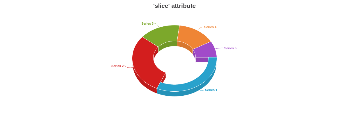
Exploded Pie Chart
You can create an exploded pie chart look (slices display as pulled away from the overall pie) using any of our pie chart types. In the plot and/or series object(s), add an offset-r attribute with a numeric or percentage value. Higher values will pull slices farther from the center of the overall pie.
Note that alternatively, the attribute offset can be used to achieve the same effect.
Note: Exploded pie charts only displays slices pulled from the overall chart. To have slices detached from the overall chart, you'll use the detached attribute discussed further below in the Chart-Specific Properties section.
{
  type: "pie3d", //'pie', "pie3d", ring:", or ring:3d"
  plot: {
    'offset-r': "25%" // provide percentage or numeric value
    // offset: "25%"  // alternatively, `offset` can be used
  },

}

Data
Provide your pie chart data in the series array.
Pie Data
In the series array, assign a value to each values object. Each value corresponds to a slice in the pie.
series: [
  { values: [slice1]},
  { values: [slice2]},
  { values: [slice3]},
  ...,
  { values: [sliceN]}
]
Note: You can have ZingChart automatically order your pie slices from largest to smallest. Create a plot object and add a layoutattribute. Set the value to auto. (This attribute also sets the pie chart’s default reference angle to 12 o'clock, or zero degrees. For more information, see the Reference Angle section below.)
Small Multiples Data
When creating pie chart small multiples (or a trellis chart) via the pie chart-specific shortcut method, each values object will still correspond to a specific slice. However, the object will contain the values for that particular slice for all of the pie charts.
series: [
  { values: [pie1Slice1, pie2Slice1, pie3Slice1, ..., pieNSlice1]},
  { values: [pie1Slice2, pie2Slice2, pie3Slice2, ..., pieNSlice2]},
  { values: [pie1Slice3, pie2Slice3, pie3Slice3, ..., pieNSlice3]},
  ...,
  { values: [pie1SliceN, pie2SliceN, pie3SliceN, ..., pieNSliceN]}
]
Note: You must also specify the layout of your small multiples by creating a scale object and adding a layoutattribute. See the above Pie Chart Small Multiples section for more information.
Chart-Specific Properties
Once you've provided your pie chart type and data, you can configure the chart's elements such as offset, donut ring size, how pie slices are detached and/or clicked, and more.
Donut Ring Size
Use the slice attribute to create and/or modify the size of the donut ring. The attribute can be applied globally in the plot object or locally in the applicable series object. Provide the ring size as a percentage or pixel value.
{
  plot: {
    slice: "50%" //applied globally
  },
  series: [
    {
      values: [59],
      slice: "80%" //applied locally
    },
    { values: [55]},
    { values: [30]},
    { values: [28]},
    { values: [15]}
  ]
}
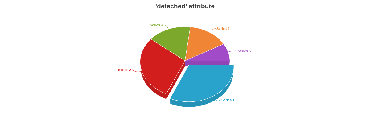
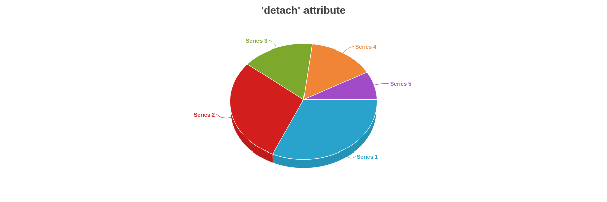
Detached Slices
Use the detached attribute to set whether or not the pie slice(s) is detached when the chart loads. The attribute can be applied globally in the plot object or locally in the series object. Clicking the detached slice will reattach it to the pie.
Note: This attribute differs from the offset-r attribute discussed in the Exploded Pie Chart section above, which does not reattach the slice to the pie.
{
  series: [
    {
      values: [59],
      'detached': true
    },
    { values: [55]},
    { values: [30]},
    { values: [28]},
    { values: [15]}
  ]
}
Clicked Slices
Use the detach attribute with a true or false value to specify whether or not the slice detaches from the pie when clicked on. The slices are set to detach by default. The attribute can be applied globally in the plot object or locally in the series object.
{
  type: "pie3d",
  plot: {
    'detach': false
  }
}
Show Zero
The showZero attributes renders zero values within series as 1px to visibly show zero values.
{
  type: 'pie',
  plot: {
    showZero: true,
  }
}

Totals
The showZero attributes sets the total value of the pie chart.
{
  type: 'pie',
  plot: {
    totals: [100],
  }
}
Further Customization
Further customize your pie chart by configuring your scales, styling your borders, backgrounds, and pie slice shapes, and incorporating value boxes, tooltips, and/or a legend.
Scale Configuration
Use the scale-r object to set the pie chart's aperture and reference angle. Use the scale object to set the size factor.
Aperture
The pie chart is sized to 360 degrees (i.e., a circle) by default. You can change this by adding an aperture attribute to the scale-r object. Provide the desired aperture value (e.g., 180 is a half circle, 90 is a quarter circle, and so on).
{
  'scale-r': {
    aperture:300
  }

Reference Angle
The reference angle (or starting point) of our pie charts is set to 90 degrees (or 3 o'clock) by default. Add a ref-angleattribute to the scale-r object to change this. Provide the desired value, keeping in mind that the value is relative to the default starting angle. For example, providing a value of 270 would make the first pie slice appear at the 12 o'clock position. See the following chart:
{
  'scale-r': {
    'ref-angle':270 //relative to the starting 90 degree position.
  }
}

Alternatively, you can have the reference angle automatically set to zero and have the pie slices automatically sorted by size, from largest to smallest, by adding a layout': "auto attribute to the plot object. See the following chart:
{
  plot: {
    layout: "auto" //to order pie slices by size and have reference angle start at zero.
  }
}

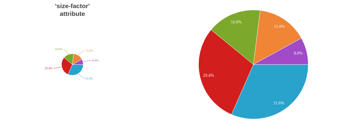
Size Factor
The size of the pie chart can be modified by adding a size-factor attribute to the scale object. Provide a decimal or percentage value, and note that you can provide values greater or less than 1.0 or 100%.
{
  scale: {
    'size-factor':0.2
  },
}
See following chart for a comparison of 'size-factor':0.2 with 'size-factor':1.01:
Plot/Series Styling
You can style the backgrounds and borders of the pie slices using the background-color, border-width, border-color, line-style, alpha, and other styling attributes. Attributes can be applied globally in the plot object or locally in the series object.
Note: Refer to the Plot/Series Styling Tutorial and the Plot/Series JSON page for more information and a full attribute list.
{
  plot: {
    'border-width': 1,
    'border-color': "#cccccc",
    'line-style': "dotted",
  },
  series: [
    {
      values: [234],
      'background-color': "#cc0000"
    },
    {
      values: [121],
      'background-color': "#ff3300"
    }
  ]
}

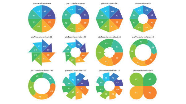
Pie Transform
Use the pieTransform attribute to transform the shape of your pie chart slices. Available transforms are: none (default), bite, callout,flat, fold, flow, and droplet. bite, callout, flow, and fold accept numeric or percentage values.
{
  plot: {
    pieTransform: 'fold=20' // 'bite=20' | 'callout=20' | 'flow=20' | 'fold=20' | 'droplet' | 'flat'
  }
}
The following demo illustrates the different options available for styling your pie chart slices:
Tokens
Tokens (or string interpolation) are highly useful when customizing pie chart tooltips and value boxes. Commonly used pie chart tokens include:
| Token | Description |
|---|---|
| %data-_____ | Format for custom tokens. The custom token is defined in the plot or series object as an attribute or array using the "data" prefix (e.g., data-year). It is then recalled in the tooltips or value boxes (e.g., %data-year). |
| %node-percent-value %npv | The percentage value of the pie slice (node) relative to the entire pie (sum of all nodes) Demo |
| %node-value %v | The pie slice (node) value |
| %pie-total-value | The sum of all the pie slice (node) values Demo |
| %plot-description | The description of the current plot, pulled from the description attribute in the plot/series object |
| %plot-text %t | The text of the current plot, pulled from the text attribute in the plot/series object |
Note: Refer to the Tokens Tutorial for a full list of available tokens.
Tooltips
Enable and style tooltips with a tooltip object in the plot object. Customize the tooltip's text with a text attribute and then provide your desired combination of text and tokens inside a string.
Note: Refer to the Tooltips Tutorial and Tooltips JSON page for more information and a full attribute list.
{
  plot: {
    tooltip: {
      text: "%t: %v (%npv%)",
      'font-color': "black",
      'font-family': "Georgia",
      'text-alpha':1,
      'background-color': "white",
      alpha:0.7,
      'border-width': 1,
      'border-color': "#cccccc",
      'line-style': "dotted",
      'border-radius': "10px",
      padding: "10%",
      placement: "node:out" //"node:out" or "node:center"
    },
}

Value Boxes
To enable and style value boxes, create a value-box object in the plot object. You can then customize the text, placement (in, out, center), and styling. You can also incorporate rules for when value boxes appear.
Note: Refer to the Value Boxes Tutorial and the Value Boxes JSON page for more information and a full attribute list.
In the following chart, rules were used to place value boxes in or out of the chart based on their value.
Note: Value boxes placed outside the pie slices are automatically drawn with connecting lines. To remove them, add a connected attribute and set the value to false.
{
  plot: {
    'value-box': {
      text: "%v",
      'font-size':12,
      'font-family': "Georgia",
      'font-weight': "normal",
      rules: [
        {
          rule: "%v > 50",
          placement: "in",
          'offset-r': "50%",
          'font-color': "white",
        },
        {
          rule: "%v <= 50",
          placement: "out",
          'font-color': "gray",
        }
      ]
    }
}

When the value boxes are placed out (placement: 'out'), the connector lines can be customized through the connector object.
{
  plot: {
    valueBox: {
      placement: 'out',
      connector: {
        lineStyle: 'dashed',
        lineSegmentSize: '5px'
      },
    },
  },
}

Alternatively, you can center the value box text, which is a useful option on donut charts.
Note: When the placement is set to center, the value boxes all collect in the middle of the chart, overlapping each other. To stop this, specify how you want the value box text formatted and styled. Next, use rules to turn off the visibility of all but the first value box.
{
  type: "ring",
  plot: {
    'value-box': {
      text: "%pie-total-value",
      placement: "center",
      'font-color': "black",
      'font-size':35,
      'font-family': "Georgia",
      'font-weight': "normal",
      rules: [
        {
          rule: "%p != 0",
          visible: false
        }
      ]
    },
  }
}

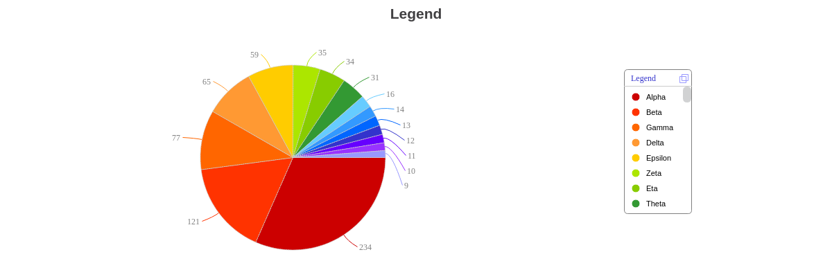
Legend
Enable and style a legend by creating a legend object in your chart object.
Note: Refer to the Legend Tutorial and the Legend JSON page for detailed instructions and a full attribute list.
{
  legend: {
    x: "75%",
    y: "25%",
    'border-width': 1,
    'border-color': "gray",
    'border-radius': "5px",
    header: {
      text: "Legend",
      'font-family': "Georgia",
      'font-size':12,
      'font-color': "#3333cc",
      'font-weight': "normal"
    },
    marker: {
      type: "circle"
    },
    'toggle-action': "remove",
    'minimize': true,
    'icon': {
      'line-color': "#9999ff"
    },
    'max-items':8,
    'overflow': "scroll"
  }
}
Interactive Charts
ZingChart supports interactive pie chart features such as animation, shared legends, drilldown, and more.
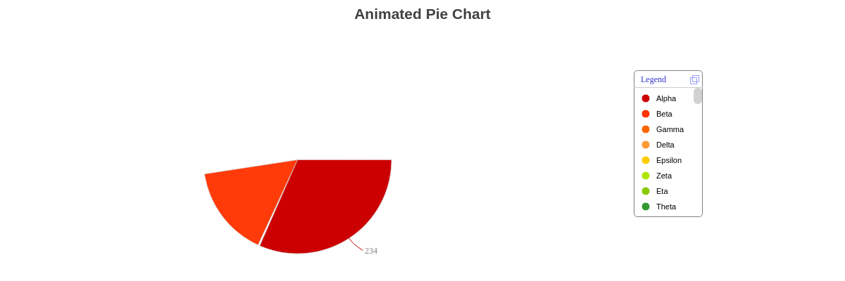
Animation
You can create animated pie charts by adding an animation object to the plot object.
Note: Learn more about adding animation to your chart with our Animation Tutorial.
{
  "plot": {
    "animation": {
      "on-legend-toggle": true, //set to true to show animation and false to turn off
      "effect": 5,
      "method": 1,
      "sequence": 1,
      "speed": 1
    }
  }
}
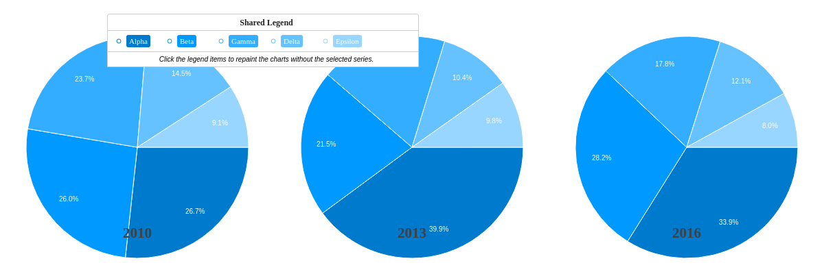
Shared Legend
When working with pie chart small multiples, you can create a shared legend that allows users to interact with all charts simultaneously. In the legend object, add a shared attribute with a true value.
Note: Learn more about shared legends with our Shared Interactions Tutorial.
{
  "legend": {
    "shared": true
  },
}
Drilldown
You can create drilldown charts using chart types such as pie and bar.
Note: Learn more about drilldown features with our Drilldown Tutorial.