Venn Diagrams
Note: See our Venn Diagram Gallery for inspiration on all the different Venn diagram possibilities.
Venn Diagram Chart Type
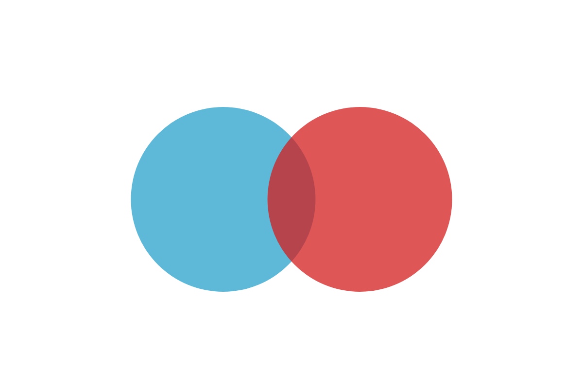
To get started, add a type attribute to your chart object. Set the value to venn. A diagram chart with two sets (or circles) looks like this:
{
  type: "venn",
  series: [
    {
      values: [100],
      join: [15]
    },
    {
      values: [100],
      join: [15]
    }
  ]
}
Data
We support two or three sets (circles) per chart. First, create a series array of objects. In the array, each object corresponds to a set (or circle).
Each set requires a values array, where you'll provide the value of the circle, and a join array, where you'll provide the value of the joined or intersecting area between the current and next circle. For Set 1, the join is in relation to Set 2; for Set 2, the join is in relation to Set 3; and for Set 3, the join is in relation to Set 1.
See the chart below, which contains three sets:
{
  type: "venn",
  series: [
    { //Set 1
      values: [100],
      join: [15]
    },
    { //Set 2
      values: [100],
      join: [15]
    },
    { //Set 3
      values: [100],
      join: [15]
    }
  ]
}

Chart-Specific Properties
Value boxes are an integral part of venn diagram charts. Utilizing tokens and section-specific objects, you can provide text for each set, the joined area between each set, and the shared area between all three sets (only applicable for three set).
Value Boxes
What distinguishes venn diagram value boxes from other chart types at ZingChart is that in addition to the text provided for each set, you can also provide text for each joined area and (if applicable) the shared area between all three sets.
Start with the value-box object, which can be placed in the plot and/or specific series objects depending on whether you are applying the changes to all sets or to a specific set.
Note: Learn more about value boxes with our Value Boxes Tutorial. For a list of available attributes, see our Value Boxes JSON Attributes/Syntax page.
Sets
In your value-box object, add a text attribute. Provide your desired text and tokens inside a string. This attribute corresponds to the value box for each set/circle.
{
  type: "venn",
  plot: {
    'value-box': {
      text: "%t" //Value box text for sets.
    }
  },
  series: [
    {
      values: [100],
      join: [15],
      text: "Set One"
    },
  ]
}

joined Object
In your value-box object, create a joined object. Place your joined text attribute and other styling attributes in this object. Remember that the joined area is where two sets intersect.
{
  type: "venn",
  plot: {
    'value-box': {
      text: '',
      joined: { //Value box text and styling for joined areas.
        text: "Joined"
      }
    }
  },
}

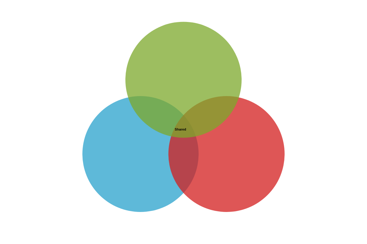
shared Object
The shared object is only applicable when creating diagrams that contain three sets. (With two-set diagrams, the joined area between Set 1 and 2 essentially acts as both the joined and shared area.)
In your value-box object, create a shared object. Your shared text attribute and any styling attributes will be placed in this object.
{
  type: "venn",
  plot: {
    'value-box': {
      text: '',
      shared: { //Text and styling for shared area, if applicable.
        text: "Shared"
      }
    }
  },
}
Tokens
With value boxes, you can incorporate tokens to display your set, joined, and shared (if applicable) values. The set/circle values are represented by the standard %v token. Joined values are represented by the %joined-value token. The shared value, if applicable, is represented by the %shared-value token.
Note: For more information on tokens, see our ZingChart Tokens Tutorial.
{
  type: "venn",
  plot: {
    'value-box': {
      text: "%t:<br>%v",
      joined: {
        text: "Joined:<br>%joined-value"
      },
      shared: {
        text: "Shared:<br>%shared-value"
      }
    }
  },
}

Further Customization
Further customize your charts by incorporating styling, tooltips, and/or a legend.
Chart Styling
You can modify the appearance of your chart by styling the circles and value boxes, as well as adding titles. Use styling attributes such as background-color, border-color, border-width, alpha, and more.
To apply changes to a specific set, place the attributes inside the applicable series object. For global application, place the attributes inside the plot object. To style your value boxes, place the relevant attributes inside the value-box object.
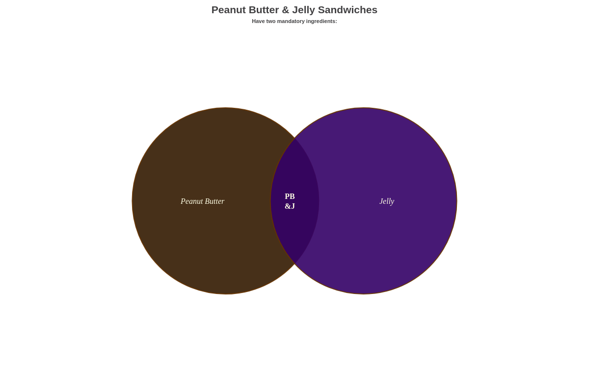
To include a title or subtitle, add a title or subtitle object. Use the text attribute to provide the relevant text, and any desired styling attributes.
Note: Browse our plot / series JSON Configuration page for more styling attribute options.
{
  type: "venn",
  title: {
    text: "Peanut Butter & Jelly Sandwiches"
  },
  subtitle: {
    text: "Have two mandatory ingredients: "
  },
  plot: {
    'value-box': {
      text: "%t",
      'font-family': "Tahoma",
      'font-color': "#ffffe5",
      'font-size': 16,
      'font-weight': "normal",
      'font-style': "italic",
      joined: {
        text: "PB<br>&J",
        'font-weight': "bold",
        'font-style': "normal"
      }
    }
  },
  series: [
    {
      values: [100],
      join: [15],
      text: "Peanut Butter",
      'background-color': "#331a00",
      alpha: 0.9,
      'border-color': "#663300",
      'border-width': 2
    },
    {
      values: [100],
      join: [15],
      text: "Jelly",
      'background-color': "#330066",
      alpha: 0.9,
      'border-color': "#663300",
      'border-width': 2
    }
  ]
}
Tooltips
You can customize your tooltips to display your choice of tokens and text. Add a tooltip object to the plot object. To specify your tooltip text, add a text attribute.
You can add any desired styling attributes to the object as well. This chart type has several venn diagram-specific tokens. In addition to the standard %v (to show set/circle values) and %t (to show set/circle text), we have %joined-value (to show the joined value between two sets) and %shared-value (to show the shared value between three sets, if applicable).
Specifically relevant to tooltips, we also have %paired-node-value and %paired-plot-text tokens to show, when hovering over a particular set, the value or text of the next set. With Set 1, its pair is 2; with Set 2, its pair is 3; and with Set 3, its pair is 1.
Note: See the ZingChart Tokens Tutorial page for more on tokens. For more on tooltips, see the tooltip JSON Attributes/Syntax page.

{
  plot: {
    tooltip: {
      text: "%t holds a value of %v.<br><br>It is paired with %paired-plot-text, which also holds a value of %paired-node-value.<br>Their joined value is %joined-value.<br><br>And the shared value for this is %shared-value."
    },
  }
}
Legend
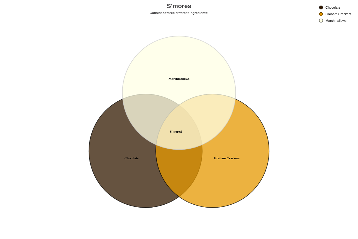
Legends allow you to provide additional information as to what each circle represents. In your chart object, add a legend object. You can change the placement of your legend by using the align (left, center, or right) and vertical-align (top, middle, or bottom) attributes.
You can also style the markers that represent each series by including a marker object.
Note: For more information, read our Tutorial on Legends or browse our Legend JSON Attributes/Syntax page.
{
  legend: {
    align: "right", //"left", "center", or "right"
    'vertical-align': "top", //"top", "middle", "bottom"
    marker: {
      type: "circle",
      'border-color': "black"
    }
  },
}