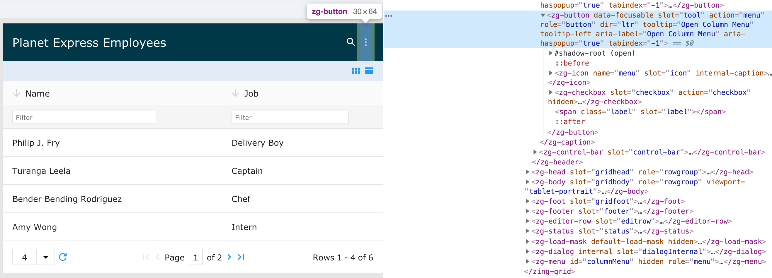
<zg-button>
Interactive Storybook Playground
The <zg-button> tag is a web component that encapsulates grid actions within a single component. The benefit to this is you can place the component anywhere in the markup and it will just work. For example, you do not have to add event listers for a reload button; you just add the button.

Related Web Components
Attributes
You can add a custom, styled button that can be used both for internal grid-related action and for user-specific actions. Some buttons are automatically inserted when a feature that uses it is enabled, like pager. Other <zg-button>s are inserted manually by the user.
Example Usage
<zing-grid>
  <zg-button disabled action="reload"></zg-button>
</zing-grid>
CSS Variables
<zg-button> can be styled with CSS variables, like so:
:root {
  --zg-button-color: red;
}
Below is a list of all the associated --zg-button CSS variables. Check out the full list of CSS variables or our Styling Basics guide to learn more about styling the grid.
CSS Selector
<zg-button> can be styled by common CSS selectors, like so:
zg-button {
  background: red;
}
Slots
<zg-button> contains placeholders to allow adding markup inside the component.
<!-- Default slot -->
<zg-button>Slotted Content</zg-button>

<!-- Named slot -->
<zg-button><span slot="label">Slotted Content</span></zg-button>
Below is a list of all the associated ZGButton slots. Check out the full list of slots.