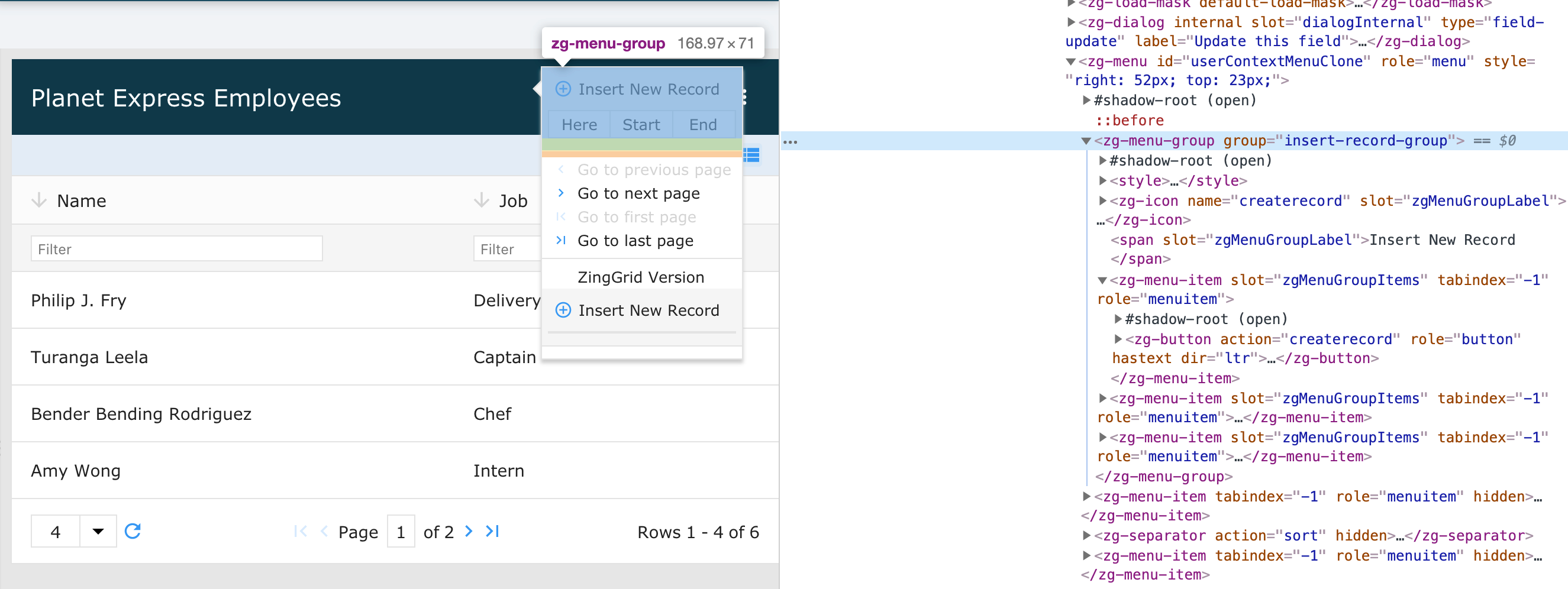
<zg-menu-group>
Interactive Storybook Playground
The <zg-menu-group> tag is a web component group wrapper for multiple menu items found in the context
menu. ZingGrid dynamically creates this element to hold various <zg-menu-item> tags together for organizational purposes. As it is a visual element, it can be styled via CSS.

Related Web Components
Attributes
There are no attributes available for the <zg-menu-group> web component.
CSS Variables
There are no CSS variables available for the <zg-menu-group> web component.
CSS Selector
<zg-menu-group> can be styled with common CSS variables using the zg-menu-group selector, like so:
zg-menu-group {
  background: red;
}
CSS Shadow Parts
<zg-menu-group> exposed elements within the shadow can be styled by CSS shadow parts, like so:
zg-menu-group::part(group) {
  background-color: red;
}
Below is a list of all the associated ZGMenuGroup shadow parts. Check out the full list of CSS shadow parts or our Styling Basics guide to learn more about styling the grid.
Slots
<zg-menu-group> contains placeholders to allow adding markup inside the component.
<zg-menu-group><span slot="zgMenuGroupLabel">Slotted Content</span></zg-menu-group>
Below is a list of all the associated ZGMenuGroup slots. Check out the full list of slots.