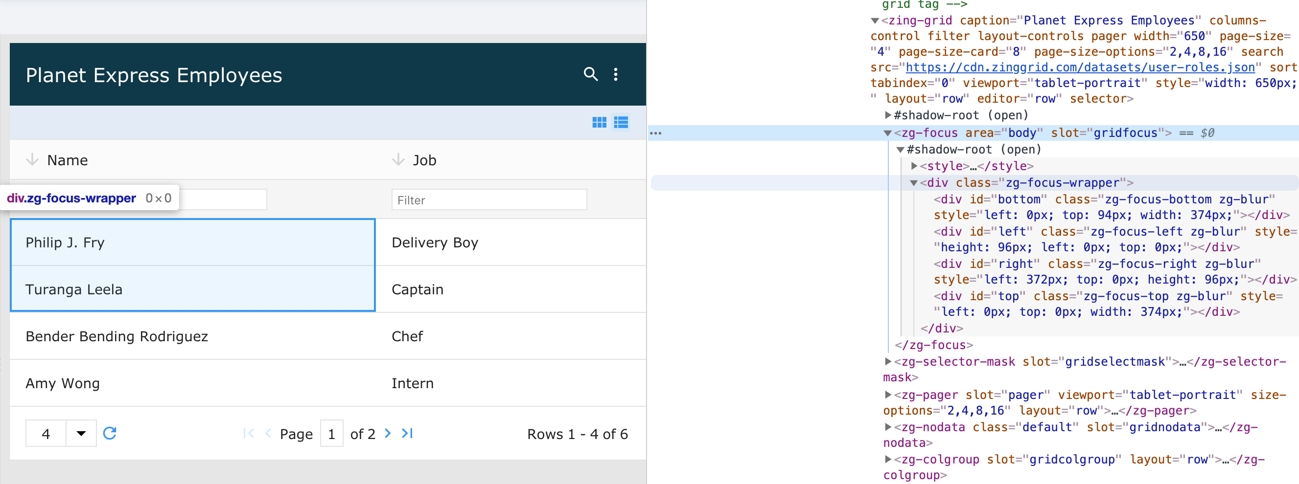
<zg-focus>
Interactive Storybook Playground
The <zg-focus> tag is a web component that is used as a container for the focus of cell(s) and used as a
CSS target for styling by the developer. The <zg-focus> web component should not be accessed specifically beyond styling.

Related Web Components
Usage
The <zg-focus> element is a generated element added to <zing-grid> when the selector attribute is defined.
<zing-grid selector
  src="https://cdn.zinggrid.com/datasets/user-roles.json">
</zing-grid>
Attributes
There are no attributes available for the <zg-focus> web component.
CSS Variables
<zg-focus> can be styled with CSS variables, like so:
:root {
--zg-focus-border-top: 1px solid red;
}
Below is a list of all the associated --zg-focus CSS variables. Check out the full list of CSS variables or our Styling Basics guide to learn more about styling the grid.
CSS Selector
<zg-focus> can be styled by common CSS selectors, like so:
zg-focus {
  border: 1px solid red;
}
CSS Shadow Parts
<zg-focus> exposed elements within the shadow can be styled by CSS shadow parts, like so:
zg-focus::part(focus) {
  background-color: red;
}
Below is a list of all the associated ZGFocus shadow parts. Check out the full list of CSS shadow parts or our Styling Basics guide to learn more about styling the grid.
Slots
There are no slots available for the <zg-focus> web component.