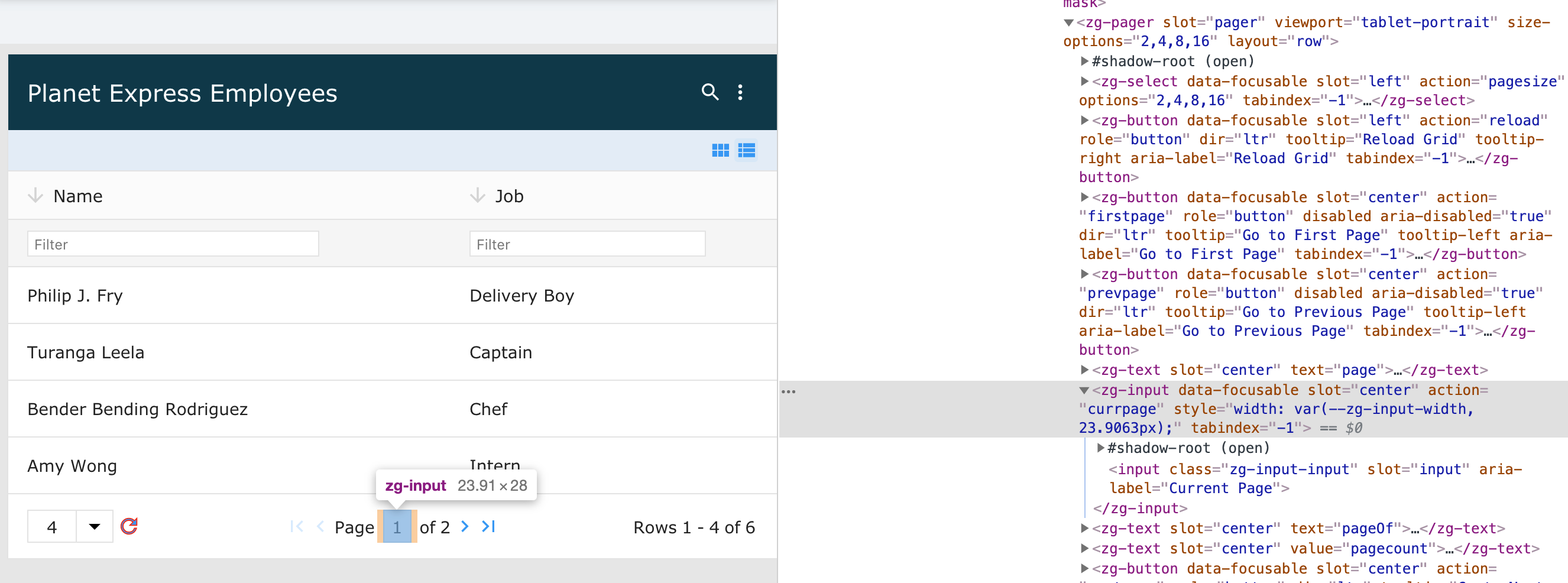
<zg-input>
Interactive Storybook Playground
The <zg-input> tag is a web component that contains input fields with native ZingGrid-specific functionality.

Related Web Components
Usage
A <zg-input> tag can be set via the action attribute.
<zing-grid src="https://cdn.zinggrid.com/datasets/user-roles.json">
  <zg-caption>
    <zg-input action="currpage"></zg-input>
    <zg-input value="hello world"></zg-input>
  </zg-caption>
</zing-grid>
Attributes
There are a couple attributes to help position the <zg-input> element in the grid and align the text within the <zg-input>.
CSS Variables
<zg-input> can be styled with CSS variables, like so:
:root {
  --zg-input-background: red;
}
Below is a list of all the associated --zg-input CSS variables. Check out the full list of CSS variables or our Styling Basics guide to learn more about styling the grid.
CSS Selector
<zg-input> can be styled by common CSS selectors, like so:
zg-input {
  background: red;
}
CSS Shadow Parts
<zg-input> exposed elements within the shadow can be styled by CSS shadow parts, like so:
zg-input::part(input) {
  background-color: red;
}
Below is a list of all the associated ZGInput shadow parts. Check out the full list of CSS shadow parts or our Styling Basics guide to learn more about styling the grid.
Slots
<zg-input> contains placeholders to allow adding markup inside the component.
<!-- Default slot -->
<zg-input>Slotted Content</zg-input>

<!-- Named slot -->
<zg-input><span slot="input">Slotted Content</span></zg-input>
Below is a list of all the associated ZGInput slots. Check out the full list of slots.