<zg-head>
Interactive Storybook Playground
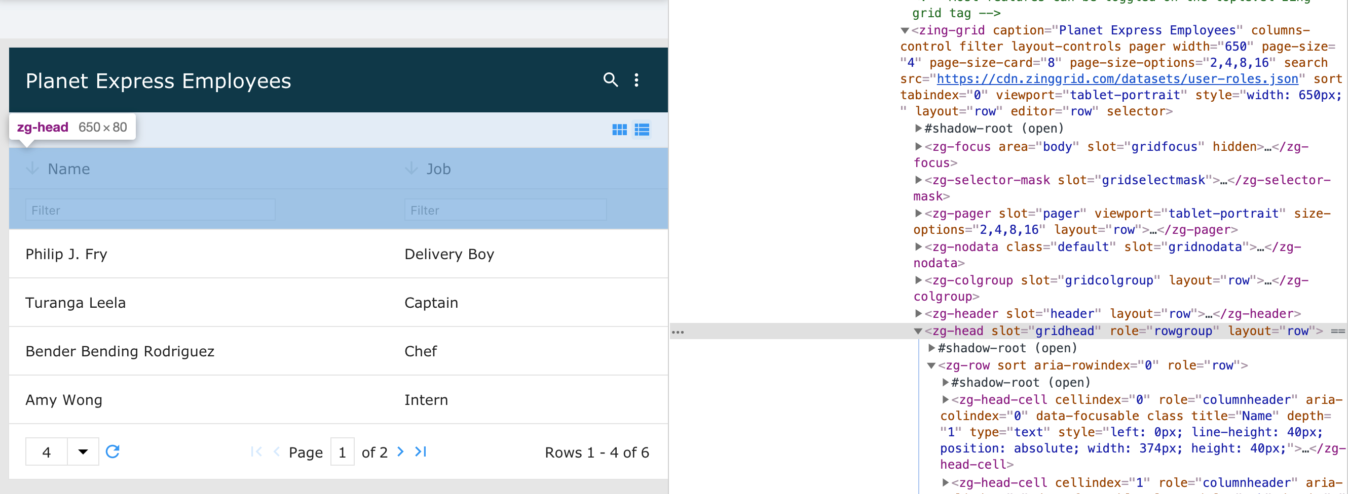
The <zg-head> tag is a web component that is a container for the head cells (<zg-head-cell>) of the data grid specified via the head-cell attribute found on <zg-column> tags.
The tag roughly corresponds to the idea of the <thead> tag used in HTML tables. The <zg-head> tag is generated by the library and should not be placed in a grid manually by a user. Instead, it is used as a styling target for CSS.

Related Web Components
Usage
The <zg-head> element is a generated element added to <zing-grid>.
<zing-grid src="https://cdn.zinggrid.com/datasets/user-roles.json">
</zing-grid>
Attributes
There are no attributes available for the <zg-head> web component.
CSS Variables
<zg-head> can be styled with CSS variables, like so:
:root {
--zg-head-background: red;
}
Below is a list of all the associated --zg-head CSS variables. Check out the full list of CSS variables or our Styling Basics guide to learn more about styling the grid.
CSS Selector
<zg-head> can be styled by common CSS selectors, like so:
zg-head {
  background: red;
}
Slots
There are no slots available for the <zg-head> web component.