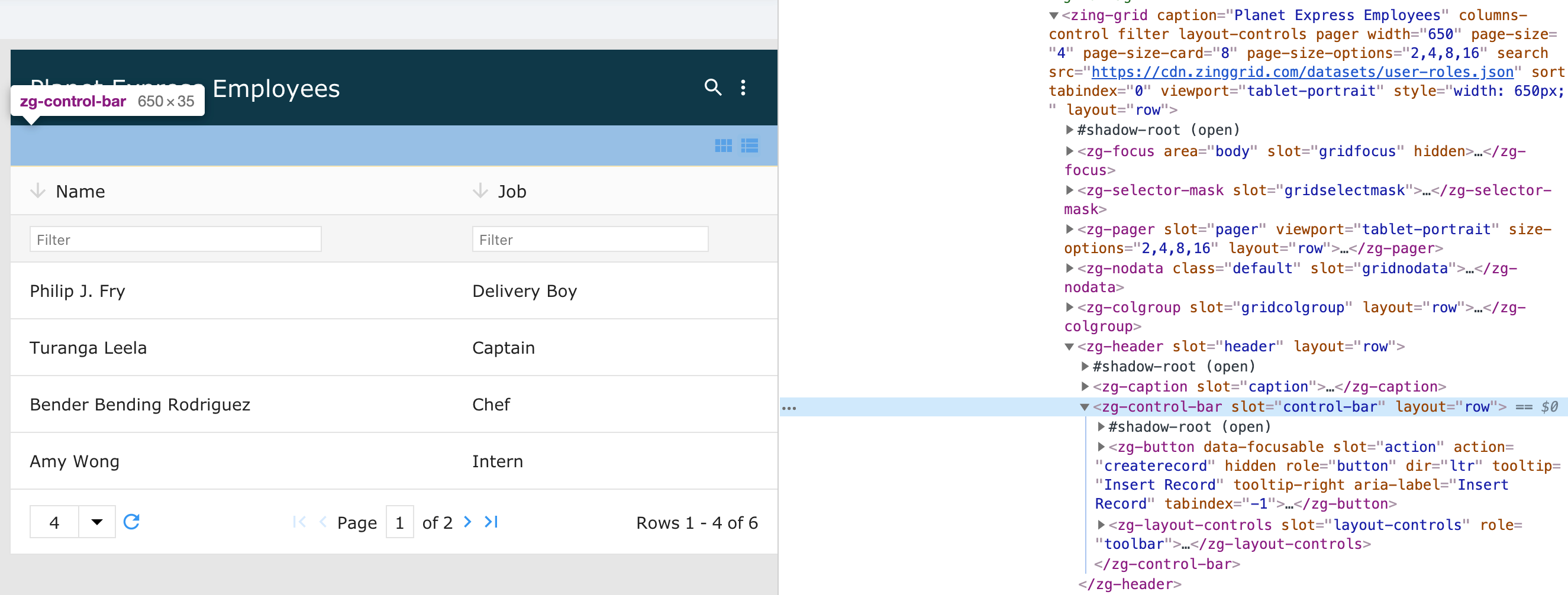
<zg-control-bar>
Interactive Storybook Playground
The <zg-control-bar> tag is a web component that serves as a container for the grid's interface controls. As a generated element, the user should not manually place <zg-control-bar> in their grid. However, users can style the component's internal elements using CSS.

Related Web Components
Usage
TO trigger the <zg-control-bar> to show, you'll need to also enable layout-controls, like so:
<zing-grid
  layout-controls
  src="https://cdn.zinggrid.com/datasets/user-roles.json">
</zing-grid>
After <zg-control-bar> is initialized, you must define some styling, like so:
zing-grid {
  --zg-control-bar-border: 10px solid #EF5350;
}
Attributes
There are no attributes available for the <zg-control-bar> web component.
CSS Variables
<zg-control-bar> can be styled with CSS variables, like so:
:root {
--zg-control-bar-padding: 2rem;
}
Below is a list of all the associated --zg-control-bar CSS variables. Check out the full list of CSS variables or our Styling Basics guide to learn more about styling the grid.
CSS Selector
<zg-control-bar> can be styled by common CSS selectors, like so:
zg-control-bar {
  border: 1px solid red;
}
CSS Shadow Parts
<zg-control-bar> exposed elements within the shadow can be styled by CSS shadow parts, like so:
zg-control-bar::part(control-bar) {
  background-color: red;
}
Below is a list of all the associated ZGControlBar shadow parts. Check out the full list of CSS shadow parts or our Styling Basics guide to learn more about styling the grid.
Slots
There are no slots available for the <zg-control-bar> web component.