<zg-menu>
Interactive Storybook Playground
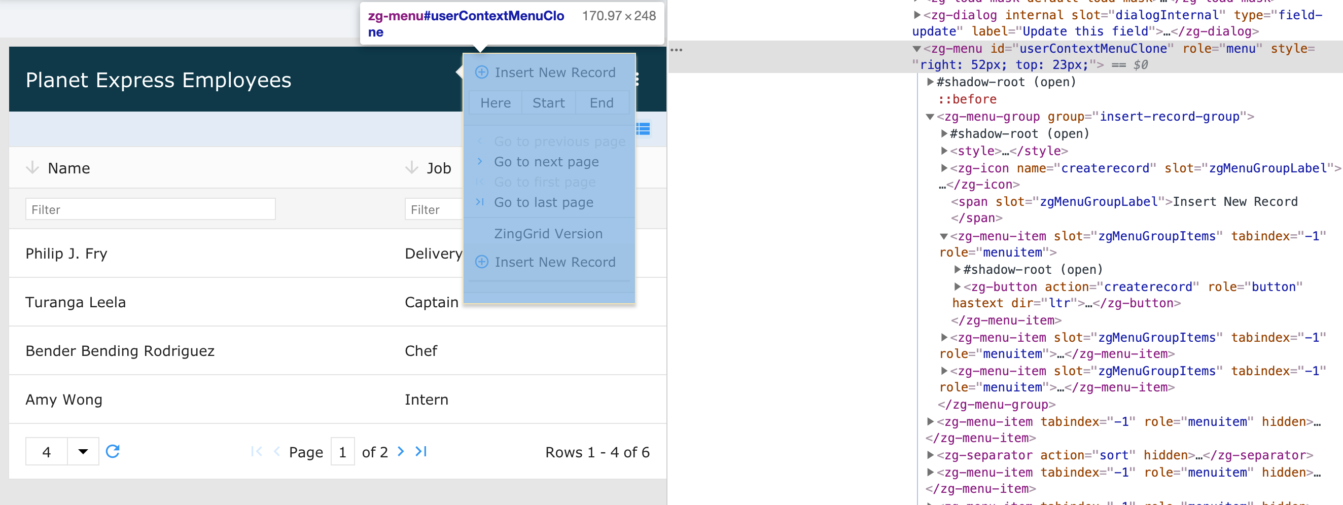
The <zg-menu> tag is a web component container for a custom menu that can be used as a context or static (aka "Hamburger") menu. The element is generally dynamically inserted by the library, but the developer can append or overwrite the menu with custom entries. The element can be styled using CSS variables and CSS selectors.

Related Web Components
Usage
The <zg-menu> is always available through right-click interactions on the grid. A <zg-menu> tag can be manually inserted inside the grid as slotted content, like so:
<zing-grid
  src="https://cdn.zinggrid.com/datasets/user-roles.json"
  context-menu="mymenu">
  <zg-menu id="mymenu" replace="true">
    <p>This content replaces the built-in menu</p>
  </zg-menu>
</zing-grid>
You can also add a default menu via the static-menu attribute, like so:
<zing-grid
  src="https://cdn.zinggrid.com/datasets/user-roles.json"
  static-menu>
</zing-grid>
Attributes
There are a couple attributes to add and replace <zg-menu>.
CSS Variables
<zg-menu> can be styled with CSS variables, like so:
:root {
  --zg-menu-font-size: 1.2rem;
}
Below is a list of all the associated --zg-menu CSS variables. Check out the full list of CSS variables or our Styling Basics guide to learn more about styling the grid.
CSS Selector
<zg-menu> can be styled by common CSS selectors, like so:
zg-menu {
  background: red;
}
CSS Shadow Parts
<zg-menu> exposed elements within the shadow can be styled by CSS shadow parts, like so:
zg-menu::part(menu) {
  background-color: red;
}
Below is a list of all the associated ZGMenu shadow parts. Check out the full list of CSS shadow parts or our Styling Basics guide to learn more about styling the grid.
Slots
<zg-menu> contains placeholders to allow adding markup inside the component.
<zg-menu>Slotted Content</zg-menu>
Below is a list of all the associated ZGMenu slots. Check out the full list of slots.