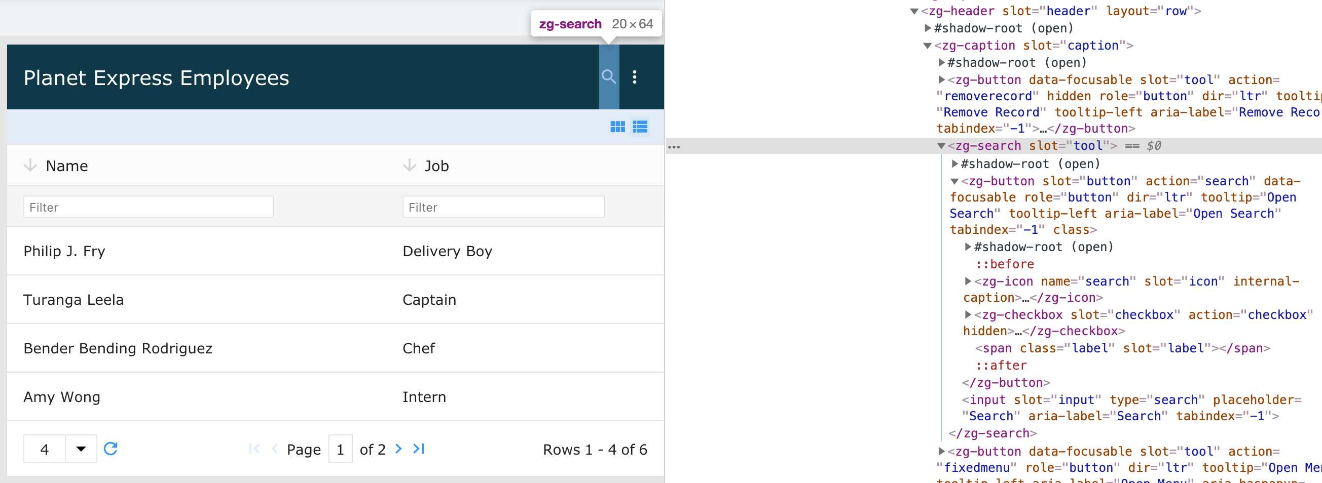
<zg-search>
Interactive Storybook Playground
The <zg-search> tag is a web component that is used to encapsulate the interface component necessary to search the grid. The element is added dynamically when search is specified and should not be directly inserted by the user. The search bar is styleable via CSS variables or the zg-search CSS selector.

Related Web Components
Usage
A <zg-search> tag can be triggered by adding the search attribute on the <zing-grid> tag, like so:
<zing-grid search
  src="https://cdn.zinggrid.com/datasets/user-roles.json">
</zing-grid>
Attributes
There are no attributes available for the <zg-search> web component.
CSS Variables
<zg-search> can be styled with CSS variables, like so:
:root {
  --zg-search-background: red;
}
Below is a list of all the associated --zg-search CSS variables. Check out the full list of CSS variables or our Styling Basics guide to learn more about styling the grid.
CSS Selector
<zg-search> can be styled by common CSS selectors, like so:
zg-search {
  background: red;
}
CSS Shadow Parts
<zg-search> exposed elements within the shadow can be styled by CSS shadow parts, like so:
zg-search::part(search) {
  background-color: red;
}
Below is a list of all the associated ZGSearch shadow parts. Check out the full list of CSS shadow parts or our Styling Basics guide to learn more about styling the grid.
Slots
There are no slots available for the <zg-search> web component.