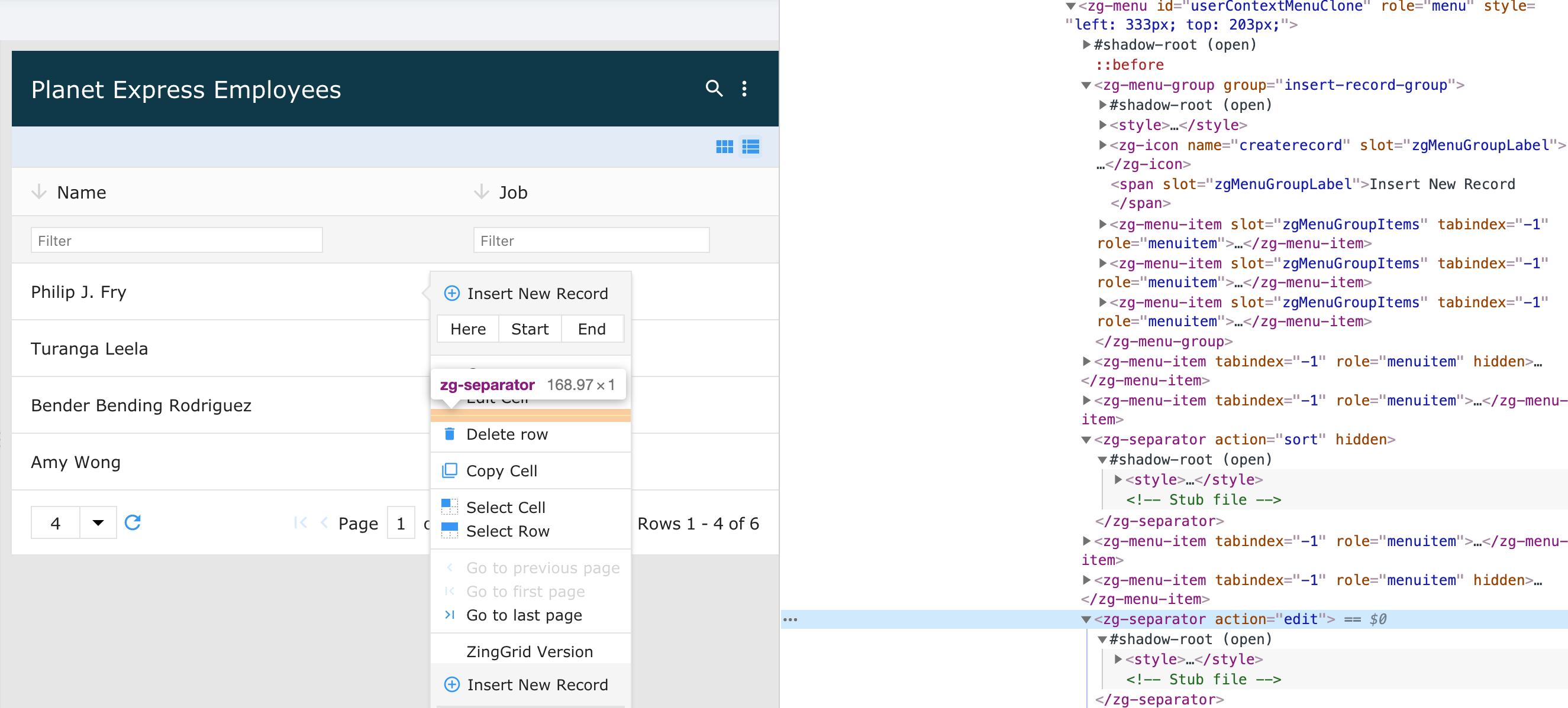
<zg-separator>
Interactive Storybook Playground
The <zg-separator> tag is a web component that specifies the horizontal bar in the <zg-menu> to separate
items. The <zg-separator> element is created dynamically and should not be manually inserted by users. The separator is styleable via CSS variables or the zg-separator CSS selector.

Related Web Components
Usage
To show the <zg-separator>, the user must first enable the menu. <zg-menu> is always available through right-click interactions on the grid.
A <zg-menu> tag can be manually inserted inside the grid as slotted content:
<zing-grid
  src="https://cdn.zinggrid.com/datasets/user-roles.json"
  context-menu="mymenu">
  <zg-menu id="mymenu" replace="true">
    <p>This content replaces the built-in menu</p>
  </zg-menu>
</zing-grid>
Attributes
There are no attributes available for the <zg-separator> web component.
CSS Variables
<zg-separator> can be styled with CSS variables, like so:
:root {
  --zg-separator-border: 1px dashed red;
}
Below is a list of all the associated --zg-separator CSS variables. Check out the full list of CSS variables or our Styling Basics guide to learn more about styling the grid.
CSS Selector
<zg-separator> can be styled by common CSS selectors, like so:
zg-separator {
  border: 1px dashed red;
}
Slots
There are no slots available for the <zg-separator> web component.