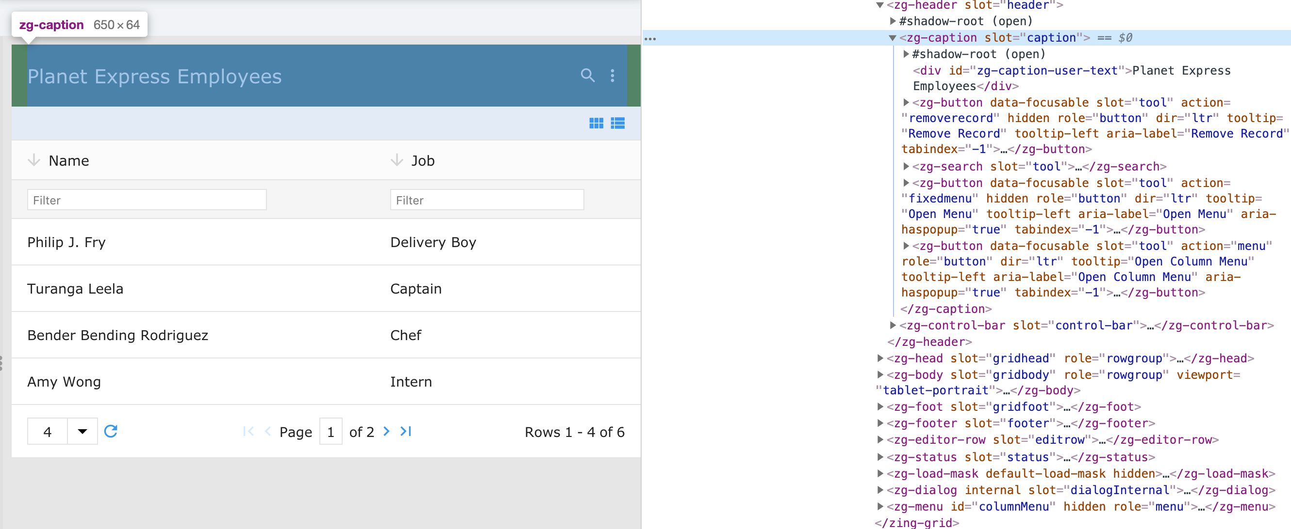
<zg-caption>
Interactive Storybook Playground
The <zg-caption> tag is a web component that controls the styling and display of the grid's caption (title).

Related Web Components
Usage
A <zg-caption> tag can be manually inserted inside the grid as slotted content or automatically inserted when the caption is enabled via the caption attribute. The caption is styleable via CSS variables or the zg-caption CSS selector.
You can use the caption attribute, like so:
<zing-grid caption="Hello World"></zing-grid>
You can slot the <zg-caption> tag as well:
<zing-grid>
  <zg-caption>Hello World</zg-caption>
</zing-grid>
Attributes
There are a couple attributes to help position the <zg-caption> element in the grid and align the text within the <zg-caption>.
Example Usage
<zing-grid
  src="https://cdn.zinggrid.com/datasets/user-roles.json">
  <zg-caption align="center" position="both">Hello World</zg-caption>
</zing-grid>
CSS Variables
<zg-caption> can be styled by CSS variables, like so:
:root {
  --zg-caption-background: red;
}
Below is a list of all the associated --zg-caption CSS variables. Check out the full list of CSS variables or our Styling Basics guide to learn more about styling the grid.
CSS Selector
<zg-caption> can be styled by common CSS selectors.
zg-caption {
  background: red;
}
CSS Shadow Parts
<zg-caption> exposed elements within the shadow can be styled by CSS shadow parts, like so:
zg-caption::part(caption) {
  background-color: red;
}
Below is a list of all the associated ZGCaption shadow parts. Check out the full list of CSS shadow parts or our Styling Basics guide to learn more about styling the grid.
Slots
<zg-caption> contains placeholders to allow adding markup inside the component.
<!-- Default slot -->
<zg-caption>Slotted Content</zg-caption>

<!-- Named slot -->
<zg-caption><span slot="message">Slotted Content</span></zg-caption>
Below is a list of all the associated ZGCaption slots. Check out the full list of slots.