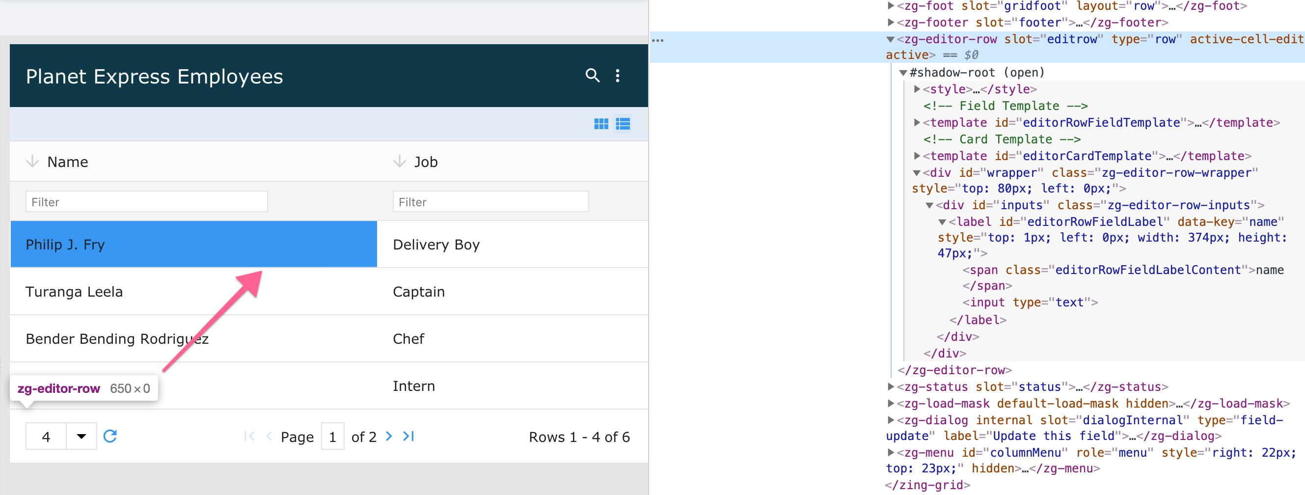
<zg-editor-row>
Interactive Storybook Playground
The <zg-editor-row> tag is a web component that holds the details of the edit mode for the grid. <zg-editor-row> is created implicitly by the grid and should be placed directly in the user's HTML. The element can inherently be styled through CSS variables or by targeting the tag directly.

Related Web Components
Attributes
There are no attributes available for the <zg-editor-row> web component.
CSS Variables
<zg-editor-row> can be styled with CSS variables, like so:
:root {
--zg-editor-row-input-color: red;
}
Below is a list of all the associated --zg-editor-row CSS variables. Check out the full list of CSS variables or our Styling Basics guide to learn more about styling the grid.
CSS Selector
<zg-editor-row> can be styled by common CSS selectors, like so:
zg-editor-row {
  border: 1px solid red;
}
CSS Shadow Parts
<zg-editor-row> exposed elements within the shadow can be styled by CSS shadow parts, like so:
zg-editor-row::part(editor-row) {
  background-color: red;
}
Below is a list of all the associated ZGEditorRow shadow parts. Check out the full list of CSS shadow parts or our Styling Basics guide to learn more about styling the grid.
Slots
There are no slots available for the <zg-editor-row> web component.