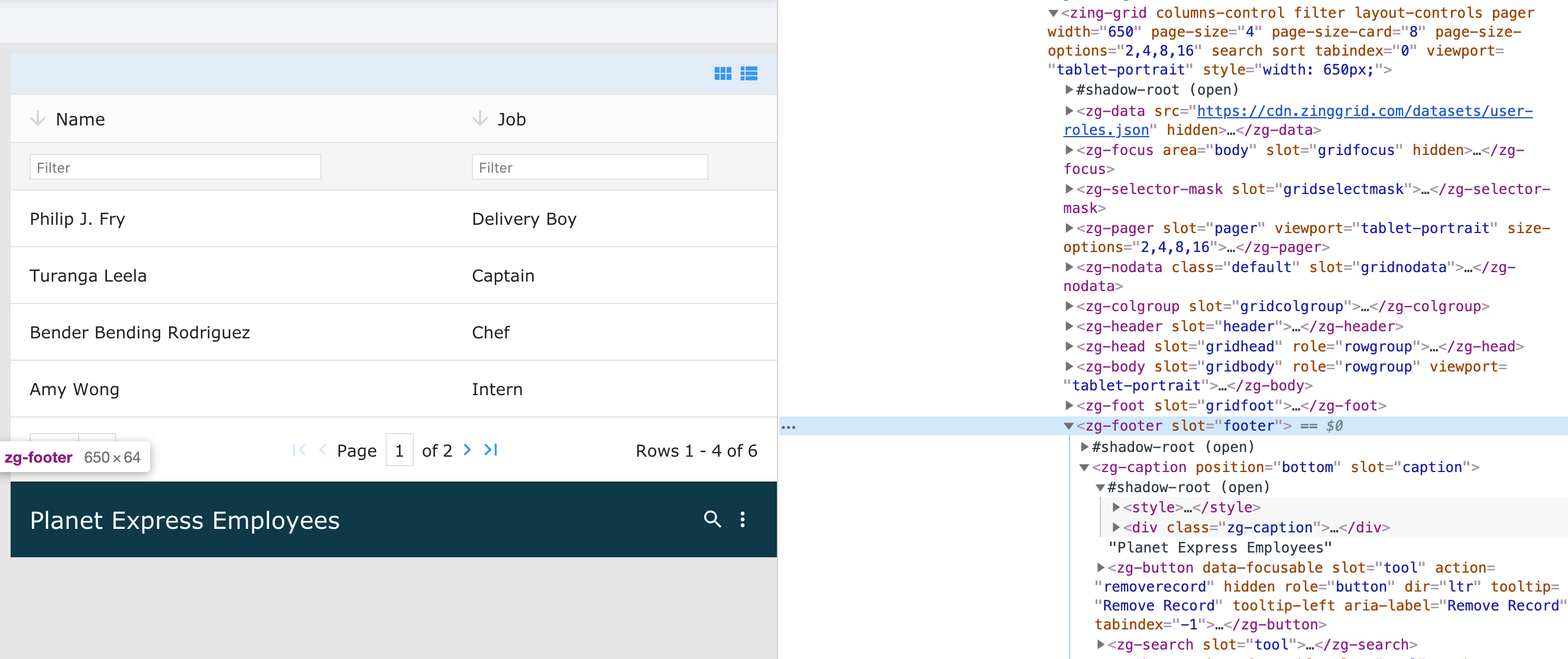
<zg-footer>
Interactive Storybook Playground
The <zg-footer> tag is a web component that is a simple container component for content placed at the bottom of a grid. It can contain <zg-caption> or <zg-source>, but can also contain arbitrarily defined elements inserted by the developer. You can style the <zg-footer> through CSS variables or the zg-footer CSS selector.

Related Web Components
Usage
A <zg-footer> tag can be manually inserted inside the grid as slotted content. The footer is styleable via CSS variables or the zg-footer CSS selector.
<zing-grid src="https://cdn.zinggrid.com/datasets/user-roles.json">
  <zg-footer>Hello World</zg-footer>
</zing-grid>
Attributes
There are no attributes available for the <zg-footer> web component.
CSS Variables
<zg-footer> can be styled with CSS variables, like so:
:root {
--zg-footer-background: red;
}
Below is a list of all the associated --zg-footer CSS variables. Check out the full list of CSS variables or our Styling Basics guide to learn more about styling the grid.
CSS Selector
<zg-footer> can be styled by common CSS selectors, like so:
zg-footer {
  padding: 2rem;
}
Slots
<zg-footer> contains placeholders to allow adding markup inside the component.
<zg-footer>Slotted Content</zg-footer>
Below is a list of all the associated ZGFooter slots. Check out the full list of slots.