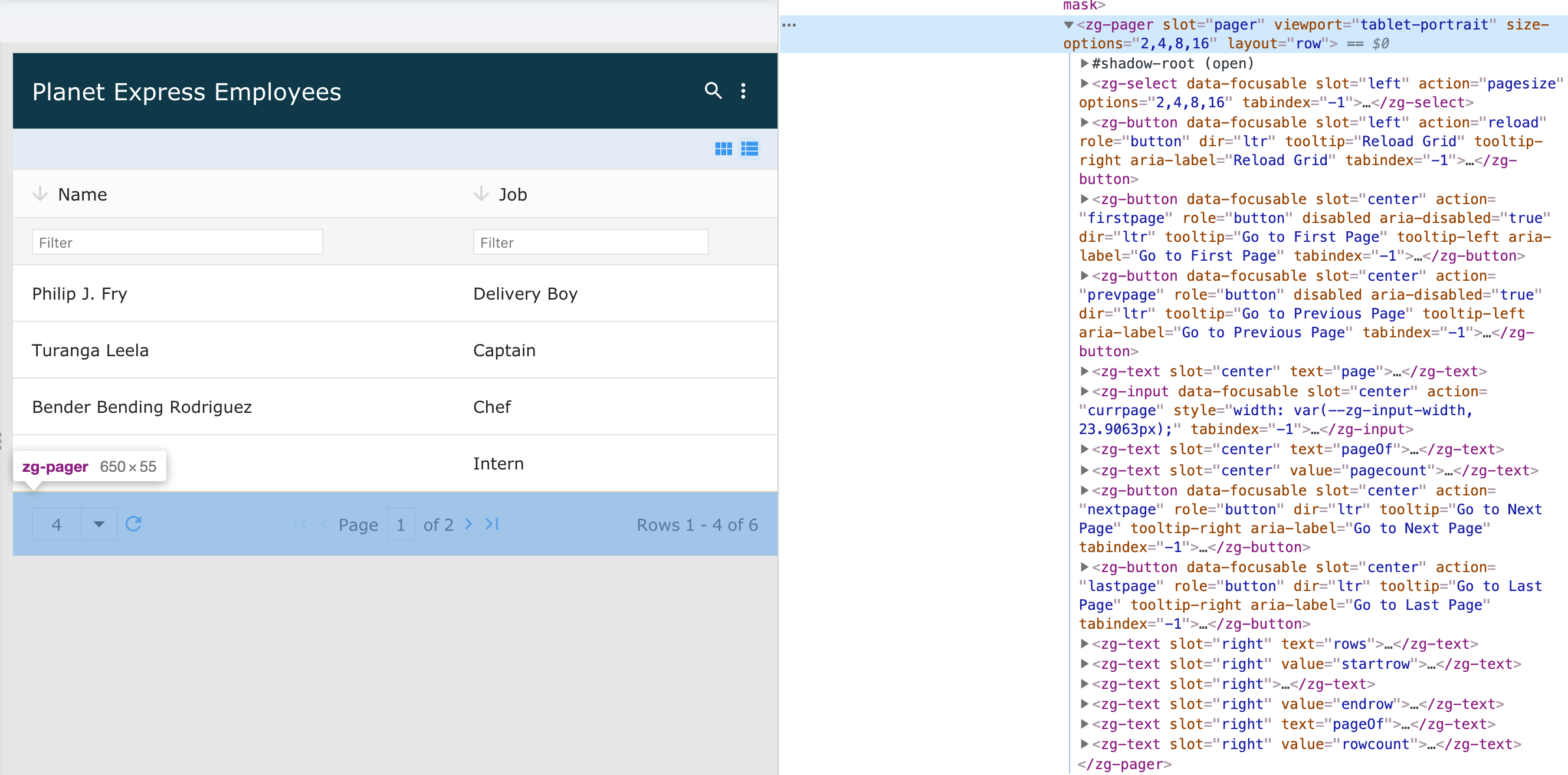
<zg-pager>
Interactive Storybook Playground
The <zg-pager> tag is a web component that controls the styling and display of the grid's paging controls.

Related Web Components
Usage
A <zg-pager> tag can be manually inserted inside the grid as slotted content or automatically inserted when enabled via the pager attribute. It is styleable via CSS variables or the zg-pager CSS selector.
You can insert <zg-pager via the pager attribute, like so:
<zing-grid pager></zing-grid>
You can slot the <zg-pager> tag as well:
<zing-grid>
  <zg-pager></zg-pager>
</zing-grid>
Attributes
There are a couple attributes to help position the <zg-pager> element in the grid and align the text within the <zg-pager>.
Example Usage
<zing-grid
  src="https://cdn.zinggrid.com/datasets/user-roles.json">
  <zg-pager align="center" position="both">Hello World</zg-pager>
</zing-grid>
CSS Variables
<zg-pager> can be styled with CSS variables, like so:
:root {
  --zg-pager-background: red;
}
Below is a list of all the associated --zg-pager CSS variables. Check out the full list of CSS variables or our Styling Basics guide to learn more about styling the grid.
CSS Selector
<zg-pager> can be styled by common CSS selectors, like so:
zg-pager {
  padding: 2rem;
}
CSS Shadow Parts
<zg-pager> exposed elements within the shadow can be styled by CSS shadow parts, like so:
zg-pager::part(pager) {
  background-color: red;
}
Below is a list of all the associated ZGPager shadow parts. Check out the full list of CSS shadow parts or our Styling Basics guide to learn more about styling the grid.
Slots
<zg-pager> contains placeholders to allow adding markup inside the component.
<!-- Default slot -->
<zg-pager>Slotted Content</zg-pager>

<!-- Named slot -->
<zg-pager><span slot="center">Slotted Content</span></zg-pager>
Below is a list of all the associated ZGPager slots. Check out the full list of slots.