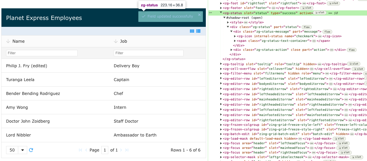
<zg-status>
Interactive Storybook Playground
The <zg-status> tag is a web component that is used to display messages to the user, such as errors and verifications of CRUD actions. <zg-status> is created dynamically and should not be inserted by the user. You can style the <zg-status> through CSS variables or the zg-status CSS selector.

Related Web Components
Attributes
There are no attributes available for the <zg-status> web component.
CSS Variables
<zg-status> can be styled with CSS variables, like so:
:root {
  --zg-status-background: red;
}
Below is a list of all the associated --zg-status CSS variables. Check out the full list of CSS variables or our Styling Basics guide to learn more about styling the grid.
<zg-status> has generic CSS variables that control all use cases, as well as specific overrides for its states (success, error, etc). Generic styles are styled in the form of 'element-property' (--zg-status-background), whereas overrides are 'element-state-property' (--zg-status-success-background). For example, to update the background color of the built-in 'success' state, you'll need to use the more specific variable, since it is already defined in the default template.
CSS Selector
<zg-status> can be styled by common CSS selectors, like so:
zg-status {
  font-size: 2rem;
}
CSS Shadow Parts
<zg-status> exposed elements within the shadow can be styled by CSS shadow parts, like so:
zg-status::part(status) {
  background-color: red;
}
Below is a list of all the associated ZGStatus shadow parts. Check out the full list of CSS shadow parts or our Styling Basics guide to learn more about styling the grid.
Slots
There are no slots available for the <zg-status> web component.