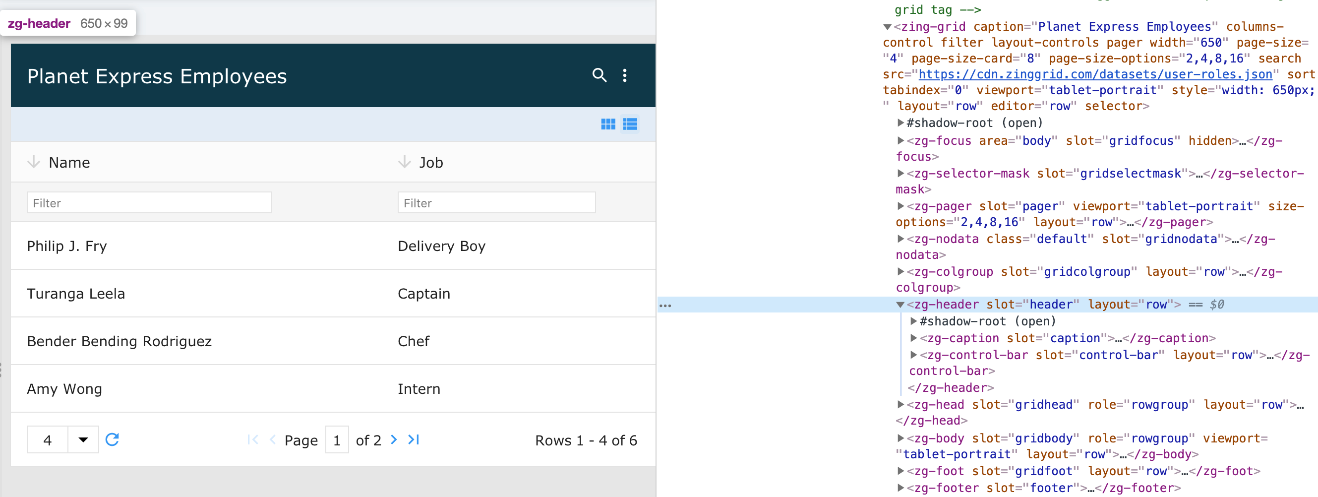
<zg-header>
Interactive Storybook Playground
The <zg-header> is a web component that is the semantic container placed at the top of the grid to hold various grid items. <zg-header> is created internally and should not be placed directly in the user's HTML. You can style the <zg-header> through CSS variables or the zg-header CSS selector.

Related Web Components
Usage
A <zg-header> tag can be manually inserted inside the grid as slotted content. The header is styleable via CSS variables or the zg-header CSS selector.
<zing-grid src="https://cdn.zinggrid.com/datasets/user-roles.json">
  <zg-header>Hello world</zg-header>
</zing-grid>
Attributes
There are no attributes available for the <zg-header> web component.
CSS Variables
<zg-header> can be styled with CSS variables, like so:
:root {
--zg-header-background: red;
}
Below is a list of all the associated --zg-header CSS variables. Check out the full list of CSS variables or our Styling Basics guide to learn more about styling the grid.
CSS Selector
<zg-header> can be styled by common CSS selectors, like so:
zg-header {
  background: red;
}
Slots
There are no slots available for the <zg-header> web component.